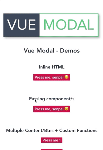
Vue Modal 🖼


Intro
Reusable Modal component, supports own custom HTML, text and classes and/or passing a component. Featuring multiple modal content / buttons.
What this ISN'T
This component is not meant to be a bootstrap-ish already-styled-modal-replacer for Vue.
What this IS
Instead: it wants to take it a step further: it gives you a skeleton base structure where you are free to apply your own css styling according to your requirements/website and gives you freedom of formatting the content/arrows/buttons/events as you wish with little to no effort.
Features
- Animated modal transition
- Overlay on modal background
- Custom event triggering on
before-closeandbefore-open - Conditional: Next/prev arrows, close button, paging
- Next and prev arrow for switching between modal contents
- Modal contents navigation with custom paging
- CSS/HTML customisation of: prev/next arrows, modal content, modal navigation, modal trigger button/s
Demo
- Code editor - codesandobx
- Preview - codesandbox
Installation
npm i @melmacaluso/vue-modalUsage
Simply import it in your desired vue component as follows:
import Modal from "@melmacaluso/vue-modal";Props
| Prop | Type | Comment |
|---|---|---|
btnText | String | Text label for modal button |
modalContent | String | Pass here your html for the modal main modal |
closeBtn | Boolean | Conditionally add a close button |
closeBtn-content | String | Pass here your html for the close button |
multiple | Boolean | Allow multiple buttons/content within the modal |
modals | Array | Pass here an array of objects, they retain the same props within the array's scope ie. <scope>.btnText |
showNav | Boolean | Conditionally show a navigation with each modal's btnText |
showArrows | Boolean | Conditionally show an arrow based navigation |
showArrowsCloseBtn | Boolean | Conditionally show an the close button between the prev/next arrows, it inherits closeBtn-content |
arrowNextContent | String | Pass here your html for the next arrow |
arrowPrevContent | String | Pass here your html for the previous arrow |
@before-open | Function | Attach here your custom function, it will be invoked before the modal opens |
@before-close | Function | Attach here your custom function, it will be invoked before the modal closes |
Examples
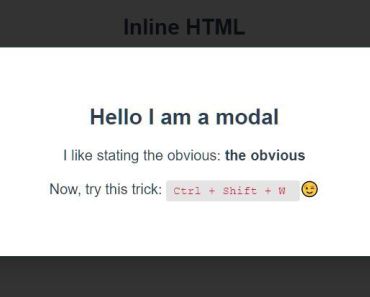
Inline HTML:
<Modal btnText="Press me, senpai 😊" modalContent=" <div> <h2> Hello I am a modal</h2> <p>I like stating the obvious: <b>the obvious</b></p> <p>Now, try this trick: <code>Ctrl + Shift + W </code> 😉</p> </div> " :closeBtn="true" closeBtn-content=" <span>X</span> " />Passing component:
<Modal btnText="Press me, senpai 😊" :closeBtn="true" closeBtnHTML="<span>X</span>" > <ExampleComponent/> </Modal>Multiple buttons & modal content + custom functions:
<Modal :multiple="true" @before-open="yourOpenFn()" @before-close="yourCloseFn()" :modals="[ { btnText: 'Press me 1', modalContent: 'This is <strong>the</strong> content 1' }, { btnText: 'Press me 2', modalContent: '<img src=\'https://media.giphy.com/media/5exwXWg9u7yow/giphy.gif\'>' }, { btnText: 'Press me 3', modalContent: 'This is the <h3>content 3</h3>' } ]" :showNav="true" />From Api/Json feed + Prev/Next Arrows:
<Modal :multiple="true" :modals="formattedUsers" :showArrows="true" /> export default { data: () => { return { users: [] } }, mounted(){ fetch('https://jsonplaceholder.typicode.com/users') .then(res => res.json()) .then(res => this.users = res) .catch(err => console.log(err)) }, computed: { formattedUsers: function() { return this.users.map(user => { return { btnText: `${user.name}`, modalContent: ` <h2>Email:${user.email}</h2> <h2>Phone:${user.phone}</h2> ` }; }); } } }