jQuery Responsive Headlines
by Thomas Kahn
A jQuery plugin for creating responsive one-line headlines that adapt their size to the containing element.
What does it do?
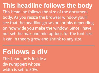
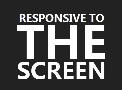
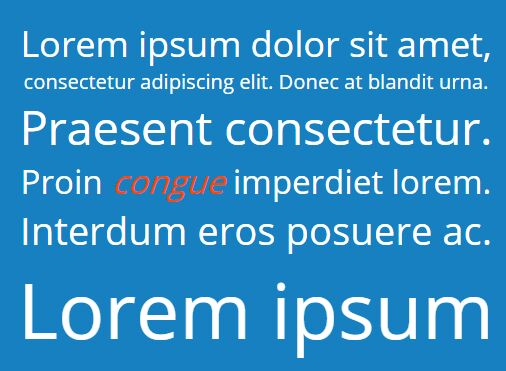
With this jQuery plugin you can create responsive one-line headlines. Instead of wrapping the headline over several rows, this plugin adapts the text size to fit the width of its container on a single line.
A typical user scenario would be if you are building a responsive web site and you want the headlines (some or all) to fit on a single row. On a big screen you want a big headline (large font size) and on a smaller screen you want a smaller headline (small font size). And you want it to change in real time if the user changes the size of the browser window.
It's build on top of jQuery Boilerplate.
How to use it
It works just like any other jquery plugin. Here's a super simple example that turns all h1-tags on the page into responsive headlines:
$('h1').responsiveHeadlines(); There are also a handfull of options that you can use to customize the behaviour of the plugin. The easiest way to understand what they do is read the comments in the source code and do some experimentation on your own using the HTML demo page which accompanies this code in this repository here on GitHub. But here's an example with some options set, just to get you started:
$('h1').responsiveHeadlines({ container: 'myDiv', maxFontSize: 64, minFontSize: 18 }); In the example above I have (again) turned all level 1 headers into responsive headlines and I've told them to adjust their width to the width of the element with the class "myDiv", in this case it would most likely be a div on the page. Then I tell it that I want font size to grow up to 64px but no further than that. And I don't want the font size to go below 18 pixles.
So with this code I will get a headline that sits on a single row and has the same width as the div with the class "myDiv" as long as the font size does not go above 64px or below 18px.
jQuery Throttle/Debounce
jQuery Responsive Headlines works best if you use it together with Ben Alman's jquery-throttle-debounce plugin. It's a plugin for controling/limiting the number of calls to a function. In this case it's very useful since the window resize event is triggered very often and the function that determines the size of the text is bound to this event.
- Ben Alman's project page: http://benalman.com/projects/jquery-throttle-debounce-plugin/
- Ben Alman's repository here on GitHub: https://github.com/cowboy/jquery-throttle-debounce
Per default jquery-trottle-debounce is used (the option useThrottleDebounce is set to true) and therefore I have included a copy of it in this repository. As I said, for performance reasons I recommend that you use it, but if you for some reason don't want it just set the option useThrottleDebounce to false.
