vue-notifyjs


Why use it?
- Small: 1.5kb (minified & gzipped), 4kb (minified)
- Simple
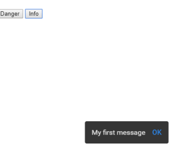
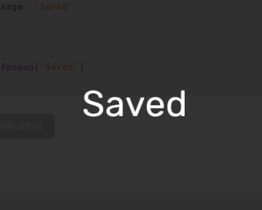
this.$notify({message:'My message'}) - Has multiple themes
- The animations can be customized through Vue transitions
- Can be used both through npm and as a script tag
Demos:
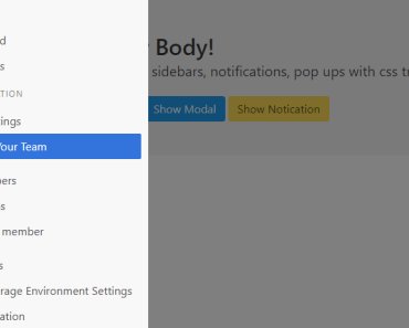
- jsFiddle demo
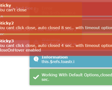
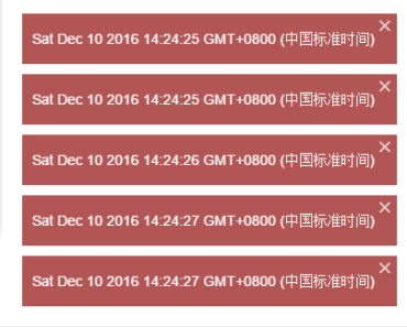
- Overlaping notifications
- Custom html content via components
- Custom animations
- Clears all current notifications
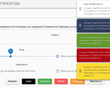
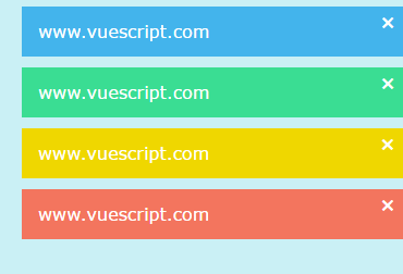
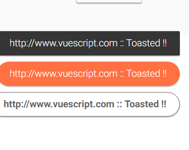
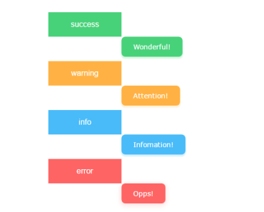
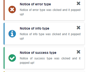
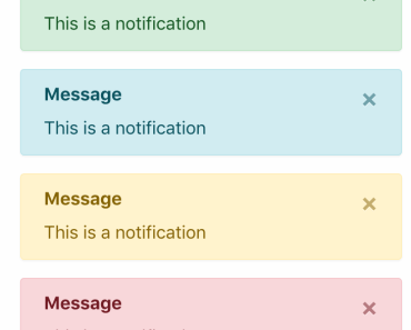
3 themes supported
Default theme
Material design theme
Now-ui theme
Install
yarn add vue-notifyjsCDN JS:
- https://unpkg.com/vue-notifyjs/dist/vue-notifyjs.min.js
- https://unpkg.com/vue-notifyjs/dist/vue-notifyjs.js
CDN CSS:
- https://unpkg.com/vue-notifyjs/themes/default.css
- https://unpkg.com/vue-notifyjs/themes/material.css
- https://unpkg.com/vue-notifyjs/themes/now-ui.css
Usage
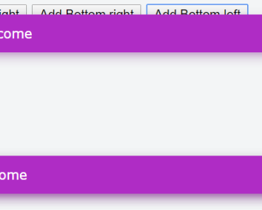
<template> <notifications></notifications> </template> <script> import Notify from 'vue-notifyjs' Vue.use(Notify) export default { methods: { addNotification() { this.$notify({ message: 'Welcome', type: 'success' }) } } } </script> <!-- import styles --> <style src="vue-notifyjs/themes/default.css"></style> Note: <notifications></notifications> can be declared only once anywhere in your app, preferably in your root component so the notification component is alive inside any other components.
Notification options
You can set notification options in 3 ways
- Upon plugin initialization
import Notify from 'vue-notifyjs' Vue.use(Notify, {type: 'primary', timeout: 2000})- Dynamically via
setOptionsmethod
this.$notifications.setOptions({ type: 'primary', timeout: 2000, horizontalAlign: 'right', verticalAlign: 'top' })- When using
$notify
this.$notify({ message: 'Welcome', type: 'success' })Note: Options sent through this.$notify will override default options and will have higher priority than default options.
Props
Notifications
transitionName: { type:String, default:'list' }, transitionMode: { type:String, default:'in-out' }, overlap: { type: Boolean, default: false }Notification (passed through the object sent to $notify method)
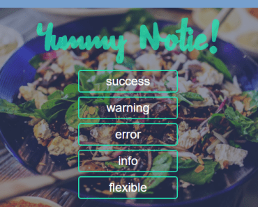
props: { message: String, title: String, icon: String, verticalAlign: { type: String, default: 'top' // top | bottom }, horizontalAlign: { type: String, default: 'center' // right | center | left }, type: { type: String, default: 'info' // info | warning | danger | success | primary }, timeout: { type: Number, default: 5000 }, timestamp: { type: Date, default: () => new Date() }, component: { //is rendered instead of notification message type: [Object, Function] }, showClose: { type: Boolean, default: true }, closeOnClick: { type: Boolean, default: true }, clickHandler: Function, },Methods
clear() - Clears all current notifications
this.$notifications.clear();Contributing
- Fork it!
- Create your feature branch:
git checkout -b my-new-feature - Commit your changes:
git commit -am 'Add some feature' - Push to the branch:
git push origin my-new-feature - Submit a pull request :D