vue-on-toast
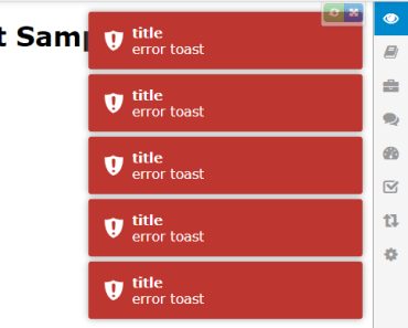
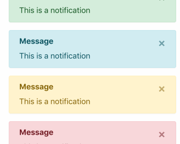
vue-on-toast An SSR-enabled, flexible, fully featured, bootstrap-themed toast notification library for Vue.
vue-on-toast focuses on performance and size with the JavaScript weighing in at 6.37kb (2.25kb gzipped) and the CSS at 10.37kb.
Demo
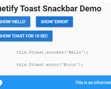
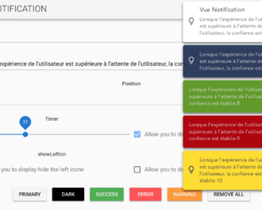
A simple demo can be found at this plunker.
Getting Started
In keeping with Vue's progressive design philosophy, you can drop vue-on-toast onto an existing page or you can add it to a build system. Choose one of the approaches below based on your needs.
CDN Installation
If you are using Vue in a new or existing application without a build system and you would like to use vue-on-toast, you can add it from CDN and it will install itself automatically.
<link href="https://unpkg.com/vue-on-toast/dist/vue-on-toast.min.css" rel="stylesheet" type="text/css"> <script src="https://unpkg.com/vue/dist/vue.js"></script> <script src="https://unpkg.com/vue-on-toast/dist/vue-on-toast.min.js"></script>NPM Install
npm install vue-on-toastIn the root of your application, import and install vue-on-toast.
import Vue from 'vue' import VueOnToast from 'vue-on-toast' Vue.use(VueOnToast)Import CSS or Stylus
@import 'node_modules/vue-on-toast/dist/vue-on-toast.styl'or
@import 'node_modules/vue-on-toast/dist/vue-on-toast.css'NOTE: Using the vue-on-toast css is not required. Although lightweight at 10.41kb minified, you can provide your own CSS to either further shrink the library size or to provide different functionality and feel.
Add Toast Container
vue-on-toast supports multiple toast containers, each allowing a unique configuration (see the Toast Config Options section).
At least one toast container component must be included in your application, preferably outside of your router.
<toast-container></toast-container>Adding and Removing Toasts
Popping a toast in a component
Vue.use(VueOnToast) will add a $vueOnToast instance to the Vue prototype, exposing pop() and remove() methods.
Within your component, you can call this.$vueOnToast.pop(). The pop method takes accepts two different forms of parameters: inline parameters for type, title and body, and an object that allows for additional configuration.
this.$vueOnToast.pop('success', 'Toast Title', 'Popped from Vue instance')OR
let toast = {} this.$vueOnToast.pop(toast)The following properties are exposed on the toast instance via the object parameter syntax and will override container-level configurations (see the Toast Config Options section).
| Property | Type | Default | Description |
|---|---|---|---|
| toastId | string | Automatically generated UUID | UUID specific to the toast instance. Cannot be overridden and is guaranteed to be unique across all containers. It is populated on the toast. |
| toastContainerId | int | null | A numeric value that matches the target container to pop the toast on. If it is omitted, the toast will be popped on all available containers. |
| type | string | none | If a type is not specified and the toast is added via the pop function, an error will be thrown. Options are: success, error, info, wait, warning. |
| title | string | null | The title of the toast. |
| body | string | null | The body of the toast. |
| bodyOutputType | string | null | By default, the body will be rendered as a raw string. To render HTML, 'TrustedHtml' should be passed via this parameter. To render a component, 'Component' should be passed via this parameter and the body parameter should contain the name of the component to render. |
| onShowCallback | function | null | An optional function to invoke after the toast has been added to the target container. The toast instance will be passed to the provided function as the only parameter. |
| onHideCallback | function | null | An optional function to invoke after the toast has been removed from the target container. The toast instance will be passed to the provided function as the only parameter. |
| showCloseButton | boolean | Inherited from config (false) | Determines if the close button should be shown on the toast. |
| toastHtml | string | Inherited from config (×) | The HTML string that should be rendered if showCloseButton is true. |
| clickHandler | function | null | An optional function that returns true/false. If provided and if toastConfig.tapToDismiss is true OR the toast close button was clicked, this function will be invoked, passing the toast instance and the isCloseButton flag (indicating if the click originated from the close button). If the function returns true, the toast will be dismissed, else the toast will persist. |
| timeout | number | Inherited from config | The number of milliseconds to show the toast before it should be automatically dismissed. If set to 0, the toast will be considered "sticky" and will not automatically self-dismiss. |
Popping a toast outside of a Vue instance
If you need to pop a toast outside of a Vue instance (such as a Vuex store module), you can import the VueOnToast instance and access the ToastService directly:
import VueOnToast from 'vue-on-toast' VueOnToast.ToastService.pop('info', 'Toast Title', 'Popped from service directly')Remove Existing Toast
A remove function is exposed that accepts two optional parameters: toastId and toastContainerId.
These parameters can be used to clear toasts by specific id, by container id, by both, or by neither. If both parameters are omitted, all toasts in all containers will be removed.
Remove from inside Vue Instance
let toast = this.$vueOnToast.pop('success', 'title', 'body') this.$vueOnToast.remove(toast.toastId, toast.toastContainerId)Remove from outside Vue Instance
import VueOnToast from 'vue-on-toast' let toast = VueOnToast.ToastService.pop('info', 'title', 'body') VueOnToast.ToastService.remove(toast.toastId, toast.toastContainerId)Toast Config Options
Each individual toast-container component instance offers a considerable degree of customization and flexibility via the toastConfig property.
<toast-container :toastConfig="customConfig"></toast-container>export default { computed: { customConfig: function () { return { toastContainerId: 1 } } } }The following properties are exposed to the container via the toastConfig property:
| Property | Type | Default | Description |
|---|---|---|---|
| animation | string | "fade" | There are three different built-in transition effects that can be applied to a container: "fade", "ease-out-left", and "ease-out-right". Custom transitions can be created as well and should be passed to this parameter. |
| bodyClass | string | "vot-body" | The class that is applied to the div that holds the body of the toast where the body parameter is applied. |
| closeHtml | string | × | The html that should be rendered if showCloseButton is true. This property is automatically inherited by toasts. |
| defaultTypeClass | string | "vot-info" | Fallback toast type when the toast is added to the container. |
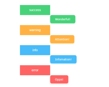
| typeClasses | object | See Description | An object mapping each toast type to its css class. The following are the default options: error: "vot-error"info: "vot-info"wait: "vot-wait"success: "vot-success"warning: "vot-warning" |
| iconClasses | object | See Description | An object mapping each icon per toast type to its css class. The following are the default options: error: "vot-icon-error"info: "vot-icon-info"wait: "vot-icon-wait"success: "vot-icon-success"warning: "vot-icon-warning" |
| mouseoverTimerStop | boolean | false | If true, the dismiss timer is paused while the toast is moused over. |
| newestOnTop | boolean | true | If true, the toast is pushed to the top of the container list. If false, the toast is added to the bottom of the container list. |
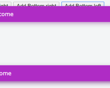
| positionClass | string | "vot-top-right" | The container can be positioned in nine distinct positions provided by the library, and can be further customized via this parameter. "vot-top-full-width", "vot-bottom-full-width", "vot-top-left", "vot-top-center", "vot-top-right", "vot-bottom-left", "vot-bottom-center", "vot-bottom-right", "vot-center" |
| preventDuplicates | boolean | false | If true, the toast id is checked against all other toasts currently displayed by the container. If there is no match, the body is compared to the bodies of all toasts currently displayed by the container. If there is a match, the new toast is not added. |
| tapToDismiss | boolean | true | If true, tapping (or clicking) the toast will automatically dismiss it. If false, taps (or clicks) have no effect on the toast. |
| timeout | number OR object | 5000 | By default, toasts have a timeout setting of 5000, meaning that they are removed after 5000 milliseconds. If the timeout is set to anything other than a number greater than 0, the toast will be considered "sticky" and will not automatically dismiss. The timeout can be configured either globally for all toast types as a number, or per toast type as an object ( timeout: {error: 1000}}). |
| titleClass | string | "vot-title" | The class that is applied to the div that holds the title of the toast where the title parameter is applied. |
| toastContainerId | number | null | A unique identifier to enable container-specific adds and removals. |
| showCloseButton | boolean OR object | false | By default, the close button is not shown for any toast type. This can be overridden for all toast types by providing false, or it can be overridden per toast type as an object (showCloseButton: {error: true}}). |
Author
Copyright
Copyright © 2017 Stabzs.
Licence
This project is licensed under the MIT license. See the LICENSE file for more info.
