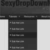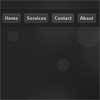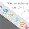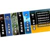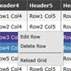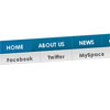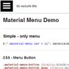
materialmenu
jQuery plugin that creates an responsive Menu on website.
Try IT!
http://requtize.github.io/materialmenu/
For downloads, see: https://github.com/requtize/materialmenu/releases/
Required
What you need, to work with materialmenu?
- jQuery 1.9+
License
This code is licensed under MIT License.
How to use?
$(function(){ // Basic usage $('.material-menu nav > ul').materialmenu(); // Full Usage (with comments) $(".material-menu nav > ul").materialmenu({ /** * Define width of the window (in pixels) where starts mobile devices. * @type integer */ mobileWidth: 768, /** * Width of the wrapper of menu. Works only on mbile. * @type integer */ width: 250, /** * Time of animation. * @type integer */ animationTime: 200, /** * Overlay opacity. * @type integer */ overlayOpacity: 0.4, /** * Class of menu button that fires showing of menu. * @type string */ buttonClass: 'material-menu-button', /** * If you want, you can define Your own menu button, * that be appended to generated title. * @type string */ buttonHTML: '<div class="material-menu-button"><span></span><span></span><span></span></div>', /** * Page title, showed on mobile devices. * @type string */ title: '', /** * Tells if title can be showed on mobile devices (only). * @type boolean */ showTitle: false, /** * Number of pixels to scroll top, when title is showed on mobile devices. * If is 0, title will always be visible on top. * @type integer */ titleShowOn: 40, /** * If true, menu will hide when user click on some menu item. * @type boolean */ hideOnClick: true, /** * Fires when menu is opened. * @param jQuery object element Menu (ul) object. * @return void */ onOpen: function(element) {}, /** * Fires when menu is closed. * @param jQuery object element Menu (ul) object. * @return void */ onClose: function(element) {}, /** * Fires when window width is chenged from desktop to mobile. * @param jQuery object element Menu (ul) object. * @return void */ onChangeMobile: function(element) { element.parent().parent().addClass('vertical'); }, /** * Fires when window width is chenged from mobile to desktop. * @param jQuery object element Menu (ul) object. * @return void */ onChangeDesktop: function(element) { element.parent().parent().removeClass('vertical'); }, /** * Fires when title-bar is opened. * @param jQuery object element Title-bar object. * @return void */ onShowTitlebar: function(element) {}, /** * Fires when title-bar is closed. * @param jQuery object element Title-bar object. * @return void */ onHideTitlebar: function(element) {} }); });