folding-content.js
v2.1
How to use it
0 Requires jQuery
1 Include folding-content.js
2 Create compatible markup
3 Init at bottom of page
4 Add required CSS
Example setup
Example markup
<ul class="folding-menu"> <li class="menu-item"> <a href="#"> <h3>Menu Item Title</h3> </a> <div class="folding-content"> <p>This is the content.</p> </div> </li> </ul> Note that the entire .menu-item will be clickable, and any immediate child <a> tags will have their href voided.
There's no reason you couldn't use divs for the hierarchy, or a ul/other content for the folding content. Just make sure the init matches your markup.
Want multiple folding content menus on the same page? Give them all the same class, and use that as your menu selector in the init below.
Corresponding init
<script type="text/javascript"> jQuery( '.folding-menu' ).foldingContent({ // called on your menu selector menuSelector: '.folding-menu', // (required) menu selector menuItemSelector: '.menu-item', // (required) menu item selector contentSelector: '.folding-content', // (required) folding content selector unfoldBeforeMarkup: '<li>', // (required) unfolded content wrapper before unfoldAfterMarkup: '</li>', // (required) unfolded content wrapper after closeMarkup: '×' // (optional) markup for your close icon to put inside close button }); </script> Minimum corresponding CSS
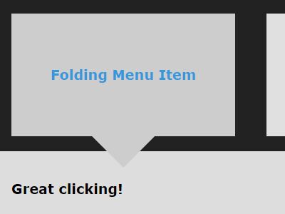
.folding-content, .unfolded-content { display: none; } .unfolded-content .folding-content { display: block; } You will need lots more CSS to make things look good, but this is what affects basic functionality and sliding animations.
Resulting example markup
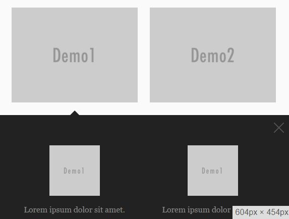
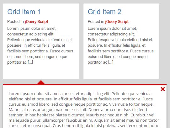
After .menu-item is clicked, the markup will be organized like this:
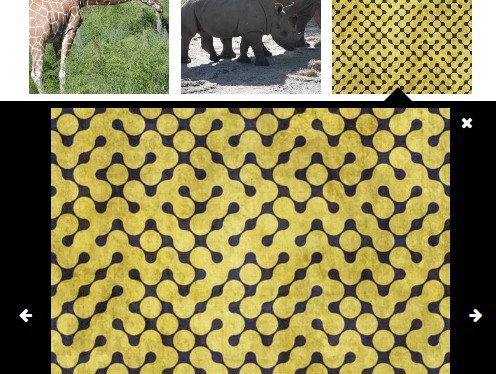
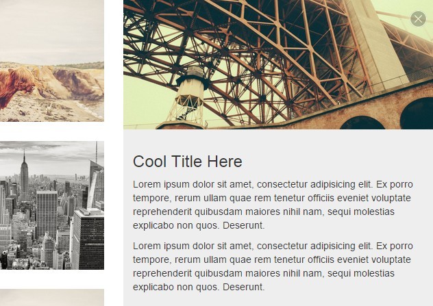
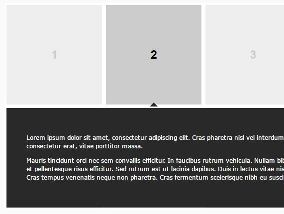
<ul class="folding-menu"> <li class="menu-item"> <a href="#"> <h3>Menu Item Title</h3> </a> </li> <li class="unfolded-content"> <div class="close-unfolded-content"> × </div> <div class="folding-content"> <p>This is the content.</p> </div> </li> </ul> The .unfolded-content wrapper comes from your unfoldMarkupeBefore/After (the unfolded-content class gets added later by the script).
Recommended additional CSS
.unfolded-content { width: 100%; } .menu-item:hover, .close-unfolded-content:hover { cursor: pointer; } .active-item:after { Add an arrow or something to denote this is the active item } Check out the demo for additional styling.
Changelog
2.1
- Fix content close doesn't use animation
- Refactor
- Add minification
2.0
- Folding content is now stored as jQuery data
1.2
- Folded content is now moved instead of cloned, so #ids in folding content will never have 2 on the page
- Better protect content in the middle of an animation from new click events
1.1
- Change name to folding-content.js
- Transition to jQuery.fn
- Pass parameters as an object
- Add debounce to window resize
- Fix sliding animations
1.0
- Made the thing
Credit and license
by Samuel Palpant - http://samuel.palpant.com
MIT License
