FlexNav jQuery Plugin
A Device Agnostic Approach to Complex Site Navigation with Support for Touch and Keyboard Accessibility
The Details
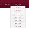
A mobile-first example of using media queries and jQuery to make a decent site menu with drop downs. Special attention is paid to touch screens using touch events and tap targets. This is something I use to test different navigation techniques and may change as I iterate over different solutions to the problem. Basically I want a simple model to build upon when working on sites from scratch.
Note: If you find a bug, please file an issue and note device and browser versions. Use the Demo as a point of reference for bugs. I can't offer my time to debug your specific code.
Resources
- Theming a Multi-level Responsive Menu in Drupal 7
- Gratis Drupal 7 Responsive Theme
- Dreamweaver support forum
- Using FlexNav with WordPress
- FlexNav with WordPress Genesis 2.0 demo
Features
- Multiple nested sub menus
- Tap targets to reveal sub menus for touch screens
- Hover reveal for desktop
- Keyboard tab input accessibility
- Use class
.one-pageon thebody,.menu-button, andul.flexnavfor single page fixed menu - Use with hoverIntent jQuery plugin (not included)
Browser Support
- IE7-10
- Latest Safari
- Latest Chrome
- Latest FireFox
- Android 2.2 to Latest
- Mobile Safari
License
FlexNav is unlicensed. Do whatever you want with it. :) Set Your Code Free
Usage
Start with a simple unordered list, adding in the class and data attributes:
<ul class="flexnav" data-breakpoint="800"> <li>...</li> </ul>Add the small screen menu button somewhere outside your navigation markup:
<div class="menu-button">Menu</div>For a single page site with id anchors, add .one-page class to <body>, .menu-button, and FlexNav <ul>:
<ul class="flexnav one-page" data-breakpoint="800"> <li>...</li> </ul> Add flexnav.css to the head of your document
<link href="css/flexnav.css" rel="stylesheet" type="text/css" / >Add jquery.flexnav.min.js before closing body tag and after jQuery
<script type="text/javascript" src="js/jquery.flexnav.min.js"></script>Initialize
<script> $(".flexnav").flexNav(); </script>Options
$(".flexnav").flexNav({ 'animationSpeed': 250, // default for drop down animation speed 'transitionOpacity': true, // default for opacity animation 'buttonSelector': '.menu-button', // default menu button class name 'hoverIntent': false, // Change to true for use with hoverIntent plugin 'hoverIntentTimeout': 150, // hoverIntent default timeout 'calcItemWidths': false, // dynamically calcs top level nav item widths 'hover': true // would you like hover support? });Contributors
- Jason Weaver - (Primary)
- James Sinclair
- Allison Wagner
- Sean Breakerfall
- Robin Cawser
- pallandt
- ac-bristol
Todo
see Todos
Changelog
see Changelog

