vue-datepicker
This is yet another vue tooltip component.
Install
Use npm to download code:
npm install hsy-vue-tooltip -S then import it into your project, add below code into your main.js:
import Tooltip from 'hsy-vue-tooltip' Vue.use(Tooltip)Usage
There are three modes for tooltip's displaying:
hover, as it's name suggests, it usesmouseover/mouseleaveevents toshow/hidetooltip
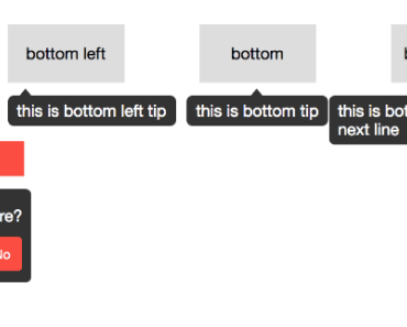
<template> <tooltip placement="top-left" mode="hover"> <div slot="outlet">top left</div> <div slot="tooltip">this is top left tip</div> </tooltip> </template>click, it usesclick inside/outsideevents toshow/hidetooltip
<template> <div class="confirm"> <tooltip placement="bottom-left" mode="click" v-model="invisible"> <div slot="outlet"> Remove </div> <div slot="tooltip"> <h3>Are your sure?</h3> <div class="btns"> <button class="yes" @click="handleYes">Yes</button> <button class="no" @click="handleNo">No</button> </div> </div> </tooltip> </div> </template> <script> export default { data() { return { invisible: true } }, methods: { handleYes() { alert('Yes') }, handleNo() { alert('No') this.invisible = true } } } </script>manual, if you want toshow/hidetooltip manually
<template> <tooltip placement="top-left" mode="manual" :visible="visible"> <div slot="outlet">top left</div> <div slot="tooltip">this is top left tip</div> </tooltip> </template> <script> export default { data() { return { visible: false } }, mounted() { setTimeout(() => { this.visible = true }, 1000) } } </script>Props
Coming soon, it's driving on the freeway built by your stars