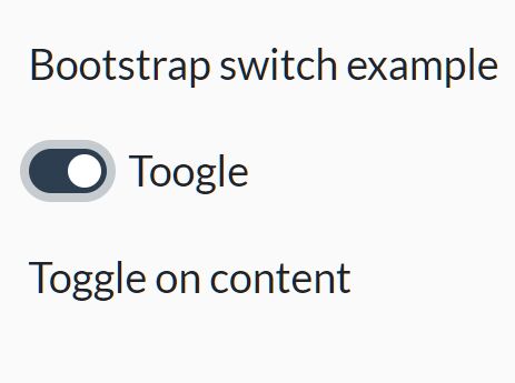
jQuery toggle
simple jQuery plugin to toggle elements.
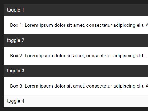
The plugin toggles a panel when its toggle is clicked, by changing classes on both the toggle and the panel. You'll have to use css to do the acutal showing/hiding; the css contains the most basis variant: toggling between display: block; and display: none;
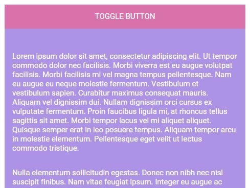
Basic setup: toggle sibling
to link toggle and toggle panel:
give toggle 2 classes: one general class js-toggle and one state-specific class js-toggle--is-expanded or js-toggle--is-collapsed.
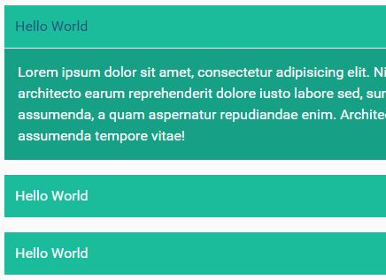
<a href="#" class="js-toggle js-toggle-expanded">show</a>the panel gets two classes: one general class js-toggle-panel, and one depending on its default state: js-toggle-panel--expanded or js-toggle-panel--collapsed
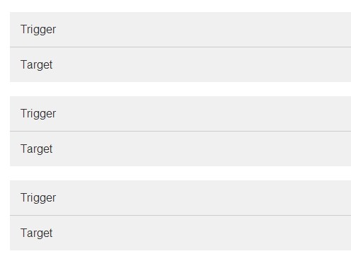
<div class="js-toggle-panel js-toggle-panel--expanded"> panel content </div>By default, the plugin searches for the first sibling of .js-toggle with class .js-toggle-panel
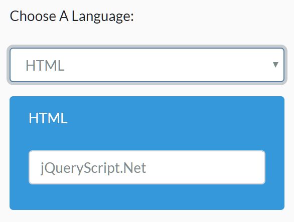
Toggle one or more specific panels
You can toggle one or more panels anywhere in the document by adding a data-attribute to both toggle and panel:
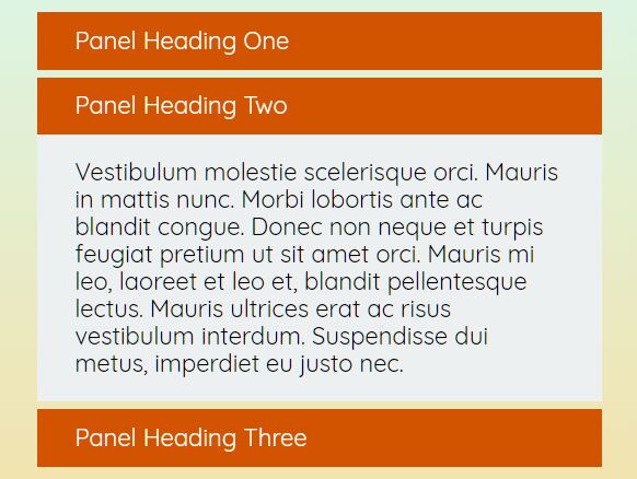
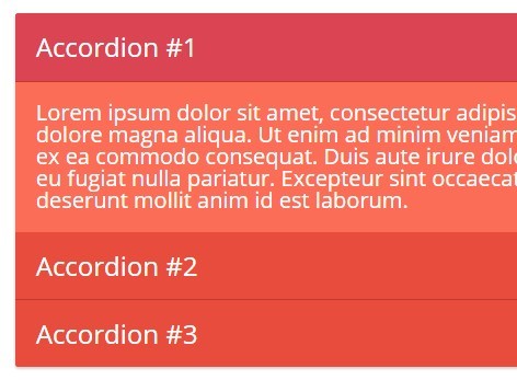
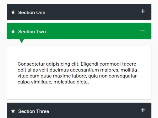
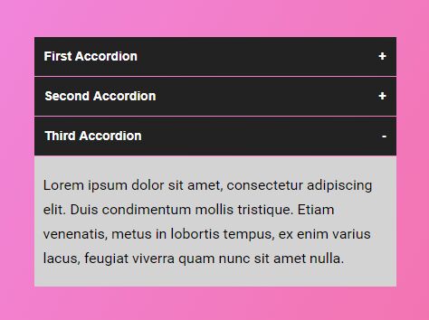
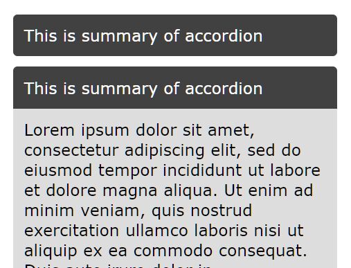
<a href="#" class="js-toggle" data-toggle-panel-id="my-panel">show</a> <div class="js-toggle-panel js-toggle-panel--expanded" data-toggle-panel-id="my-panel"> panel content </div>Close panel when another opens (accordion)
When you give multiple toggles the same data-attribute data-toggle-group, opening one will close the others.
<ul> <li> <a href="#" class="js-toggle js-toggle--is-expanded" data-toggle-group="my-toggle-group">toggle group - #1</a> <div class="js-toggle-panel js-toggle-panel--is-expanded"> toggle group panel #1 </div> </li> <li> <a href="#" class="js-toggle js-toggle--is-collapsed" data-toggle-group="my-toggle-group">toggle group - #2</a> <div class="js-toggle-panel js-toggle-panel--is-collapsed"> toggle group panel #2 </div> </li> <li> <a href="#" class="js-toggle js-toggle--is-collapsed" data-toggle-group="my-toggle-group">toggle group - #3</a> <div class="js-toggle-panel js-toggle-panel--is-collapsed"> toggle group panel #3 </div> </li> </ul>Only open or close a panel
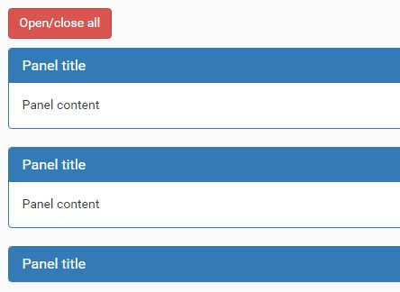
When you give a toggle the data-attribute data-toggle-expand-only, it will expand its corresponding panel but won't close it; with the data-attribute data-toggle-collapse-only, it wil collapse its panel but not expand it.