Vue.js popover
Install:
npm install vue-js-popover --saveImport:
import Vue from 'vue' import Popover from 'vue-js-popover' Vue.use(Popover)Use:
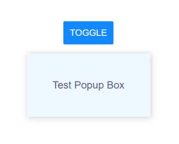
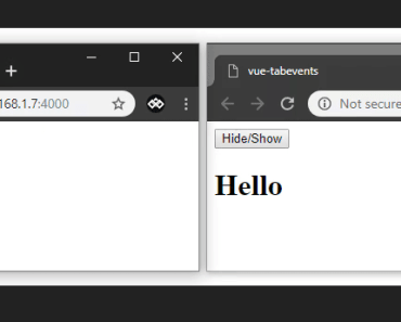
<button v-popover:foo>Toggle popover</button> <popover name="foo"> Hello 🎉 </popover>Or:
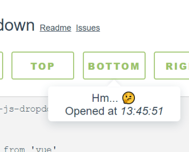
<button v-popover="{ name: 'foo' }">Toggle popover</button> Tooltip
Plugin contains a simple wrapper for Tooltip. To use it you will have to:
Set tooltip flag in your main.js:
import VPopover from 'vue-js-popover' Vue.use(VPopover, { tooltip: true })Include tooltip component anywhere in the application:
<tooltip/>Assign message to any element:
<button v-popover:tooltip="'This is a string value'">My butt0n</button>Tooltip component is simple af - 33 lines of code (mostly declarations). It demonstrates how easily you can create new things using the provided tool.
Props
props: { /* Tooltip name. */ name: { type: String, required: true }, width: { type: Number, default: 180 }, /* If set - will show a tiny tip. */ pointer: { type: Boolean, default: true }, /* Name of the event which triggeres showing/hiding of the popover. Possible values are: 'click', 'hover'. */ event: { type: String, default: 'click' } }Positioning
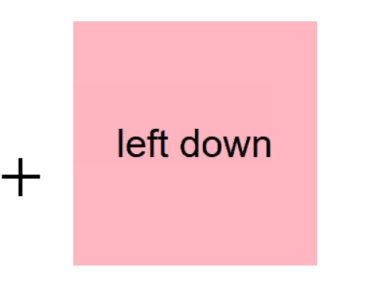
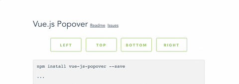
You can use .left, .right, .top, .bottom modifiers to set the position of the popover.
Example:
<button v-popover:info.right>Edit (show popover right)</button> <button v-popover.left="{ name: 'info' }">Edit</button>Styling
Popover components have data-popover="name" argument that allows to apply styles to it.
Example:
<popover name="foo" :pointer="false">Bar</popover> div[data-popover="foo"] { background: #444; color: #f9f9f9; font-size: 12px; line-height: 1.5; margin: 5px; }