vue-stars
Flexible VueJS input control for ratings (stars, etc.)
Demo
For a live demo, visit https://www.tallent.us/vue-stars/.
Properties
The following properties are supported:
name
Name of the underlying form fields. The default is rating. This must be unique on your page, otherwise browsers will apply changes to one rating to others with the same name. This means if you have more than one <vue-stars> control on your page, this property is required.
readonly
Like native input controls, if this is set, the user cannot make changes to the value, but the control will still submit a value if it is part of a form. Hover animations are also disabled.
value
The integer value of the current rating, from 0 (no set value) to max. Since this is a number, be sure to use the v-bind syntax this attribute (e.g., :value="3" rather than value="3"). If not specified, the default value is 0.
max
The integer maximum rating (e.g., number of stars or other character the user can choose from). Since this is a number, be sure to use the v-bind syntax this attribute (e.g., :max="3" rather than max="3"). If not specified, the default is 5.
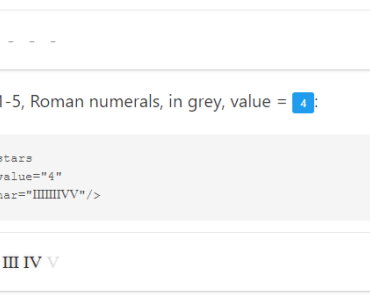
char
This is the character to use for each rating. The default is the Unicode star (★).
If you would like to use a different character for each value from 1-max, you can provide a multi-character string. For example, a letter grade control could use :max="5" char="FDCBA", making the first rating value an F, the second a D, etc.
If max is longer than the string provided, the last character in char is used for all additional values. For example, :max="5" char="!★" would result in a rating control like this: !★★★★.
If you're using an icon font such as FontAwesome, providing a literal value could be troublesome since it won't display in your code editor. Also, Vue does not interpret HTML/XML entity references in attributes, so using something like char="" won't work. However, you can take advantage of v-bind's JavaScript interpretation and escape the character in Javascript, e.g., :char="'\uF005'".
While emoji characters are supported, many don't respond to CSS colors, so using a separate character for inactiveChar (below) is highly recommended. Keep in mind that if you use the JavaScript encoding for char, many emoji characters are outside the 16-bit range of \uXXXX, so you'll need to use the surrogate pair form (lead and tail). There's an example of this using smiling faces in the sample app.
inactiveChar
Sometimes, you may want to use a different set of characters for the "active" values than the "inactive" ones. This property works exactly like chars, but applies only to values between value+1 and max. If not provided, this falls back to the char property.
For example, to use the Unicode "white star" (☆) for the inactive values, use inactive-char="☆".
This is especially useful for icon fonts such as FontAwesome that provide different glyphs for on/off state. It may also be a useful way to allow use of emoji characters, since those characters don't respond to CSS font color (making it difficult to distinguish the current value if the same character is used for active and inactive values).
Color Properties
Some additional properties are supported on all modern browsers (in other words, not on IE11). These all accept any normal CSS color expression (triplets, rgb(), etc.). Remember to use kebab-case for your attributes.
Rather than using props, you can also just define the CSS variables, shown in parenthesis, in your CSS in a way that would cascade down to your vue-star components. I personally find using props for styling to be suboptimal--there's no editor support for validation, and they just remind me too much of the old FONT tag days. That said, they aren't difficult to maintain and I know they are less cumbersome than the alternatives if you want to do dynamic coloring, so I don't plan to remove them.
activeColor (--active-color)
If specified, this overrides the default gold color used for the active values.
inactiveColor (--inactive-color)
If specified, this overrides the default grey color used for the active values.
hoverColor (--hover-color)
If specified, this overrides the default lighter gold color used when hovering over a value.
shadowColor (--shadow-color)
If specified, this overrides the default light yellow color used for the active values. (Inactive values don't have a shadow.)
Customizing the Style
Custom colors are handled using properties, as described above. Everything is sized to the relative font size, so sizing the component requires no special CSS, just set it's font-size in your CSS. To override all other styling, you can use plain old CSS. The main div for these components has a vue-stars class.
Events
Since this is a custom input control, this component emits a single event, input, when a new value is selected by the user (the value is returned as the first argument). This event is required for v-model to work properly (if you choose to use it).
Slots
While the built-in char and inactiveChar works for most use cases, you can used named slots instead to pass more complex markup for your "stars," such as svg or img tags, or multi-character strings.
activeLabel
Used this named slot to pass your own markup to render for an "active star." Because the content will be repeated for each active value, the slot-scope="props" attribute is required.
inactiveLabel
Used this named slot to pass your own markup to render for an "inactive star." Because the content will be repeated for each active value, the slot-scope="props" attribute is required.
Browser Compatibility
This component is at least compatible with the current versions of Chrome, Firefox, Edge, iOS Safari, and desktop Safari.
IE11 is partially supported. The JavaScript should transpile properly, but it will need a polyfill for the ES6 method Array.from, and custom colors are not supported (since IE11 lacks CSS custom property support).
Implementation Details
Under the hood, this control uses radio buttons. The buttons themselves are hidden, the user interacts with the corresponding <label> tags.
As with any Vue input component, the component's value property won't automatically change to match the user's selection (though the unerlying DOM value will). You'll need to either listen for the input event and change the property yourself, or use v-model to set up two-way binding.
To work around a known (but obscure) issue with Apple iPhone/iPad, the hover animations are disabled for touch screen devices.
Build Setup
# install dependencies npm install # build for production with minification npm run buildImport (required) and Global Registration (optional)
import { VueStars } from "vue-stars" Vue.component("vue-stars", VueStars)Release History
| Date | Version | Notes |
|---|---|---|
| 2017.10.28 | 0.1.0 | First published version |
| 2017.10.30 | 0.2.0 | Fixes mostly for iOS Safari |
| 2017.12.16 | 0.3.0 | Rebuild configs from scratch, remove sample app, hopefully building a proper component now |
| 2017.02.17 | 1.0.0 | Rewrite CSS properties mechanism, add named/scoped slots |
| 2018.12.23 | 1.0.1 | Fix bleed-over of CSS into non-vue-rating checkbox input controls |
| 2018.12.24 | 1.1.0 | BROKEN. Change to using vue ui for development, inject CSS, update build process and deps. |
| 2018.12.24 | 1.1.1 | BROKEN. Fix module export issue. |
| 2018.12.24 | 1.1.2 | BROKEN. Still working on module export issues. |
| 2018.12.24 | 1.1.3 | Revolved build issue. Minor semi-breaking change, requires dereferenced import. |
| 2019.05.26 | 1.2.0 | Update deps. Adjusted CSS variables to allow external CSS control. Tweaked shadow. |