Vue-Form-Base
DEPRECATED see next Version: vuetify-form-base
Vue-Form-Base is a Vue 2.0 Component and Form-Generator for editing plain or deep nested Javascript objects getting a reactive Result.
You have to create a lot of different forms? Vue-Form-Base can simplify your job by creating forms from JS-Objects.
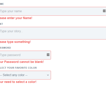
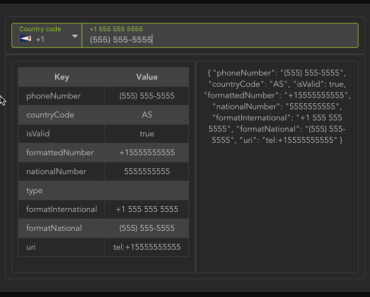
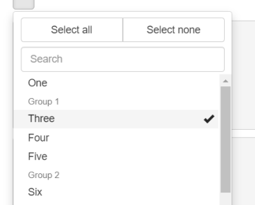
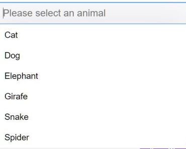
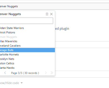
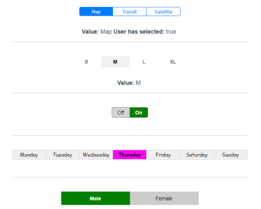
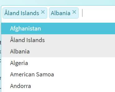
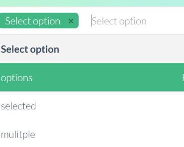
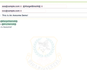
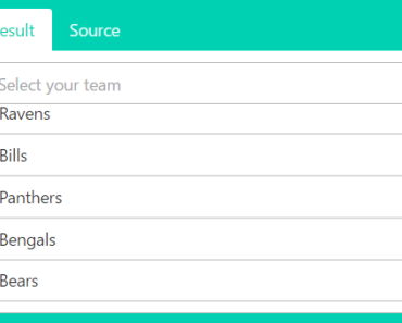
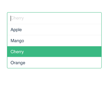
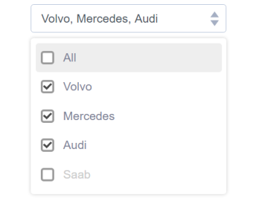
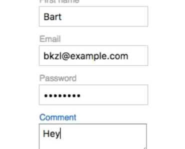
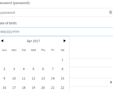
Select from different HTML5 Input-types like Text, Password, Checkboxes, Radios, Select, Multiselect, Color, Files or a lot of other fields. Apart from 'select' or multiselect' the Browser specific implementation of Input-Types is used. Some Informations to HTML5 input-types here
We use the Materialize CSS framework for styling. Input Fields have a clear, minimalistic design, but don't worry you can change your style with CSS in a lot of ways. For more details see section Style with CSS
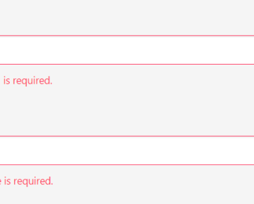
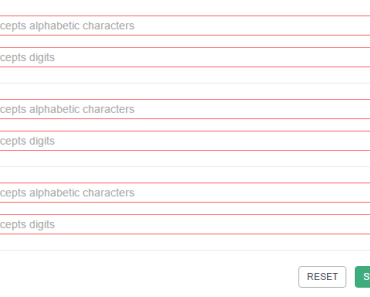
Add global Validation to the form or validate only a single field. Use inline validation or write a new function for individuell validation.
Make complex data editable by mapping your incoming and outgoing data: i.e. change dateformats, trim strings or join/split arrays for editing in a textfield.
And finally get a full reactive Result by using Vuex.
Installation
npm install vue-form-base --save Using single-file components with a .vue extension,
import Formbase.vue File from your path
import FormBase from 'vue-form-base'; then register in
export default { ... components:{ FormBase } } and use it in template
<template> <form-base :data="data" :schema="schema" data-state-name="datastate" /> </template> Minimalistic Example
If your data-state-name property has the value datastate, then you must additionally define datastate in Vuex State.
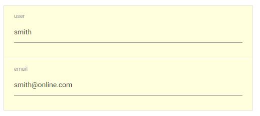
State:{ datastate:null, ... } Now use existing Data Object
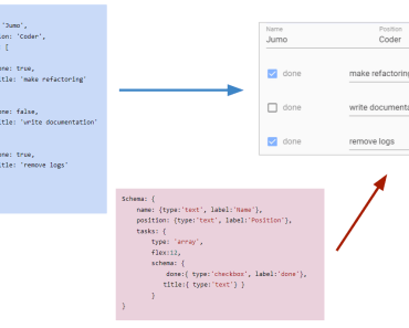
data:{ name: 'smith', email:'[email protected]' } define the following minimalistic Schema
schema:{ name: {type:'text'}, email: {type:'email'} } and get this full editable Form
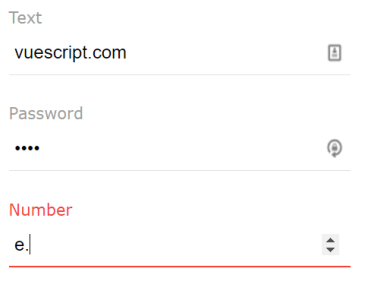
Edit using different Input-Types
A more realistic Example.
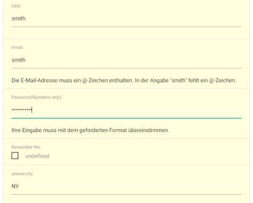
Your Data to edit:
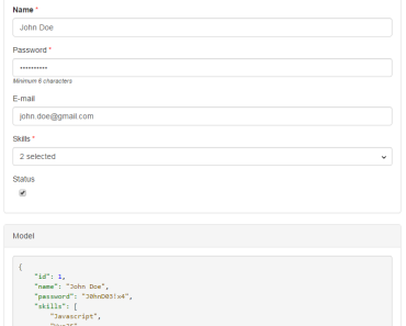
data:{ name: 'smith', email:'smith', password: '12345ABCDEF', remember: 'undefined', address:{ city:'NY', } }, Create a Schema Object:
schema:{ user: {type:'text', label:'User:', placeholder:'User...', mapSet: (val, obj, data, schema) => { // type 'hide' to hide dependent item password schema.password.hidden = val === 'hide'; return val; } }, email: {type:'email',label:'Email:', validate:true }, password: {type:'password', label:'Password(Numbers only):', pattern:'[0-9]*', validate: msg => console.log(msg) }, remember: {type:'checkbox', label:'Remember Me:', true:'Yes', false:'No' }, address:{ city:{ type:'text', mapSet: v => v && v.toUpperCase() } } } 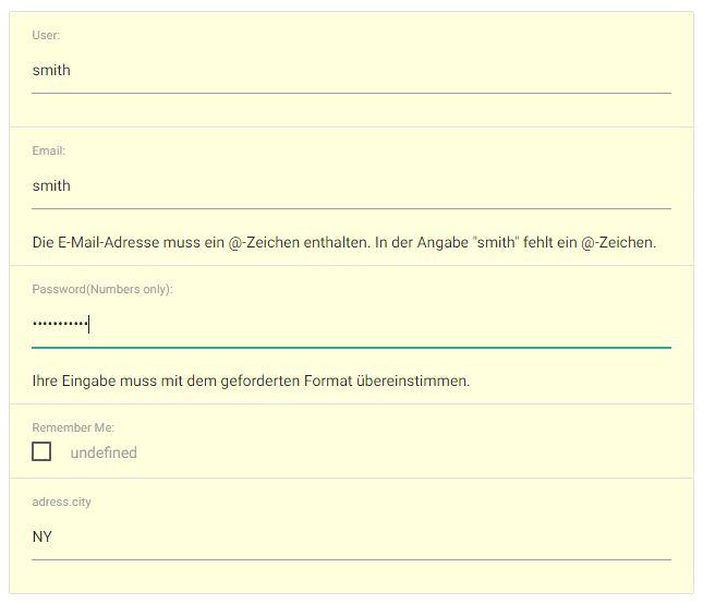
IMPORTANT:
Properties from Data-Object, which doesn't exist in Schema-Object, are ignored.
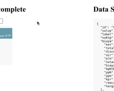
Reactive Result (Vuex)
Model Data und describing Schema flow as prop into the Vue-Form-Base. On the concept of one-way data flow you get reactive access to your modified data via Vuex Store $store.state.datastate . Installed Vuex is mandatory, details about Vuex you can find here Vuex-Introduction
<form-base :data="data" :schema="schema" data-state-name="datastate" /> If you need to dynamically modify the internal Schema (for example if you want to change dynamically schema.hidden to show/hide one item depending from the input of another item) you can have reactive access to the modified Schema via Vuex Store $store.state.schemastate.
Inside a single component .vue file you can use your component like this
<template> <form-base :data="data" :schema="schema" data-state-name="datastate" schema-state-name="schemastate" > </form-base> </template> Get Access to the reactive Result using Vuex State anywhere in your Project.
this.$store.state.datastate IMPORTANT:
'Data' and 'Schema' passed as Prop becomes not mutated.
Two Forms can be reactiv Linked by using the same state property
<form-base :data="data" :schema="schema" data-state-name="dataCommon" /> <form-base :data="data" :schema="schema" data-state-name="dataCommon" /> and if you need different CSS
<form-base id="form1" :data="data" :schema="schema" data-state-name="dataCommon" /> <form-base id="form2" :data="data" :schema="schema" data-state-name="dataCommon" /> Reset modified Data and modified Schema use following code inside the parent single component .vue file
If you need to change the Schema-Object dynamically, like in this case hiding another item
schema:{ ... user: { type:'text', mapSet: (val, obj, data, schema) => { schema.password.hidden = val === 'hide'; return val } }, password: { ... } } then you need datastate and schemastate to restore like in this case
... methods:{ reset(){ this.$store.state.datastate= cloneDeep(this.data); this.$store.state.schemastate= cloneDeep(this.schema) }, ... }, ... In common use cases without modified Schema Reset can be shortened
<template> <form-base :data="data" :schema="schema" data-state-name="datastate" /> </template> <script> import { cloneDeep } from 'lodash' export default { ... methods:{ reset(){ this.$store.state.datastate= cloneDeep(this.data); }, ... }, ... </script> Schema
<form-base :schema="schema" ... /> Schema is an object, which defines and controls the behavior of your form. Each Key in your schema-object must reflect a key in the data-object.
schema:{ user: { type:'text'}, // minimalistic definition of input-type } // more validate = val => console.log(val); mapSet = val => val + '!' schema:{ user: { type:'text', label:'User:', pattern:'([A-Z]*)', css:'blue', validate, // is the same as - validate:validate, mapSet, // is the same as - mapSet:mapSet, order:1 }, ... } In common use cases the the value will be another object with several properties, to get different control over the behaviour of your input-field.
Properties in Schema
schema:{ order: number, // controls order of displaying type: string, // 'text', 'password', 'email', ... label: string, // title of item placeholder: string, // placeholder set null to hide true: string, // text if checkbox is checked false: string, // text if checkbox is unchecked accept: string, // type:'file' - limit files audio/*, image/*, .pdf title: string, // define your own validation message error: string, // preset/set inline error msg css: string, // inject one or more classnames at item level // Use 12 column grid system from materializecss.com/grid.html for displaying items // for example a 12 column grid with 3 items in one row would look like: // schema:{ item1:{ css:'col s4'}, item2:{ css:'col s4'}, item3:{ css:'next-row col s4'} } pattern: string, // regex to control input min: number, // limit number or range max: number, // limit number or range step: number, maxlength: number, // max length of type text, password, email multiple: bool, // type:'file' select one or more files required: bool, // need an input value disabled: bool, // disable input field readonly: bool, hidden: bool, // hide item - set from another item options: array, // used with type: radio, list, text, select, mselect mapGet: function, function( val, obj, state, schema ) {... return val} mapSet: function, function( val, obj, state, schema ) {... return val} } validate: true // use inline error message validate: function, function( msg, obj, state, schema, validity ) {...} noValidate: function, function( value, obj, state, schema ) {...} } Real-Life Example
... schema:{ user: { type:'text', label:'Fullname:', placeholder:'Name...', css:'col s6'}, email: {type:'email', validate:true, mapSet: v => v && v.toUpperCase(), css:'next-row col s6' }, singleRole:{ type:'select', options:['Admin','Guest','User'] }, } ... Style with CSS
Customize your vue-form-base component using the following CSS-Classnames
IMPORTANT:
Don't use<style scoped>in parents component, because scoped definitions are inside the child component not accessable
Form-ID
#form-base is the default form-id. If you need different CSS for two or more forms in the same parent component, then change default value by setting a different id for each component and use this new id
/* default */ <form-base ... /> #form-base .collection {...} /* individualize it */ <form-base id="my-custom-id" ... /> #my-custom-id .collection {...} General - Classnames
#form-base .collection {...} // style container for all items #form-base .item {...} // each key is represented, by an item #form-base .error {...} // style inline-error messages Validate with Pseudoselectors
#form-base .item input:invalid { background-color: #fdd; } #form-base .item input:valid { background-color: #dfd; } #form-base .item input:focus { background-color: #ffd; } Type - Classnames
Style all items of a specific type, then use type-classnames. They start with a type ie. password appending -type. Then you have a classname password-type
#form-base .text-type {...} or #form-base .item.text-type {...} You can use most of HTML5 input-types like <input type="password" />. Some Informations to HTML5 input-types
/* Available Types: text, password, email, select, multiselect, list, file, radio, checkbox, number, range, url, date, time, week, month use class by appending -type -> .text-type */ #form-base .text-type { font-weight:500 } #form-base .item.select-type {...} #form-base .item.multiselect-type {...} #form-base .item.checkbox-type {...} Make validate CSS for multiselect type
If you want to style select or multiselect types you have append select after the classname
#form-base .item.multiselect-item select { height:6rem } Key - Classnames
Here you get direct access to each key in your Data-Object. If you want access deep nested keys youst must use a hyphen
data{ user:{ address:{ city:'',... } ... } ... } access deep nested key 'city' with CSS
#form-base .item.user-address-city-key {...} Example
a) Use Example with vue-webapp template, checkout example directory in this repo and follow the readme.
b) Here is a working Vue-File, you can integrate this in your vue-project. Lodash and Vuex must be installed. In initial Vuex state definition state.datastate must exist
<style> #form-base .error { color:red} #form-base .item input:invalid{ background-color: #fdd; } </style> <template> {{$store.state.datastate}} <form-base :data="data" :schema="schema" data-state-name="datastate" /> </template> import FormBase from './FormBase.vue'; export default { data () { return { data:{ user: 'smith', pw: 'secret' }, schema:{ user: { type:'text', label:'User:', placeholder:'User...' }, pw: { type:'password', pattern:'^.{6,}', lable:'Password:', title: 'Password must have minimal 6 Chars', required:true, validate:true } } } }, components:{ FormBase } } Features
- vue-component
- edit plain or deep nested objects
- support most of input types
- full reactive result
- configurable via Schema Defintion
- configurable Style based on Materialize CSS
Dependencies
-
Vue 2.0
-
Vuex
-
Lodash
-
Materialize CSSs