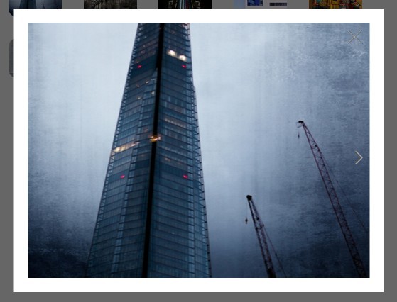
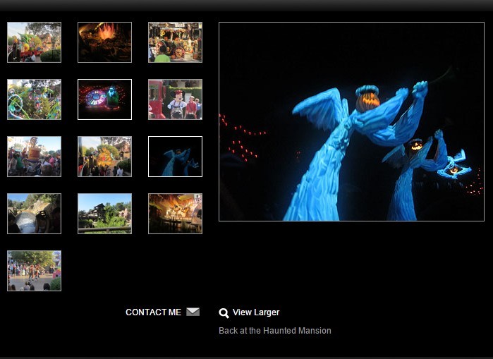
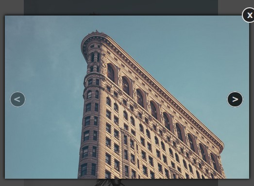
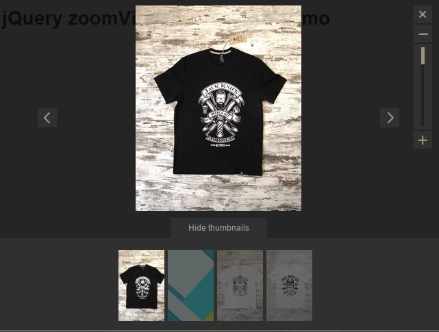
xGallerify
A lightweight, responsive, smart gallery based on jQuery.
- Responsive
- Simple to use
- Customizable and custom styling
- Only 3kb file size
- AngularJS directive available
Demo
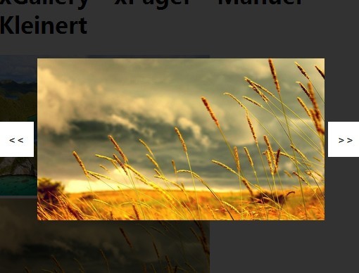
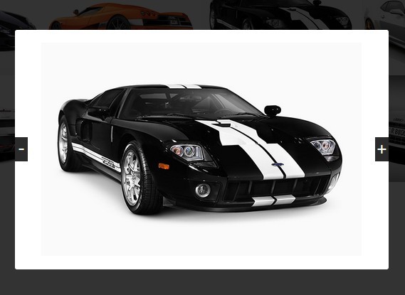
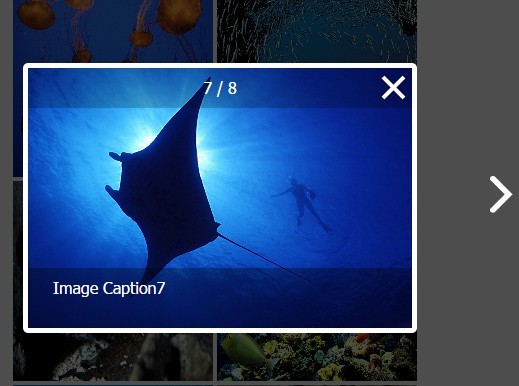
Check out the Demo or try it yourself with CodePen
To see a real-live sample see the Flickr Demo or try it yourself with the CodePen Sample
Usage
$('.photos').gallerify({ margin:10, mode:'default' });In this sample .photos is a <div> containing the images. xGallerify will resize the images in a pleasant way for you.
Custom Styling
Images can be put inside of div's and styled on your own. Check out the full CodePen Demo including all settings, for a sample with a custom styled div.
CDN jsDelivr
The official CDN for xGallerify is hosted on jsDelivr and will support the latest version (served from NPM).
<!-- Latest Version --> <script src="https://cdn.jsdelivr.net/npm/xgallerify@latest/dist/jquery.xgallerify.min.js"></script> <script src="https://cdn.jsdelivr.net/npm/xgallerify@latest/dist/jquery.xgallerify.js"></script> <!-- Specific Version --> <script src="https://cdn.jsdelivr.net/npm/[email protected]/dist/jquery.xgallerify.min.js"></script> <script src="https://cdn.jsdelivr.net/npm/[email protected]/dist/jquery.xgallerify.js"></script>Alternate CDN (rawgit)
Specific branch versions directly from github.com are hosted at the rawgit CDN.
<!-- Master Branch --> <script src="https://rawgit.com/xremix/xGallerify/master/dist/jquery.xgallerify.js"></script> <!-- Develop Branch --> <script src="https://rawgit.com/xremix/xGallerify/develop/dist/jquery.xgallerify.js"></script> Parameters
| Name | Default / Options | Type | Description |
|---|---|---|---|
margin | e.g. 10 | int | Value in pixels of the margin of each image on each side |
galleryMargin | e.g. 17 | int | Value in pixels of the margin outside of the gallery. This is set to 17px default because of some rendering issue on macOS Safari |
mode | default, bootstrap, bootstrapv4, flickr, small or custom object | string or object | The style mode wich defines how the gallery should be displayed and how many images fit in a row. See description in the mode section. |
lastRow | adjust, fullwidth or hidden | string | Set the last row to the full width, hide it or find a good adjustment. NOTE: I personally prefer adjust, wich is also the default. |
jsSetup | true or false | bool | Sets some default CSS values to the elements like dislay:inline-block and for each image inside of a container width:100%. This can be disabled if you want to have your own floating or style this in plain CSS. |
debounceTime | 0 | int | This functionality waits x ms before rendering a new loaded image to boost the performance on older machines. |
width | 800 | int | Width of the gallery in px - Work in Progress! It is recommended to use an outer div with a specific width to controll the width of the Gallery. |
Modes
The modes property defines how many images do show at what container width
NOTE If you want to have another mode you are welcome to contribute or open an issue.
The maximal image height helps to show multiple images in a row, if the images do have a very high ratio like 3:9.
Predefined Modes
| Mode | Breakpoint | Images per row |
|---|---|---|
| default mode | Container width > 1800 | 4 |
| Container width > 1200 | 3 | |
| Container width > 768 | 2 | |
| Container width < 768 | 1 | |
| Maximal image height | Screen Height * 0.5 | |
| bootstrap mode | Container width > 1170 | 4 |
| Container width > 970 | 3 | |
| Container width > 750 | 2 | |
| Container width < 750 | 1 | |
| Maximal image height | Screen Height * 0.5 | |
| bootstrapv4 mode | Container width > 1200 | 4 |
| Container width > 992 | 3 | |
| Container width > 768 | 2 | |
| Container width < 768 | 1 | |
| Maximal image height | Screen Height * 0.5 | |
| flickr mode | Container width > 1800 | 4 |
| Container width > 1300 | 3 | |
| Container width > 610 | 2 | |
| Container width < 610 | 1 | |
| Maximal image height | Screen Height * 0.4 | |
| small mode | Container width > 1800 | 14 |
| Container width > 1300 | 10 | |
| Container width > 610 | 6 | |
| Container width < 610 | 4 | |
| Maximal image height | Screen Height * 0.4 |
Custom Modes
The mode parameter can also be an object that defnies the breakpoints and max height of an image.
Check out the Codepen demo or the following sample object:
var gallery = $('.photos').gallerify({ margin:5, mode:{ maxHeight: screen.height * 0.5, breakPoints:[ { minWidth: 1170, columns: 10, },{ minWidth: 970, columns: 6, },{ minWidth: 750, columns: 3, },{ maxWidth: 750, columns: 2, } ] }, lastRow:'adjust' }); Functions
Render
If new images are added or loaded you can call render to reinitialize the gallery. This will only resize the images to fit again.
$('.photos').gallerify(); //... $(window).on('load', function() { // Eventlistener that fires when all images are loaded $('.photos').gallerify.render(); });Render Async Images
Automatically renders every time an image has been loaded. This needs to get called everytime you add a new image to .photos after calling gallerify(), if you don't have your own image loaded event listener like described in the Render function documentation.
$('.photos').gallerify(); $('.photos').append('<img src="sample-image.jpg">'); $('.photos').append('<img src="sample-image2.jpg">'); $('.photos').append('<img src="sample-image3.jpg">'); $('.photos').gallerify.renderAsyncImages();Community
xGallerify AngularJS directive: JohnnyTheTank/angular-xGallerify
Thanks everyone for contributing. Suggestions are always welcome.
Also I'm happy to hear in which projects you've used the library.

