#miSlider jQuery Plugin
Multi-item Slider or miSlider is an open-source jQuery slider plugin specifically designed for displaying multiple images or slides of content. The slider can be configured to display one slide at a time, as many slides as possible or anything in between.
Version: 0.1.14
Contributors: jbowyers
Donate link:
Tags: slider, jQuery, plugin, carousel, image, gallery, multiple, images
Requires: jQuery
License: GPLv3
License URI: http://www.gnu.org/licenses/gpl-3.0.html
##Highlights
- Easy to use
- Supports one or more slides on screen
- Slides can be single images or complex HTML
- Lightweight
- Only requires jQuery core
- Responsive - Can automatically calculate the number of slides that fit on screen
- Easily customizable
- Callbacks for slider events
- Cross-Browser Support - Supports IE8+
- Supports More than 1 slider per page
##Download Source Download miSlider zip or visit miSlider on GitHub
##Quickstart The fastest way to start using miSlider is to download miSlider, copy the demo folder to your project and adapt the html and css as needed.
You can also install mislider in your project using Bower package manager.
##Full list of Options The following are setting that can be customized:
- Speed of the slide transition
- Slide pause time between transitions
- Number of slides to increment
- Height of the slider
- Number of slides visible on screen at one time
- Continuous motion - Slides loop continuously in one direction
- Location of the current slide on screen - left, center, right
- Slide to start on.
- Width of the current slide
- Scaling factor of the current slide - Other slides are scaled down.
- Vertical offset of the slide center - Useful when slide images are not in the center of the slide
- Transition to clicked slide
- Center slide contents vertically - Centers oversized slides vertically
- Enable & disable Navigation Dots
- Enable & disable Arrow Buttons
- Arrow Buttons transparency
- Randomize the order of the slides
- Slides loaded callback function
- Slide transition before callback function
- Slide transition complete callback function
- CSS class name that will be applied to the Stage element
- CSS class name that will be applied to the Slider element
- CSS class name that will be applied to each Slide element
- CSS class name that will be applied to Arrow Buttons element
- CSS class name that will be applied to the Navigation Dots element
- Selector used to select the Slider element
- Selector used to select each Slide element
##Demos Visit the miSlider website for demos - www.mislider.com
##Problems with Setup and Configuration For issues with installation and configuration visit Stack Overflow.
##Bugs and Feature Requests Please report bugs and suggestions for features to GitHub issues.
##Installation
-
Download and extract miSlider
-
Add the miSlider Plugin to your project - Copy the 'mislider.min.js' file to the scripts folder for your website and the 'mislider.min.css' file to the css folder
-
Create the slides markup - Open the HTML page in which you want to add the slider and add the HTML. You can use any tags you like as long as you have elements for each slide, contained within an element for the slider, contained within an element for the stage. Example:
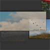
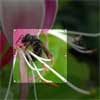
<div class="mis-stage"> <ol class="mis-slider"> <li class="mis-slide"> <img src="images/garden01.jpg" alt="Lillies"> </li> <li class="mis-slide"> <img src="images/garden02.jpg" alt="Pond"> </li> </ol> </div>
Note: The classes are not required and will be automatically added by the plugin if absent. By default, miSlider is designed to work with an ordered list as demonstrated above. If you want to use different elements be sure to change the 'selectorSlider' and 'selectorSlide' options as defined in the Configuration section below.
-
Reference jQuery - If jQuery is not present then add the following reference to the head of the HTML page
<script src="//ajax.googleapis.com/ajax/libs/jquery/1.11.0/jquery.min.js"></script>
-
Reference the miSlider Plugin - Add the following references after the jQuery reference in the head of the HTML page
<link href="styles/mislider.min.css" rel="stylesheet"> <link href="styles/mislider-custom.css" rel="stylesheet"> <script src="scripts/mislider.min.js"></script> <script> jQuery(function ($) { var slider = $('.mis-stage').miSlider(); }); </script>
Note: Make sure the jQuery selector ('.mis-stage') correctly selects the stage element defined in your HTML
-
You're good to go
##Configuration To change the default behaviour of the slider you can configure the slider by adding the following optional setting:
<script> jQuery(function ($) { var slider = $('.mis-stage').miSlider({ // The speed of the slide transition // in milliseconds. Options: positive integer. speed: 700, // slide pause time between transitions // in milliseconds. Options: false, positive integer. // false = Autoplay off. pause: 4000, // The number of slides to increment with // Autoplay and Nav Buttons. // Options: positive or negative integer. // Positive integer = Slide left. // Negative integer = Slide right. increment: 1, // The height of the stage in px. // Options: false or positive integer. // false = height is calculated using // maximum slide heights. stageHeight: false, // Number of slides visible at one time. // Options: false or positive integer. // false = Fit as many as possible. slidesOnStage: 1, // Continuous motion - Boolean. // true = slides loop in one direction if possible. slidesContinuous: true, // The location of the current slide on the stage. // Options: 'left', 'right', 'center'. slidePosition: 'left', // The slide to start on. // Options: 'beg', 'mid', 'end' // or slide number starting at 1 - '1','2', etc. slideStart: 'beg', // The width of the current slide in px. // Options: false or positive integer. // false = width is the maximum of // the existing slide widths. slideWidth: false, // The relative percentage scaling factor // of the current slide // other slides are scaled down. // Options: positive number 100 or higher. // 100 = No scaling. slideScaling: 100, // The vertical offset of the slide center // as a percentage of slide height. // Options: positive or negative number. // Neg value = up. Pos value = down. // 0 = No offset. offsetV: 0, // Center slide contents vertically // Boolean. centerV: false, // Transition to clicked slide instead of visting URL // Boolean. slideClickable: true, // Enable numbered list navigation // Boolean. navList: true, // Enable prev and next button navigation // Boolean. navButtons: true, // Always show prev and next button navigation // except when transitioning - Boolean. navButtonsShow: false, // Opacity of the prev and next // button navigation when not transitioning. // Options: Number between 0 and 1. // 0 (transparent) - 1 (opaque). navButtonsOpacity: 0.5, // Randomize the order of the slides // Boolean. randomize: false, // The slides loaded call back function // called when slides have loaded. slidesLoaded: false, // The slide transition before // call back function - called before // the slide transition. beforeTrans: false, // The slide transition complete // call back function - called at the end // of a slide transition. afterTrans: false, // The CSS class that will be applied // to the stage element. classStage: 'mis-stage', // The CSS class that will be // applied to the slider element. classSlider: 'mis-slider', // The CSS class that will be // applied to each slide element. classSlide: 'mis-slide', // The CSS class that will be // applied to the parent of the // prev and next button navigation elements. classNavButtons: 'mis-nav-buttons', // The CSS class that will be // applied to the parent of the // numbered list navigation elements classNavList: 'mis-nav-list', // The selector used to select // the slider element // Descendant of the stage selectorSlider: 'ol', // The selector used to select // each slide element // Descendant of the slider selectorSlide: 'li' }); }); </script>##Styling To style the slider, create a new stylesheet, name it 'mislider-custom.css' and save it to your CSS folder (Note: Add a reference to the stylesheet as illustrated above if you haven't already). Add your custom CSS to this file. By default miSlider uses the following class names:
- 'mis-stage' - The containing element that defines the visible area
- 'mis-slider' - The slide container element used to move the slides
- 'mis-slide' - Each slide element
- 'mis-container' - A container element inserted automatically by the plugin, wraped around the contents of each slide
- 'mis-nav-buttons' - The previous and next arrows on each side of the current image
- 'mis-nav-list' - the little dots used to navigate to different slides


