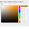
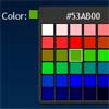
A full-featured colorpicker for jQueryUI with full theming support.
Copyright © 2011-2019 Martijn W. van der Lee.
Most images from jPicker by Christopher T. Tillman. Sourcecode created from scratch by Martijn W. van der Lee.
Features
- jQueryUI (themeroller-based) look & feel
- Familiar interface layout
- Highly configurable
- Control parts
- Layout
- Input/output formats
- Swatches
- Many more
- Accurate color model
- Supports localization
- English, Dutch, French, etc.
- Easily translatable (https://www.transifex.com/projects/p/jquery-colorpicker/)
- Smart window alignment
- Complete API with events and methods
- Easily extendable with plugins
- Many examples included: RGB-Sliders with CSS gradients, Per-user cookie memory for colors.
- Documented
- Limited Unit tests (QUnit-based)
- Disable/enable
- Keyboard support
Requirements
jQuery 1.7.1 or higher required (will not work with v1.6 or before).
jQueryUI 1.8.0 or higher required.
For jQuery 3.0.0 or higher, you must use jQueryUI 1.12.0 or higher.
IE support; make sure you have a doctype defined, or the colorpicker will not display correctly.
Installation
With npm: npm install vanderlee-colorpicker
With yarn: yarn add vanderlee-colorpicker
With bower (deprecated): bower install colorpicker
Zip archive: https://github.com/vanderlee/colorpicker/archive/master.zip
jQueryUI custom build
If you download a custom build of jQueryUI, you need these components:
- Dialog (includes Core, Widget, Mouse, Position, Draggable and Resizable)
- Fade Effect (only if you use the
showAnimoption, includes Effects Core)
To use the parts/jquery.ui.colorpicker-rgbslider.js plugin, you must add:
- Slider (includes Core, Widget and Mouse)
To use the demo page included in the documentation, you must add:
- Tabs (includes Core and Widget)
Browser support
Tested various versions of this plugin with the following browsers:
- Chrome 31-54
- FireFox 25-48
- Opera 17-39
- Internet Explorer 10-11
- Edge 20-25
Keyboard support
You can use the arrow keys to move the cursors on the map and bar controls. Steps are measures in on-screen pixels.
Holding the shift key while using the arrow keys takes steps 10x larger. Pressing the page down and page up keys does the same for vertical movement.
Holding the ctrl key while using the arrow keys takes you to the edges. Pressing the home and end keys does the same for vertical movement.
Documentation
.colorpicker(options)
Turns an element into a colorpicker.
Options
alpha (false)
Whether or not to show the inputs for alpha.
altAlpha (true)
Change the opacity of the altField element(s) according to the alpha setting.
altField ('')
Change the background color of the elements specified in this element.
altOnChange (true)
If true, the altField element(s) are updated on every change, otherwise only upon closing.
altProperties (background-color)
Comma-separated list of CSS properties to set color of in the altField. The following properties are allowed, all others are ignored.
background-colorborder-colorcolorfilloutline-colorstroke
autoOpen (false)
If true, the dialog opens automatically upon page load.
buttonClass (null)
If this option is set to a string, the button will be assigned the class specified.
buttonColorize (false)
If a buttonImage is specified, change the background color of the image when the color is changed.
buttonImage ('images/ui-colorpicker.png')
Same as jQueryUI DatePicker.
buttonImageOnly (false)
Same as jQueryUI DatePicker.
buttonText (null)
Same as jQueryUI DatePicker. If null, use language default.
cancelOnExit (false)
If true, the value is reverted to the original one on exit.
closeOnEscape (true)
Close the window when pressing the Escape key on the keyboard.
closeOnOutside (true)
Close the window when clicking outside the colorpicker display.
color ('#00FF00')
Initial color. Formats recognized are:
- #rrggbb
- rrggbb (same as previous, but without the #)
- rgb(rrr,ggg,bbb)
- rgba(rrr,ggg,bbb,a.a)
- rgb(rrr%,ggg%,bbb%)
- rgba(rrr%,ggg%,bbb%,aaa%)
- w3c-defined color name
colorFormat ('HEX')
Specifies the format of the color string returned in callbacks. You can either specify one of the predefined formats:
#HEX#112233 (#RRGGBB)#HEX3#123 (#RGB) if possible, otherwise false.HEX112233 (RRGGBB)HEX3123 (RGB) if possible, otherwise false.#HEXA#11223344 (#RRGGBBAA)#HEXA4#1234 (#RGBA) if possible, otherwise false.HEXA11223344 (RRGGBBAA)HEXA41234 (RGBA) if possible, otherwise false.RGBrgb(123,45,67) if opaque, otherwise false.RGBArgba(123,45,67,0.123%)RGB%rgb(12%,34%,56%) if opaque, otherwise false.RGBA%rgba(12%,34%,56%,0.123%)HSLhsl(123,45,67) if opaque, otherwise false.HSLAhsla(123,45,67,0.123%)HSL%hsl(12%,34%,56%) if opaque, otherwise false.HSLA%hsla(12%,34%,56%,0.123%)NAMEClosest color nameEXACTExact name if possible, otherwise false.
or specify your own format... Each color channel is specified as a pair of two characters. The first character determines the color channel:
aAlphar, g, bRGB color space; red, green and blueh, s, vHSV color space; hue, saturation and valuec, m, y, kCMYK color space; cyan, magenta, yellow and blackL, A, BLAB color space; Luminosity, *A and *B.
The second character specifies the data type:
xTwo-digit hexadecimal notation.dDecimal (0-255) notation.fFloating point (0-1) notation, not rounded.pPercentage (0-100) notation, not rounded.
If you prefix a valid pair with a backslash, it won't be replaced. All patterns are case sensitive. For example, to create the common hex color format, use "#rxgxbx". For an rgba() format, use "rgba(rd,gd,bd,af)"
You can also specify an array of formats where the first non-FALSE one is returned. Note that the only formats able to return FALSE are the predefined formats HEX3 and EXACT. For example, this array will output HEX3 format if possible or HEX format otherwise:
['HEX3', 'HEX']
disabled (false)
Disable or enable the colorpicker and all it's controls by setting this option.
If you disable the input using the disabled HTML attribute before attaching a colorpicker, it will automatically be disabled.
You can change this option using the option method call.
draggable (true)
Make the dialog draggable if the header is visible and the dialog is not inline.
containment (null)
If the dialog is draggable, constrains dragging to within the bounds of the specified element or region. Same as jQueryUI Draggable.
duration ('fast')
Same as jQueryUI DatePicker.
hideOn ('button')
Specifies what user events will hide the colorpicker if not inline. Specify multiple events by separating with space.
focusWhen the element goes out of focus (either tab or click)clickWhen the element is clicked (for non-inputs)altWhen clicking on an element specified with as altFieldbuttonWhen clicking on the button created if this event is specified.allselects all possible triggersbothsame asall(deprecated, kept backwards compatibility)
hsv (true)
Whether or not to show the inputs for HSV.
inline (true)
If set to false, attaching to a non-input will still make the dialog a popup instead of inline. Make sure you handle events to catch the color change, otherwise you can't use the color.
inlineFrame (true)
If enabled, shows a border and background when inline. Disabling may allow closer integration.
layout ({ ... })
Set the position of elements in a table layout. You could create any layout possible with HTML tables by specifying cell position and size of each part.
The layout option takes a map (object) with each property name matching one of the available parts (including any possible custom or plugin parts). The value is a an array with four coordinates on order [left, top, width, height].
The coordinates correspond to cells in a table, so if you want to have a part at top-left and spanning two rows and three columns, the value would be [0, 0, 3, 2].
Care should be taken to ensure no parts overlap (best to just draw out a grid on paper first). Behavior is undefined if parts overlap. You need not cover the entire rectangular area; any empty cells will be simply remain empty.
The default layout is as follows:
{ map: [0, 0, 1, 5], bar: [1, 0, 1, 5], preview: [2, 0, 1, 1], hsv: [2, 1, 1, 1], rgb: [2, 2, 1, 1], alpha: [2, 3, 1, 1], hex: [2, 4, 1, 1], lab: [3, 1, 1, 1], cmyk: [3, 2, 1, 2], swatches: [4, 0, 1, 5] } limit ('')
Limit the selectable colors to any of the predefined limits:
''No limitations, allow 8bpp color for a palette of all 16 million colors.websafeSet of 216 colors composed of 00, 33, 66, 99, cc and ff color channel values in #rrggbb.nibble4 bits per color, can be easily converted to #rgb format. The palette is limited to 4096 colors.binaryAllow only #00 or #ff as color channel values for primary colors only; only 8 colors are available with this limit.nameLimit to closest color name.
modal (false)
Ensures no other controls on screen can be used while the dialog is opened. Also look at showCancelButton and closeOnEscape to use in combination with the modal option. closeOnOutside is redundant when used with modal.
mode ('h')
Determines the functionality of the map and bar components. Allowed values are; 'h', 's', 'l', 'r', 'g', 'b' or 'a', for hue, saturation, luminosity, red, green, blue and alpha respectively.
okOnEnter (false)
Close the window when pressing the Enter key on the keyboard, keeping the selected color.
part
Use the part option to specify options specific to parts (including plugin parts). By default, the following part options are available:
parts ('')
Determine which parts to display. Use any of the preset names ('full', 'popup' or 'inline') or specify an array of part names (i.e. ['header', 'map', 'bar', 'hex', 'hsv', 'rgb', 'alpha', 'lab', 'cmyk', 'preview', 'swatches', 'footer']). If an empty string is given, the parts will be automatically chosen as preset 'popup' or 'inline' depending on the context in which the colorpicker is used.
position (null)
Specify the position of the dialog as a jQueryUI position object. See jQueryUI .position() API documentation for information on how to use. ColorPicker adds an additional option to the of option; the value 'element' will refer to the element to which the ColorPicker is attached, including if it is invisible). By default, the dialog will attached to the bottom-left of the element, flipping on collision.
regional ('')
Sets the language to use. Note that you must load the appropriate language file from the i18n directory. '' is included by default.
revert (false)
If enabled, closing the dialog through any means but the OK button will revert the color back to the previous state, as if pressing the Cancel button. The revert option changes the behavior of the [X] button in the header, the Escape keyboard button and clicking outside the dialog, when any of these features are enabled.
rgb (true)
Whether or not to show the inputs for RGB.
showAnim ('fadeIn')
Same as jQueryUI DatePicker.
showCancelButton (true)
Show the Cancel button if buttonpane is visible.
showCloseButton (true)
Show the Close button if the header is visible. If the dialog is inline, the close button is never shown.
showNoneButton (false)
Show the None/Revert button if buttonpane is visible.
showOn ('focus click alt')
Specifies what user events will show the colorpicker if not inline. Specify multiple events by separating with space.
focusWhen the element comes into focus (either tab or click)clickWhen the element is clicked (for non-inputs)altWhen clicking on an element specified with as altFieldbuttonWhen clicking on the button created if this event is specified.allselects all possible triggersbothsame asall(deprecated, kept backwards compatibility)
showOptions ({})
Same as jQueryUI DatePicker.
swatches (null)
'null' to show swatches of HTML colors or provide your own object with colornames and {r:1, g:1, b:1} array. For example { 'red': {r:1, g:0, b:0}, 'blue': {r:0, g:0, b:1} } Alternatively, load a predefined set of swatches and specify the name. For example, for the pantone set, specify 'pantone'.
swatchesWidth (84)
Width of the swatches display in pixels.
title (null)
Title to display in the header. If null, use language default.
Events
Each event receives a jQuery event object and an object containing the elements 'formatted' (with the color formatted according to formatColor), the Colorpicker element that triggered the event and the color represented in a number of format:
hex: rrggbbcss: #rrggbba: ...rgb: {r: ..., g: ..., b: ...}hsv: {h: ..., s: ..., v: ...}cmyk: {c: ..., m: ..., y: ..., k: ...}hsl: {h: ..., s: ..., l: ...}lab: {l: ..., a: ..., b: ...}
Note that select may be triggered in rapid succession when dragging the mouse across the map or bar and may be triggered without a change in color upon specific user interactions.
cancel (event, {formatted: ..., colorPicker: ...})
Triggered when the dialog is closed through the cancel button.
close (event, {formatted: ..., colorPicker: ...})
Triggered when the popup is closed.
init (event, {formatted: ..., colorPicker: ...})
Triggered on initially setting the color. Called only once. Callbacks receive same data as select event.
ok (event, {formatted: ..., colorPicker: ...})
Triggered when the dialog is closed through the cancel button.
open (event, {formatted: ..., colorPicker: ...})
Triggered whenever the dialog is opened.
ready (event, {formatted: ..., colorPicker: ...})
Triggered after creating the widget/dialog.
select (event, {formatted: ..., colorPicker: ...})
Triggered on each change, confirmation (click on OK button) and cancellation (click on Cancel, outside window or window close button) respectively.
stop(event, {formatted: ..., colorPicker: ...})
Triggered when the user stops changing a control. This only affects the map and bar parts. Where the select event will trigger on each mouse move, the stop event will only trigger when the mouse button is released. For other controls, stop and select are both triggered.
The callback is otherwise identical to select. When both are triggered, select is triggered before stop.
Methods
open
Open the dialog
close
Close the dialog
destroy
Destroy the widget
setColor
Set the current color to the specified color. Accepts any CSS-confirming color specification.
Plugins
Colorpicker is extensible with several types of plugins. A number of plugins is provided for use. The plugins are constructed such that you only need to load the javascript file after the Colorpicker plugin itself is loaded.
limits
Limits let you limit the possible colors, as used by the 'limit' option.
No plugins included.
parsers
Parser take a textual representation of a color and return a Color object. If no match is found, nothing is returned and the next parser is tried. Parsers are tried in order of appearance.
Included plugins:
cmyk-parserParses acmyk(c, y, m, k)format, similar to rgba.cmyk-percentage-parserParses acmyk(c%, y%, m%, k%)format with percentages.
parts
You can add additional visual parts, usually controls, that interact with the rest of Colorpicker framework.
Included plugins:
memoryCookie-based memory nodes.rgbslidersSet of three red/green/blue sliders with dynamically adjusted gradients.swatchesswitcherSwitch through all available sets of swatches.
partslists
Partslists are a convenient way to select multiple parts at once without having to specify each one individually.
No plugins included.
regional
Regional (in the i18n directory) plugins contain localized texts (a.k.a. translations). A number of languages is provided.
Included regionals:
deGerman (Deutsch).elGreece.enEnglish (default).frFrench.nlDutch.pt-brBrazilian Portuguese.ruRussian.
swatches
Swatches are collections of predefined and named colors. By default the standard html colors are loaded. Setting swatches using the option method will switch the displayed swatches.
Included plugins:
crayolaCrayola pencil color namespantonePantone color codesral-classicClassic RAL paint numbersx11X11 color palette (using "gray", not "grey").
writers
Writers take a Color object and output a textual representation of the color. Writers are used for the colorFormat option.
No plugins included.
Objects
Colorpicker uses a Color object internally to represent a color and convert between the supported color models. You can create a new Color object through $.colorpicker.Color.
