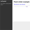
Demo
Side panel slider plugin (jQuery) that also slides page (inspired on medium).
NOTE: Since version 1.0.0 animation and positioning are no longer implemented by the plugin. The animation should be implemented by user's CSS. This enables CSS transform to be used instead of jQuery's animate which significatively boosts performance and makes animations smoother on mobile devices. Checkout example.html to see a CSS implementation of left and right panels.
Features
- slide page and panel together (inspired on medium.com)
- support multiple panels on same page
- support closing when clicking outside panel or pressing ESC.
- play well with angularJS directives (Example comming soon)
Installation
Include jQuery and jquery.panelslider.min.js scripts:
<script src="https://ajax.googleapis.com/ajax/libs/jquery/2.1.4/jquery.min.js"></script> <script src="jquery.panelslider.min.js"></script>Bower users can get the source with:
bower install jquery-panelsliderUsage
Opening
Create an element with the panel content and a link to it.
<div id="my-panel"> <p>Hello, world</p> </div> <a id="my-link" href="#my-panel">Open panel</a>Implement animation using CSS. The CSS below implements a left panel.
/* Panel opening and closing animation lasts 200ms */ body { transition: transform .2s; } /* Slide page 200px to the right when panel is opened */ body.ps-active { transform: translateX(200px); } /* Position panel */ #my-panel { position: fixed; top: 0; left: 0; width: 200px; height: 100%; /* remember to set 100% height for all its parents too, including html and body */ background-color: #eee; transform: translateX(-200px); }and then invoke panelslider() on the element.
$('#my-link').panelslider();You can also invoke panelslider() directly
$.panelslider($('#my-link'));Closing
The panel will close when ESC is pressed or any part of the page outside of panel is clicked (if options.clickClose is true).
Alternativaly, it's possible to close it manually. Because there can be only one panel active at a single time, there's no need to select which panel to close:
$.panelslider.close(callback);Events
The panel triggers few basic events:
$('#my-panel') .on('psOpen', function(e) { console.log(e.type) }) .on('psClose', function(e) { console.log(e.type) }) .on('psBeforeOpen', function(e) { console.log(e.type) }) .on('psBeforeClose', function(e) { console.log(e.type) });Options
These are the supported options and their default values:
defaults = { bodyClass: 'ps-active', // Class to be added to body when panel is opened clickClose: true, // If true closes panel when clicking outside it onOpen: null // Callback after the panel opens }A call with no arguments is equivalent to:
$('#my-link').panelslider({bodyClass: 'ps-active', clickClose: true, onOpen: null});


