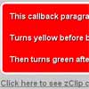
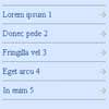
#Responsive Tables A great way to deal with responsive tables is to reformat the related information cells into grouped blocks in mobile view, like these guys did. The problem is that you have to set a media query to initiate this change, lets say at 400px. What if your table breaks before you get there? What if your table displays just fine under 400px? This little jQuery plugin detects when your table breaks, and only applies the 'fix' when that happens.
##Demo Open demo in new window
##Usage Include the css, or just add it into your own stylesheet:
<link rel="stylesheet" href="css/responsivetables.css"> Make sure to include and call the script after loading jQuery at the end of the page:
<script type="text/javascript" src="js/responsivetables.js"></script> <script type="text/javascript"> $(window).load( function() { $(document).responsiveTables(); }); </script> Add a class of "rwd-table" to the tables you'd like to be responsive. If you want titles on each cell in mobile view, make sure to give the table a heading.
<table class="rwd-table"> <thead> <tr> <th>Date</th> <th>Title</th> <th>Room</th> <th>Time</th> </tr> </thead> <tr> <td>12.21.15</td> <td>Event Title</td> <td>Room 3b</td> <td>12:30PM </td> </tr> </table> ##Titles Add data-autogen-headers="true" to the table if you'd like this plugin to automatically assign mobile titles based on the table heading. Alternatively, add data-title="Event" to individual TDs to only add specific mobile titles.
##How It Works This script puts a wrapper div around the table. On page load or resize, it checks the width of the table VS the width of the wrapper div. If the table width exceeds its wrapper, the plugin goes into action. It will first check to see if your table has a heading. If so, it uses that information to set data attributes on each cell. Then it reformats the table for mobile view, and uses those data attributes to apply your heading titles to each cell (if applicable). It's also worth noting that the plugin uses a delayed method of checking window resizes by <a href="http://www.paulirish.com/2009/throttled-smartresize-jquery-event-handler/ target="_blank">Paul Irish to increase performance.
##Known Issues
- Does not work if your table is within another table, or an element with display:table-cell set.


