Zebra Accordion 
A tiny (3 KB minified, 1.3KB gzipped), easily configurable, fully customizable, cross-browser jQuery accordion plugin
Zebra Accordion is a tiny (3KB minified, ~1.3KB gzipped) jQuery accordion plugin. It transforms a basic definition list, without requiring any specific markup, into a small-footprint, easily configurable, fully customizable, cross-browser accordion widget, useful for better organizing larger groups of content.
Features
- no additional markup required other than a basic definition list
- no default style allowing you to fully customize it to suit your needs
- works with responsive layouts
- allows for a single expanded tab at a time, or for any number of tabs to be expanded/collapsed
- allows for tabs to expand on mouse over, not just on click
- if an expanded tab's content is not in the viewport it automatically scrolls the browser window so that the content is visible
- callback functions can be used for further customizations
- works in pretty much any browser - Firefox, Chrome, Safari, Edge, Opera and Internet Explorer 6+
Demo
See the demos
Requirements
Zebra Accordion has no dependencies other than jQuery 1.7.0+
Installation
Zebra Accordion is available as a npm package. To install it use:
# the "--save" argument adds the plugin as a dependency in packages.json npm install zebra_accordion --saveZebra Accordion is also available as a Bower package. To install it use:
# the "--save" argument adds the plugin as a dependency in bower.json bower install zebra_accordion --saveHow to use
First, load jQuery from a CDN and provide a fallback to a local source like:
<script src="https://code.jquery.com/jquery-3.3.1.min.js"></script> <script>window.jQuery || document.write('<script src="path/to/jquery-3.3.1.js"><\/script>')</script>Load the Zebra Accordion jQuery plugin:
<script src="path/to/zebra_accordion.min.js"></script>Alternatively, you can load Zebra Accordion from JSDelivr CDN like this:
<!-- for the most recent version, not recommended in production --> <script src="https://cdn.jsdelivr.net/npm/zebra_accordion@latest/dist/zebra_accordion.min.js"></script> <!-- for a specific version --> <script src="https://cdn.jsdelivr.net/npm/[email protected]/dist/zebra_accordion.min.js"></script> <!-- replacing "min" with "src" will serve you the non-compressed version -->Load the style sheet file from a local source
<link rel="stylesheet" href="path/to/zebra_accordion.min.css">...or from JSDelivr CDN
<!-- for the most recent version --> <link rel="stylesheet" href="https://cdn.jsdelivr.net/npm/zebra_accordion@latest/dist/zebra_accordion.min.css"> <!-- for a specific version --> <link rel="stylesheet" href="https://cdn.jsdelivr.net/npm/[email protected]/dist/zebra_accordion.min.css"> <!-- replacing "min" with "src" will serve you the non-compressed version -->You need a basic definition list for your HTML markup
Don't forget to add the
Zebra Accordionclass to the list container! If you'll have a look you will see that all it does is to setdisplay:hiddenthe all the tabs and addcursor:pointerto titles, so it will not add overweight to your CSS and that you will have to style the accordion to suit your needs.
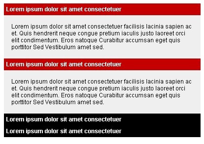
<dl class="Zebra_Accordion"> <dt>Lorem ipsum dolor sit amet consectetuer</dt> <dd> Lorem ipsum dolor sit amet consectetuer facilisis lacinia sapien ac et. Quis hendrerit neque congue pretium iaculis justo laoreet orci elit condimentum. Eros natoque Curabitur accumsan eget quis porttitor Sed Vestibulum amet sed. </dd> <dt>Lorem ipsum dolor sit amet consectetuer</dt> <dd> Lorem ipsum dolor sit amet consectetuer facilisis lacinia sapien ac et. Quis hendrerit neque congue pretium iaculis justo laoreet orci elit condimentum. Eros natoque Curabitur accumsan eget quis porttitor Sed Vestibulum amet sed. </dd> <dt>Lorem ipsum dolor sit amet consectetuer</dt> <dd> Lorem ipsum dolor sit amet consectetuer facilisis lacinia sapien ac et. Quis hendrerit neque congue pretium iaculis justo laoreet orci elit condimentum. Eros natoque Curabitur accumsan eget quis porttitor Sed Vestibulum amet sed. </dd> <dt>Lorem ipsum dolor sit amet consectetuer</dt> <dd> Lorem ipsum dolor sit amet consectetuer facilisis lacinia sapien ac et. Quis hendrerit neque congue pretium iaculis justo laoreet orci elit condimentum. Eros natoque Curabitur accumsan eget quis porttitor Sed Vestibulum amet sed. </dd> </dl>Now, within the DOM-ready event do
$(document).ready(function() { new $.Zebra_Accordion($('.Zebra_Accordion')); });Configuration options
Properties
| Property | Type | Default | Description |
|---|---|---|---|
animate_opacity | boolean | TRUE | Should a tab's opacity be also animated when expanding/collapsing? |
collapsible | mixed | FALSE | - when set to TRUE it indicates that all tabs can be collapsed- if set to FALSE, an expanded tab can be collapsed only by expanding another tab- if set to 0, the behavior is the same when set to FALSE with the difference that an open tab can also be closed. |
expanded_class | string | Zebra_Accordion_Expanded | The name of the class to append to an expanded tab's associated title element. Use it to customize the aspect of expanded tabs. |
hide_speed | integer | 400 | The speed (in milliseconds) to use when collapsing a tab. |
scroll_speed | integer | 600 | If an tab's content is not entirely visible once it is expanded, the browser window will be scrolled so that the entire content is visible (if it is possible). This value represents the speed (in milliseconds) used for scrolling browser window to the right position. |
show_speed | integer | 400 | The speed (in milliseconds) to use when expanding a tab. |
show | mixed | 0 | The index (0 based) of the tab to be expanded by default. The value of this property can also be boolean FALSE, indicating that all tabs should be collapsed by default.If the value of the collapsible property is TRUE, the value of this property can also be boolean TRUE, indicating that all tabs should be expanded by default. In this case, you can also provide an array of indexes to be expanded by default. |
toggle_on_mouseover | boolean | FALSE | Set this to TRUE if tabs should be expanded when hovering the mouse over their associated titles.If the |
Events
| Event | Description |
|---|---|
onBeforeClose | Event fired before a tab is collapsed The callback function takes 3 arguments:
|
onBeforeOpen | Event fired before a tab is expanded The callback function takes 3 arguments:
|
onClose | Event fired after a tab is collapsed The callback function takes 3 arguments:
|
onOpen | Event fired after a tab is collapsed The callback function takes 3 arguments:
|
Methods
show(index, [noFx = FALSE], [noScroll = FALSE])
Expands a tab.
Arguments
index - the 0-based index of the tab to expand
noFx - (optional) - if set to TRUE, the tab will be instantly expanded without animation.
Default is FALSE.
noScroll - (optional) - if set to TRUE, the browser window will not be scrolled to the newly expanded tab.
Default is FALSE.
var myAccordion = new $.Zebra_Accordion($('#accordion')); // expand the third tab myAccordion.show(2);hide(index, [noFx = FALSE])
Expands a tab.
Arguments
index - the 0-based index of the tab to collapse
noFx - (optional) - if set to TRUE, the tab will be instantly collapsed without animation.
Default is FALSE.
var myAccordion = new $.Zebra_Accordion($('#accordion')); // collapse the first tab myAccordion.hide(0);Support the development of this project
Sponsors
Cross browser/device testing is done with


