jQuery accessible simple tooltip window, using ARIA
This jQuery plugin will provide you an accessible and simple non-modal tooltip, using ARIA.
Installation
You can download and install the plugin via:
- npm:
$ npm i jquery-accessible-simple-tooltip-aria - bower:
$ bower install jquery-accessible-simple-tooltip-aria
Demo
The demo is here: https://a11y.nicolas-hoffmann.net/simple-tooltip/
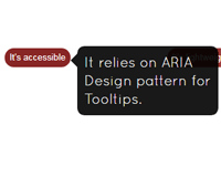
Why it is accessible
- It relies on ARIA Design pattern for Tooltips;
- Thanks to
aria-describedbyandids generated on the fly, you never loose any information; - You can close it using Esc.
How it works
Default
Basically, the scripts wraps each class="js-simple-tooltip" into a span class="<your-prefix-class>-container" and adds the content into a hidden content next to it. Once you focus or hover the element with class="js-simple-tooltip", it is displayed.
You can use it on the tag you want (input, button, a…)
jQuery Plugin
$('div').accessibleSimpleTooltipAria({ simpletooltipText: title });License
No license problem, it uses MIT license, so it’s free, open-source and you can do whatever you want with it, including commercial use (permission notice)
Options and attributes
Use data-simpletooltip-text or data-simpletooltip-content-id attributes on an element to activate the tooltip.
- Simply put
class="js-simpletooltip"on a button to activate the script. - Attribute
data-simpletooltip-prefix-class(non mandatory): the prefix to all style classes of the tooltip (useful to set up different styles). - Attribute
data-simpletooltip-text: the text of your tooltip. - Attribute
data-simpletooltip-content-id: theidof (hidden) content in your page that will be put into your tooltip. - Attribute
data-simpletooltip-wrapper-tag: the tag used for wrapping your tooltip (spanby default). - Attribute
data-simpletooltip-tag: the tag used for your tooltip (spanby default).
How to style it
/* it will work better with this box-sizing, you may adapt it to your needs */ /*html { box-sizing: border-box; } *, *:before, *:after { box-sizing: inherit; }*/ /* Tooltip hidden by default */ .simpletooltip[aria-hidden="true"], .minimalist-simpletooltip[aria-hidden="true"], .minimalist-left-simpletooltip[aria-hidden="true"] { display: none; } /* position relative for containers */ .simpletooltip_container, .minimalist-simpletooltip_container, .minimalist-left-simpletooltip_container { position: relative; display: inline; } /* tooltip styles */ .simpletooltip, .minimalist-simpletooltip, .minimalist-left-simpletooltip { position: absolute; display: inline-block; z-index: 666; width: 10em; border-radius: .5em; background: rgba( 0, 0, 0, .9 ); color: #eee; padding: .5em; text-align: left; line-height: 1.3; } .simpletooltip, .minimalist-simpletooltip { right: auto; left: 100%; margin-left: .5em; } .minimalist-left-simpletooltip { right: 100%; left: auto; margin-right: .5em; } /* used pseudo-element to make arrows */ .simpletooltip::before, .minimalist-simpletooltip::before, .minimalist-left-simpletooltip::before { content: ''; speak: none; position: absolute; z-index: 666; width: 10px; height: 10px; } .simpletooltip::before, .minimalist-simpletooltip::before { top: .5em; left: -10px; margin-left: -10px; border: 10px solid transparent; border-right: 10px solid rgba( 0, 0, 0, .9 ); } .minimalist-left-simpletooltip::before { top: .5em; right: -10px; margin-right: -10px; border: 10px solid transparent; border-left: 10px solid rgba( 0, 0, 0, .9 ) } /* it can be easily adapted in media-queries for tablets/mobile */ /* for this example: mobile */ @media (max-width: 44.375em) { .simpletooltip, .minimalist-simpletooltip, .minimalist-left-simpletooltip { top: 100%; left: 50%; right: 0; margin: 0; margin-top: .7em; margin-left: -5em; } .simpletooltip::before, .minimalist-simpletooltip::before, .minimalist-left-simpletooltip::before { top: -10px; right: auto; left: 50%; margin-left: -5px; margin-top: -10px; border: 10px solid transparent; border-bottom: 10px solid rgba( 0, 0, 0, .9 ); } }examples
<button class="js-simple-tooltip" data-simpletooltip-text="Cool, it works!"> Hover or focus me to show the tooltip </button> <button class="js-simple-tooltip" data-simpletooltip-content-id="tooltip-case_1"> Show me another tooltip </button> <div id="tooltip-case_1" class="hidden">Woot, you can take the content of a hidden block.</div>Enjoy.


