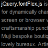
jQuery.fontFlex
Lightweight jQuery extension for dynamically changing font sizes according to container / browser width. Intended for use with responsive or adaptive CSS layouts.
Installation
Include the latest version of jQuery and jQuery.fontFlex.js in the <head> of your HTML document:
<script src="jQuery.min.js"></script> <script src="jQuery.fontFlex.js"></script>How to Use
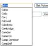
Define a default CSS font base by setting font-size: 1em and line-height: 150% on the body or intended element. Declaring the font-size is optional, but highly recommended in case javascript is disabled. Finally, call the plugin on said element. Live Demo: code.nath.co/fontFlex
Syntax Example
$(function() { // All elements $('body').fontFlex(14, 20, 70); // H1 only $('h1').fontFlex(24, 36, 70); });Custom Parameters
min Minimum font-size in pixels
max Maximum font-size in pixels
mid Mid-range buffer. Values ranging from 60 to 70 produce the best results. Lower values produce a larger initial font-size, while higher values produce the opposite. Adjust accordingly to fit your requirements.
Browser Support
– Google Chrome
– Safari ( Desktop and Mobile )
– Internet Explorer ( 8, 9, 10+ )
– Firefox
Feedback
If you discover any issues or have questions regarding usage, please send a message to [email protected] or find me on GitHub @nathco.


