Timepicker Plugin for jQuery
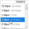
jquery.timepicker is a lightweight timepicker plugin for jQuery inspired by Google Calendar. It supports both mouse and keyboard navigation, and weighs in at 2.7kb minified and gzipped.
Requirements
- jQuery (>= 1.7)
Usage
$('.some-time-inputs').timepicker(options);Include jquery.timepicker.css and jquery.timepicker.min.js in your page.
options is an optional javascript object with parameters explained below.
You can also set options as data attributes on the intput elements, like <input type="text" data-time-format="H:i:s" />. Timepicker still needs to be initialized by calling $('#someElement').timepicker(options);. Data attributes will override any conflicting initialization options.
The defaults for all options are exposed through the $.fn.timepicker.defaults object. Properties changed in this object (same properties configurable through the constructor) will take effect for every instance created after the change.
Options
-
appendTo
Override where the dropdown is appended.
Takes either astringto use as a selector, afunctionthat gets passed the clicked input element as argument or a jqueryobjectto use directly.
default: "body" -
className
A class name to apply to the HTML element that contains the timepicker dropdown.
default: null -
closeOnWindowScroll
Close the timepicker when the window is scrolled. (Replicates<select>behavior.)
default: false -
disableTimeRanges
Disable selection of certain time ranges. Input is an array of time pairs, like[['3:00am', '4:30am'], ['5:00pm', '8:00pm']]. The start of the interval will be disabled but the end won't. default: [] -
disableTextInput
Disable typing in the timepicker input box; force users to select from list. More information here.
default: false -
disableTouchKeyboard
Disable the onscreen keyboard for touch devices. There can be instances where Firefox or Chrome have touch events enabled (such as on Surface tablets but not actually be a touch device. In this casedisableTouchKeyboardwill prevent the timepicker input field from being focused. More information here.
default: false -
durationTime
The time against whichshowDurationwill compute relative times. If this is a function, its result will be used.
default: minTime -
forceRoundTime
Force update the time tostepsettings as soon as it loses focus.
default: false -
lang
Language constants used in the timepicker. Can override the defaults by passing an object with one or more of the following properties: decimal, mins, hr, hrs.
default:{ am: 'am', pm: 'pm', AM: 'AM', PM: 'PM', decimal: '.', mins: 'mins', hr: 'hr', hrs: 'hrs' } -
maxTime
The time that should appear last in the dropdown list. Can be used to limit the range of time options.
default: 24 hours after minTime -
minTime
The time that should appear first in the dropdown list.
default: 12:00am -
noneOption
Adds one or more custom options to the top of the dropdown. Can accept several different value types:
Boolean (true): Adds a "None" option that results in an empty input value
String: Adds an option with a custom label that results in an empty input value
Object: Similar to string, but allows customizing the element's class name and the resulting input value. Can containlabel,value, andclassNameproperties.valuemust be a string type.
Array: An array of strings or objects to add multiple non-time options
default: false -
orientation
By default the timepicker dropdown will be aligned to the bottom right of the input element, or aligned to the top left if there isn't enough room below the input. Force alignment withl(left),r(right),t(top), andb(bottom). Examples:tl,rb. default: 'l' -
roundingFunction
Function used to compute rounded times. The function will receive time in seconds and a settings object as arguments. The function should handle a null value for seconds. default: round to nearest step -
scrollDefault
If no time value is selected, set the dropdown scroll position to show the time provided, e.g. "09:00". A time string, Date object, or integer (seconds past midnight) is acceptible, as well as the string'now'.
default: null -
selectOnBlur
Update the input with the currently highlighted time value when the timepicker loses focus.
default: false -
show2400
Show "24:00" as an option when using 24-hour time format. You must also settimeFormatfor this option to work.
default: false -
showDuration
Shows the relative time for each item in the dropdown.minTimeordurationTimemust be set.
default: false -
showOn
Display a timepicker dropdown when the input fires a particular event. Set to null or an empty array to disable automatic display. Setting should be an array of strings. default: ['focus'] -
showOnFocus
DEPRECATED: Display a timepicker dropdown when the input gains focus.
default: true -
step
The amount of time, in minutes, between each item in the dropdown. Alternately, you can specify a function to generate steps dynamically. The function will receive a count integer (0, 1, 2...) and is expected to return a step integer.
default: 30 -
stopScrollPropagation
When scrolling on the edge of the picker, it prevent parent containers () to scroll. default: false -
timeFormat
How times should be displayed in the list and input element. Uses PHP's date() formatting syntax. Characters can be escaped with a preceeding double slash (e.g.H\\hi). Alternatively, you can specify a function instead of a string, to use completely custom time formatting. In this case, the format function receives a Date object and is expected to return a formatted time as a string. default: 'g:ia' -
typeaheadHighlight
Highlight the nearest corresponding time option as a value is typed into the form input.
default: true -
useSelect
Convert the input to an HTML<SELECT>control. This is ideal for small screen devices, or if you want to prevent the user from entering arbitrary values. This option is not compatible with the following options:appendTo,closeOnWindowScroll,disableTouchKeyboard,forceRoundTime,scrollDefault,selectOnBlur,typeAheadHighlight.
default: false -
wrapHours
If a time greater than 24 hours (27:30, for example) is entered, apply modolo 24 to create a valid time. Setting this tofalsewill cause an input of 27:30 to result in atimeFormatErrorevent.
default: true
Methods
-
getSecondsFromMidnight
Get the time as an integer, expressed as seconds from 12am.$('#getTimeExample').timepicker('getSecondsFromMidnight');
-
getTime
Get the time using a Javascript Date object, relative to a Date object (default: today's date).$('#getTimeExample').timepicker('getTime'); $('#getTimeExample').timepicker('getTime', new Date());
You can get the time as a string using jQuery's built-in
val()function:$('#getTimeExample').val();
-
hide
Close the timepicker dropdown.$('#hideExample').timepicker('hide');
-
isVisible
Check if the timepicker attached to a specific input is visible. Not compatible with theuseSelectoption.$('#hideExample').timepicker('isVisible');
-
option
Change the settings of an existing timepicker. Callingoptionon a visible timepicker will cause the picker to be hidden.$('#optionExample').timepicker({ 'timeFormat': 'g:ia' }); // initialize the timepicker sometime earlier in your code ... $('#optionExample').timepicker('option', 'minTime', '2:00am'); $('#optionExample').timepicker('option', { 'minTime': '4:00am', 'timeFormat': 'H:i' });
-
remove
Unbind an existing timepicker element.$('#removeExample').timepicker('remove');
-
setTime
Set the time using a Javascript Date object.$('#setTimeExample').timepicker('setTime', new Date());
-
show
Display the timepicker dropdown.$('#showExample').timepicker('show');
Events
-
change
The nativeonChangeevent will fire any time the input value is updated, whether by selection from the timepicker list or manual entry into the text input. Your code should bind tochangeafter initializing timepicker, or use event delegation. -
changeTime
Called after a valid time value is entered or selected. SeetimeFormatErrorandtimeRangeErrorfor error events. Fires beforechangeevent. -
hideTimepicker
Called after the timepicker is closed. -
selectTime
Called after a time value is selected from the timepicker list. Fires beforechangeevent. -
showTimepicker
Called after the timepicker is shown. -
timeFormatError
Called if an unparseable time string is manually entered into the timepicker input. Fires beforechangeevent. -
timeRangeError
Called if maxTime and minTime, or disableTimeRanges is set and an invalid time is manually entered into the timepicker input. Fires beforechangeevent.
The selectTime and hideTimepicker events fire slightly differently when using the useSelect option. See https://github.com/jonthornton/jquery-timepicker/issues/427 for more information.
Theming
Sample markup with class names:
<input value="5:00pm" class="ui-timepicker-input" type="text"> ... <div class="ui-timepicker-wrapper ui-timepicker-positioned-top optional-custom-classname" tabindex="-1"> <ul class="ui-timepicker-list"> <li class="ui-timepicker-am">12:00am</li> <li class="ui-timepicker-am">12:30am</li> ... <li class="ui-timepicker-pm">4:30pm</li> <li class="ui-timepicker-pm ui-timepicker-selected">5:00pm</li> <li class="ui-timepicker-pm ui-timepicker-disabled">5:30pm</li> <li class="ui-timepicker-pm">6:00pm <span class="ui-timepicker-duration">(1 hour)</span></li> <li class="ui-timepicker-pm">6:30pm</li> ... <li class="ui-timepicker-pm">11:30pm</li> </ul> </div>The ui-timepicker-positioned-top class will be applied only when the dropdown is positioned above the input.
Packaging
NPM npm install --save timepicker
CDN https://cdn.jsdelivr.net/npm/timepicker/
An AngularJS directive is available at https://github.com/Recras/angular-jquery-timepicker
Help
Submit a GitHub Issues request. Please try provide code that demonstrates the problem; you can use this jsFiddle as a starting point.
Development guidelines
- Install dependencies (jquery + grunt)
npm install - For sanity checks and minification run
grunt, or justgrunt lintto have the code linted
jquery-timepicker follows semantic versioning.
This software is made available under the open source MIT License. © 2014 Jon Thornton and contributors
