Tablesaw
A set of plugins for responsive tables.
- Getting Started
- Stack Mode
- Column Toggle Mode
- Swipe Mode
- Mini-Map
- Mode Switcher
- Sortable
- Kitchen Sink Example
- Check All
- Internationalization i18n
- Limitations
- Run Tests
- Browser Support
- Bundler Compatibility
Roadmap and Enhancement Queue
This repository is now using lodash style issue management for enhancements. This means enhancement issues will be closed instead of leaving them open.
- Look through the enhancement backlog and vote for your favorite features by adding a
👍 to the top comment.
Stack Mode
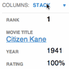
The Stack Table stacks the table headers to a two column layout with headers on the left when the viewport width is less than 40em (640px).
<table class="tablesaw tablesaw-stack" data-tablesaw-mode="stack">If you only want to use the Stack Table and don’t want all the extra features below (save yourself some bytes), Tablesaw provides a Stack-Only version.
| Option | Description |
|---|---|
| Opt out of inline labels | To opt-out of inline label creation (the table header cell text that shows at small breakpoints) on a per-table basis, use <table data-tablesaw-no-labels>; on a per-row basis, use <tr data-tablesaw-no-labels>; on a per-cell basis, use <td data-tablesaw-no-labels> (added in v3.1.0) |
| Hide headers for empty body cells | When the table cell is empty, use <table data-tablesaw-hide-empty> to hide the header when stacked. |
Column Toggle Mode
The Column Toggle Table allows the user to select which columns they want to be visible.
<table data-tablesaw-mode="columntoggle">| Option | Description |
|---|---|
| Add a Mini-Map | The little dots that appear next to the column toggle popup. Use the data-tablesaw-minimap attribute: <table data-tablesaw-mode="columntoggle" data-tablesaw-minimap> |
The user always has the option to select all columns. If the table gets too wide for the viewport, it can overflow and cause a page-level scrollbar. To combat this issue, we recommend wrapping your table in a <div class="tablesaw-overflow"> element to restrict scrolling to the table-only. The toggle demo has one such example.
Advanced Option: Prioritize Columns
Table headers must have a data-tablesaw-priority attribute to be eligible to toggle. data-tablesaw-priority is a numeric value from 1 to 6, which determine default breakpoints at which a column will show. The breakpoint defaults are:
<th data-tablesaw-priority="persist"><!-- Not eligible for toggle, always shows --></th> <th data-tablesaw-priority="0"><!-- Hidden at all breakpoints by default, must be toggled back on manually --></th> <th data-tablesaw-priority="1"><!-- Shows at (min-width: 20em) (320px) --></th> <th data-tablesaw-priority="2"><!-- Shows at (min-width: 30em) (480px) --></th> <th data-tablesaw-priority="3"><!-- Shows at (min-width: 40em) (640px) --></th> <th data-tablesaw-priority="4"><!-- Shows at (min-width: 50em) (800px) --></th> <th data-tablesaw-priority="5"><!-- Shows at (min-width: 60em) (960px) --></th> <th data-tablesaw-priority="6"><!-- Shows at (min-width: 70em) (1120px) --></th>Keep in mind that the priorities are not exclusive—multiple columns can reuse the same priority value.
Swipe Mode
Allows the user to use the swipe gesture (or use the left and right buttons) to navigate the columns.
<table data-tablesaw-mode="swipe">| Options | Description |
|---|---|
| Persist a Column | Columns also respect the data-tablesaw-priority="persist" attribute: <th data-tablesaw-priority="persist"><!-- Always shows --></th> |
| Add a Mini-Map | The little dots that appear next to the column navigation buttons. Use the data-tablesaw-minimap attribute: <table data-tablesaw-mode="swipe" data-tablesaw-minimap> |
| All columns visible class | Tablesaw also exposes a tablesaw-all-cols-visible class that is toggled on when all of the table columns are visible (and off when not). You can use this in CSS to hide the minimap or navigation buttons if needed. |
| Disable swipe touch events | Use the <table data-tablesaw-no-touch> attribute to opt-out of swiping left or right to navigate columns. Users will need to use the provided buttons instead. |
Advanced Option: Configure Swipe Thresholds
Add a TablesawConfig object to your page in a <script> element. It doesn’t matter if it’s declared before or after the Tablesaw JavaScript.
<script> TablesawConfig = { swipeHorizontalThreshold: 15, swipeVerticalThreshold: 20 }; </script>Mini Map
Use data-tablesaw-minimap to add a series of small dots to show which columns are currently visible and which are hidden. Only available on swipe and columntoggle tables. Examples available above.
Mode Switcher
<table data-tablesaw-mode-switch> <!-- With a different default mode --> <table data-tablesaw-mode-switch data-tablesaw-mode="swipe"> <!-- Exclude a mode from the switcher --> <table data-tablesaw-mode-switch data-tablesaw-mode-exclude="columntoggle">Sortable
The “sortable” option allows the user to sort the table data by clicking on the table headers. Since all the columns may not be visible on smaller breakpoints (or not there at all if using the “stack” table mode), relying solely on the column headers to choose the table sort isn’t practical. To address this, there is an optional data-tablesaw-sortable-switch attribute on the table that adds a select menu auto-populated with the names of each column in the table with options for choosing ascending or descending sort direction. Data options on table headers can be used to control which columns are sortable (data-tablesaw-sortable-col) and the default sort order (data-tablesaw-sortable-default-col).
<table data-tablesaw-sortable> <thead> <tr> <!-- Default column --> <th data-tablesaw-sortable-col data-tablesaw-sortable-default-col>Rank</th> <th data-tablesaw-sortable-col>Movie Title</th> <th data-tablesaw-sortable-col data-tablesaw-sortable-numeric>Year</th> <th data-tablesaw-sortable-col data-tablesaw-sortable-numeric><abbr title="Rotten Tomato Rating">Rating</abbr></th> <!-- Unsortable column --> <th>Reviews</th> </tr> </thead> ...Use data-tablesaw-sortable-switch to add a select form element to manually choose the sort order.
<table data-tablesaw-sortable data-tablesaw-sortable-switch>Advanced Option: Custom Sort Functions
Tablesaw provides two methods of sorting built-in: string and numeric. To use numeric sort, use the data-tablesaw-sortable-numeric class as shown in the above sorting markup example. Otherwise, tablesaw uses a case insensitive string sort.
All other types of sorting must use a Custom Sort function on the individual columns (working example). In the contrived example below, we want to sort full dates (e.g. 12/02/2014) just on the year.
// Add a data function to the table header cell $( "th#custom-sort" ).data( "tablesaw-sort", function( ascending ) { // return a function return function( a, b ) { // Ignore rows with data-tablesaw-ignorerow (leave them where they were) if( a.ignored || b.ignored ) { return 0; } // use a.cell and b.cell for cell values var dateA = a.cell.split( "/" ), dateB = b.cell.split( "/" ), yearA = parseInt( dateA[ 2 ], 10 ), yearB = parseInt( dateB[ 2 ], 10 ); if( ascending ) { return yearA >= yearB ? 1 : -1; } else { // descending return yearA < yearB ? 1 : -1; } }; }); Kitchen Table Sink
All of the above options combined into a single table.
Check All
Added in 3.0.1. Add the data-tablesaw-checkall to a checkbox in a thead cell to enable that checkbox to toggle the other checkboxes in the same column.
Internationalization i18n
Added in 3.0.2. Use the TablesawConfig global on your page to override internationalization strings. It doesn’t matter if it’s declared before or after the Tablesaw JavaScript library.
<script> TablesawConfig = { i18n: { modeStack: 'Stack', modeSwipe: 'Swipe', modeToggle: 'Toggle', modeSwitchColumnsAbbreviated: 'Cols', modeSwitchColumns: 'Columns', columnToggleButton: 'Columns', columnToggleError: 'No eligible columns.', sort: 'Sort', swipePreviousColumn: 'Previous column', swipeNextColumn: 'Next column' } }; </script>Getting Started
Available through npm:
npm install tablesaw The Full Tablesaw
Tablesaw (no dependencies)
<link rel="stylesheet" href="tablesaw.css"> <script src="tablesaw.js"></script> <script src="tablesaw-init.js"></script>or Tablesaw (jQuery Plugin)
<link rel="stylesheet" href="tablesaw.css"> <!-- load your own jQuery --> <script src="jquery.js"></script> <script src="tablesaw.jquery.js"></script> <script src="tablesaw-init.js"></script>Don’t forget to add your table markup! For a stack table, this is how it’d look:
<table class="tablesaw tablesaw-stack" data-tablesaw-mode="stack">The demos above include full markup examples for all of the Tablesaw types.
Manual initialization of Tablesaw Components
If you want to initialize your Tablesaw tables manually, don’t include <script src="tablesaw-init.js"> in your markup. Instead, you can use Tablesaw.init(). This will scan the tree for any Tablesaw tables and initialize them for you.
Tables must be visible for proper initialization.
Tablesaw.init(); Tablesaw.init( myElement ); // OR pass an element to only init within a contextDynamically Loading Tablesaw
For user interfaces that are dynamically built, Tablesaw can be loaded on an as-needed basis.
Here's how you might do this with jQuery:
$('head').append('<script src="tablesaw.js"></script>');Following that, tables may be initialized manually as they are created.
Using Stack-Only Tablesaw
As shown above, we provide a Stack-mode-only package of Tablesaw. It’s a barebones version that doesn’t include any of the other features above.
Stack-only Tablesaw (no dependencies)
<link rel="stylesheet" href="tablesaw.css"> <script src="stackonly/tablesaw.stackonly.js"></script> <script src="tablesaw-init.js"></script>or just Stack-only Tablesaw (jQuery Plugin)
<link rel="stylesheet" href="tablesaw.css"> <!-- load your own jQuery --> <script src="jquery.js"></script> <script src="stackonly/tablesaw.stackonly.jquery.js"></script> <script src="tablesaw-init.js"></script>And then:
<table class="tablesaw tablesaw-stack" data-tablesaw-mode="stack">Using Stack-Only Tablesaw SCSS Mixin
To easily customize the breakpoint at which the stack table switches, use the SCSS mixin. First, include the tablesaw.stackonly.scss file instead of tablesaw.stackonly.css in your SASS. Then, use a parent selector on your table.
<div class="my-parent-selector"> <table class="tablesaw" data-tablesaw-mode="stack">Include the mixin like so:
.my-parent-selector { @include tablesaw-stack( 50em ); }The argument to tablesaw-stack is the breakpoint at which the table will switch from columns to stacked.
Default Styles
Starting with Tablesaw 3.0, the “Bare”, or stripped down style version of Tablesaw has been made the default.
Some of the more intrusive default styles have instead moved to opt-in classes you can add to the <table> element:
tablesaw-row-border: Adds a bottom border to each table row.tablesaw-row-zebra: Adds a light background color to every other table row.tablesaw-swipe-shadow: Adds the light shadow to the right of persistant columns to make them stand out a little more.
Limitations
- Simple
colspanandrowspanare supported, in part thanks to a lovely PR from @jgibson.
| Stack | Column Toggle | Swipe | Sortable | |
|---|---|---|---|---|
rowspan | Not yet supported (#247) | Supported | Supported | Not yet supported (#268) |
colspan | Supported | Supported | Supported | Supported |
Tests
Browser Support
All major browsers (evergreens are not listed, but supported). Notably this project cuts the mustard for A-grade support with:
- Internet Explorer 9+
- Android Browser 2.3+
- Blackberry OS 6+
Other legacy browsers and Opera Mini receive unenhanced table markup.
Bundler Compatibility
- Added in
v3.0.6: tested to work in Webpack.
Building the Project Locally
Run npm install to install dependencies and then grunt to build the project files into the dist folder.
Release Names
- 3.1.0: Acacia
- 3.0.6: Wonderboom
- 3.0.3: Cucumbertree
- 3.0.2: Bald Cypress
- 3.0.1: Cypress
- 3.0.0: Rosewood
- 2.0.1: Mountain Hemlock
- 2.0.0: Hemlock
- 1.0.5: Hickory
- 1.0.4: Ironwood
- 1.0.3: Red Mahogany
Previous versions didn’t have names.
