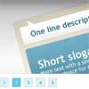
jquery.tabSlideOut.js
jQuery plugin to create tabs that slide out from the window edges to show a feedback form, contact form, notepad etc.
Includes methods to programmatically interact with tabs, and events and handlers fire on open, close and bounce (bounce is used to attract attention to a tab).
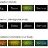
Demo
- Demonstration on JSFiddle
- Features are also demonstrated on the demo page in the demo directory.
Usage
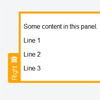
To use this you need an element for the tab panel content ('panel'), and inside it an element for the tab which will stick out from the window edge and be clickable ('handle'). By default the selector for handles is '.handle'. The plugin will take care of positioning them for you.
example HTML:
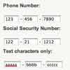
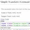
<div id="my-tab"><span class="handle">Click me</span>Hello World</div> example JavaScript (puts the tab on the right, and opens it on hover rather than click):
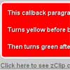
$('#my-tab').tabSlideOut( {'tabLocation':'right','action':'hover'} ); There are many more options which can be put inside the { } - they are described below.
Style the tab panel and handle using CSS (or inline styles if you must). Add the class ui-slideouttab-handle-rounded to handles to give them rounded outer corners. These features are shown on the demo page.
Scrollbars
To achieve a tabSlideOut with vertical scrollbars for long content, you will need to:
- Put the scrolling content in a div inside your tabSlideOut panel, and give your div height: 100%. (If you don't do this, the scrolling will apply to the whole panel, causing the tab handle inside it to disappear).
- Limit the height of your tabSlideOut using height, top, bottom, left or right CSS properties, or the otherOffset option to the plugin.
Methods
You can use some methods to programmatically interact with tabs. Methods except 'isOpen' are chainable.
$('#my-tab').tabSlideOut('isOpen'); // return true or false $('#my-tab').tabSlideOut('open'); // opens it $('#my-tab').tabSlideOut('close'); // closes it $('#my-tab').tabSlideOut('toggle'); // toggles it $('#my-tab').tabSlideOut('bounce'); // bounces the tab You can also send JQuery events to initiate actions:
$('#my-tab').trigger('open'); // opens it $('#my-tab').trigger('close'); // closes it $('#my-tab').trigger('toggle'); // toggles it $('#my-tab').trigger('bounce'); // bounces the tab Events
Three events are defined and can be caught when tabs open and close:
$(document).on('slideouttabopen slideouttabclose slideouttabbounce',function(event){ var $panel = $(event.target); var eventType = event.type; // your code here }); Handlers
onOpen, onClose and onSlide handlers can be set as options, to take some action when the slide out tab opens or closes.
There are also onBeforeOpen, onBeforeClose and onBeforeSlide handlers which can cancel the sliding by returning false.
Options
You can leave out any options, and the following defaults are used:
tabLocation: 'left', // left, right, top or bottom tabHandle: '.handle', // JQuery selector for the tab, can use any JQuery selector action: 'click', // action which will open the panel, e.g. 'hover' hoverTimeout: 5000, // ms to keep tab open after no longer hovered - only if action = 'hover' offset: '200px', // panel dist from top or left (bottom or right if offsetReverse is true) offsetReverse: false, // if true, panel is offset from right or bottom of window instead of left or top otherOffset: null, // if set, panel size is also set to maintain this dist from bottom or right of view port (top or left if offsetReverse) handleOffset: null, // e.g. '10px'. If null, detects panel border to align handle nicely on edge handleOffsetReverse: false, // if true, handle is offset from right or bottom of panel instead of left or top bounceDistance: '50px', // how far bounce event will move everything bounceTimes: 4, // how many bounces when 'bounce' is called bounceSpeed: 300, // time to animate bounces tabImage: null, // optional image to show in the tab tabImageHeight: null, // optional IE8 and lower only, else autodetected size tabImageWidth: null, // optional IE8 and lower only, else autodetected size onLoadSlideOut: false, // slide out after DOM load clickScreenToClose: true, // close tab when somewhere outside the tab is clicked clickScreenToCloseFilters: ['.ui-slideouttab-panel'], // if click target or parents match any of these, click won't close this tab onOpen: function(){}, // handler called after opening onClose: function(){}, // handler called after closing onSlide: function(){}, // handler called after opening or closing onBeforeOpen: function(){return true;}, // handler called before opening, return false to cancel onBeforeClose: function(){return true;}, // handler called before closing, return false to cancel onBeforeSlide: function(){return true;} // handler called before opening or closing, return false to cancel Add the class ui-slideouttab-handle-rounded to a handle to give it rounded outer corners.
Classes
The following may help you locate and interact with your panels, especially if you have more than one of them.
- All slide out panels will be given the class ui-slideouttab-panel and ui-slideouttab-EDGE, where EDGE is one of left, right, top or bottom.
- The tab will be given the class ui-slideouttab-handle.
Licence
History
This was originally written by wpauli and hosted on Google Code.


