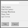

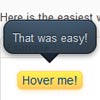
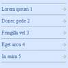
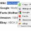
smallipop
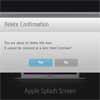
Small Improvements info popup
This jQuery plugin has been created because all the tooltips we tested didn't meet our requirements.
We wanted:
- Pure css for the design. Fallbacks for older browsers and no images.
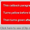
- CSS Animations are supported.
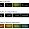
- Custom themes for different use cases.
- The popup trigger can be positioned anywhere. The popup will be displayed at the body root, so the position won't be affected by your layout.
- Automatic orientation whereever the popup appears. The popup will try to stay in the visible area of the screen, even when scrolling or at the edges.
- Only a single popup element in the document. Some plugins create a hidden popup for each trigger.
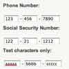
- Custom options for each trigger. You can have 20 different popups with 20 different themes on one page if you like.
- Small. Only ~ 3.5KB minified and ~ 2KB gziped.
We are starting to use this plugin for a lot of things, so watch for new releases at github.
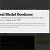
See the documentation page for a live demo and examples.
Do you like this project? Buy me a beer
Installation
Prequisites
- jQuery - 1.5.2 or better
- Modernizr - This library tests the browser for feature support and adds classes to the body tag. We use this for css fallbacks in our themes.
Both are also provided in the lib folder.
If you don't want to use the Modernizr library you can remove the .cssgradients, .borderradius, .rgba and .boxshadow classes in css/jquery-smallipop.css.
Required files
Copy lib/jquery-smallipop.js to your javascript folder. Copy css/jquery-smallipop.css to your css folder.
Usage
If you like demos more than a boring documentation see the index.html file and play with it.
The plugin can be called with jQuery in different ways.
Standard call with default theme and settings:
$('.myElement').smallipop(); Popup content and markup
If myElement is a <a> tag, the elements title attribute is used as popup text:
<a class="myElement" href="#" title="Some hint text"> Sample link </a> You can also provide the text in javascript for all selected elements:
$('.myElement').smallipop({}, 'This is my special hint'); If myElement contains an element with the smallipop-hint class, it's content is copied into the popup when displayed. This can be any markup content you like. Be careful when using floating elements as content, they need a clearfix afterwards or jQuery is unable to get the correct size for the popup.
<div class="myElement"> Sample link <span class="smallipop-hint"> <h6>My bubble title</h6> <p>Some text for the bubble</p> </span> </div> The plugin first checks if the text has been provided in the javascript call. If not then the title attribute will be used, if the trigger is a link. If not the element will be checked if it contains another element with the smallipop-hint class, and it's html content will be used.
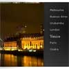
Using a different theme:
$('.myElement').smallipop({ theme: 'white' }); Hide the popup trigger while displaying the popup:
$('.myElement').smallipop({ hideTrigger: true }); Provide the hint in javascript:
$('.myElement').smallipop({}, 'This is my special hint'); Changing the default theme for all subsequently created popups:
$.smallipop.defaults.theme = 'black' You can change the default value for all other options as well in this way.
Options
- popupOffset: horizontal offset for the popup. Default is
31. - popupYOffset: vertical offset for the popup. Default is
0. - popupDistance: vertical distance when the popup appears and disappears. Default is
20. - hideTrigger: hide the trigger when the popup is shown. Default is
false. - theme:
black,orange,blue,whiteanddefaultare included in the css file. Default isdefault. - infoClass: Class in an element which contains markup content for the popup. Default is
smallipop-hint. - popupDelay: How much time in milliseconds you have to hover on an element before the popups shows up. Default is
100. - triggerAnimationSpeed: How fast the trigger fades in and out when
hideTriggeris enabled, default is150. - popupAnimationSpeed: How much time the popup needs to reach it's final animation position and opacity in milliseconds. Default is
200. - invertAnimation: The popup will move up when an element is hovered and further up when fading out. If you set this to true, the popup will move down when fading out. Default is
false. - horizontal: The popup will be positioned left or right of the trigger. Default is
false.
Editing
Read this chapter if you want to modify or extend smallipop.
The plugin is written in coffeescript and the css with sass. The sources are provided in the src and scss folders.
So you can either work with the compiled .js and .css files in your project or use the coffeescript and sass files.
I have provided a combined watcher script watcher.py which starts the two watcher daemons, when your editing the files. This requires the installation of python, coffeescript and sass. You can find very good installation instructions on the project homepages.
The generated css for the themes is quite long. Remove any themes you don't need.
The css used for the popup arrow is a bit tricky. If you want to change it, you need to know how css borders are rendered or you use images instead.
Feedback
Please send me an email or a tweet @sebobo with any feedback you have.
This plugin was my first attempt at a custom tooltip, coffeescript and scss, so any ideas for improvement are welcome.
Contributing
Clone the repository, make changes, run grunt qunit and create a pull request.


