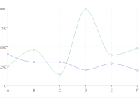
React Linechart
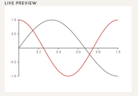
Highly customizable line charts using React! Check the Live Demo and follow along the tutorial.
Why
I always felt frustrated with the libraries out there which aim to implement this simple visualization. Many would lack basic features (such as adding multi lines or changing line colors) or would be extremely low-level (think d3). Built on top of d3, react-linechart provides necessary customization without losing simplicity.
Installation
npm install react-linechart --saveUsage
Add Line Charts with minimum configuration:
import React, { Component } from 'react'; import LineChart from 'react-linechart'; import '../node_modules/react-linechart/dist/styles.css'; export default class App extends Component { render() { const data = [ { color: "steelblue", points: [{x: 1, y: 2}, {x: 3, y: 5}, {x: 7, y: -3}] } ]; return ( <div> <div className="App"> <h1>My First LineChart</h1> <LineChart width={600} height={400} data={data} /> </div> </div> ); } }This component is an attempt to simplify the rendering of a basic Line Chart by exposing many props that are commonly used. I realize it is very hard to encompass every use case, so I put an effort in making this especially pleasant to work with continuous values of numbers and dates.
The only mandatory prop is data - an array of objects describing the lines that will be rendered on screen. The typical line object follows this structure:
{ id, name, color, points: [ { x, y } ] }Where id is an identificator for the line, name is a name for the line, color is a color for the line and points are an array of { x, y } objects representing the data. It would be particularly annoying if we need to parse our data to this format, so I provided a handful of parser functions that hopefully will meet most data formats commonly out there.
Properties Table
| Property | Type | Default | Description |
|---|---|---|---|
| id | String | none | Unique ID for the visualization |
| data | Array<Object> | none | Data that describes lines to be rendered (required) |
| width | `Number | String` | 1024 |
| height | `Number | String` | 720 |
| margins | Object | { top: 50, right: 20, bottom: 50, left: 55 } | Chart margins |
| xLabel | String | "X" | Label for the X axis |
| yLabel | String | "Y" | Label for the Y axis |
| hideXLabel | Bool | false | States if the X label is hidden |
| hideYLabel | Bool | false | States if the Y label is hidden |
| hideXAxis | Bool | false | States if the X axis is hidden |
| hideYAxis | Bool | false | States if the Y axis is hidden |
| xMin | String | none | Lower domain for the X axis |
| xMax | String | none | Higher domain for the X axis |
| yMin | String | none | Lower domain for the Y axis |
| yMax | String | none | Higher domain for the Y axis |
| isDate | Bool | false | Determines if we need to treat the X dimension as date (or numeric) |
| xParser | Function | isDate ? d3.time.format("%Y-%m-%d").parse : ((x) => x) | Parse X values before scaling |
| xDisplay | Function | isDate ? d3.time.format("%b %d") : d3.format("d") | Parse X values before displaying |
| ticks | Number | 10 | Chart width. |
| hideLines | Bool | false | States if lines are drawn |
| interpolate | String | "cardinal" | Line interpolation function |
| hidePoints | Bool | false | States if points are shown |
| pointRadius | Number | 5 | Point radius in pixels |
| onPointClick | Function | (event, point) => console.log(point) | Callback for clicking on points |
| onPointHover | Function | none | Callback for hovering on points |
| onTextClick | Function | (text) => console.log(text) | Callback for clicking on texts |
| onTextHover | Function | none | Callback for hovering on texts |
| showLegends | Bool | false | States if legends are shown |
| legendPosition | String | "top-left" | Position where the legend is rendered |
| tooltipClass | String | "svg-line-chart-tooltip" | Tooltip class |
| pointClass | String | "svg-line-chart-point" | Point class |
| labelClass | String | "svg-line-chart-label" | Label class |
Tooltips
It is easy to hook tooltips onto your chart. Just provide a function on the onPointHover prop that returns a HTML element and this will be displayed inside the tooltip. You can use the class provided by default or write your own and pass to the chart as a tooltipClass prop.
Derived Charts
Turns out a simple Line Chart with the right props can assume a different aspect. For example, setting hideLines={true} gives an awesome Scatter Plot.
import { ScatterPlot } from 'react-linechart' ... render() { return <ScatterPlot id="my-scatter-plot" data={data} /> }It is also possible to build a "Stair Chart", which is how I am calling a time-table-ish kind of chart when we have start and end dates and want to display them as nice stacked bars. Check the Live Demo to get a better insight.
import { StairChart } from 'react-linechart' ... render() { return <StairChart id="my-stair-chart" data={stairedData} /> }You can add optional onTextHover and onTextClick functions to interact with the chart.
Parsers
In order to comply with the format specified, you can use 3 utilitaries functions which parse your raw data. They are the following:
parseFlatArray(data, xDimension, yDimensionArray, colorArray, idArray, nameArray)
| Parameter | Type | Default | Description |
|---|---|---|---|
| data | Array<Objects> | none | Array of objects describing your data in a flat format |
| xDimensions | String | none | Property that will serve as X dimension |
| yDimensionArray | Array<Strings> | none | Array of properties that will serve as Y dimension |
| colorArray | Array<Strings> | [] | Array of hex strings colors that will be assigned in accordance with the yDimensionArray. If no colors are specified, a default array of 20 colors is used |
| idArray | Array<Strings> | [] | Array of ids that will be assigned in accordance with yDimensionArray. If no ids are specified, a combination of X and Y dimensions is used |
| nameArray | Array<Strings> | [] | Array of names that will be assigned in accordance with yDimensionArray |
This is useful when you want to display a multi-line chart in a one-data-per-object basis. Just pick the dimensions you want and the chart will be rendered.
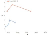
const gsmData = [ { "Year": 1880, "Glob": -19, "NHem": -33, "SHem": -5, }, { "Year": 1881, "Glob": -10, "NHem": -18, "SHem": -2, }, ... ]; // Creates a three-line chart: Glob x Year, Glob x NHem, Glob x SHem const gsmFlat = parseFlatArray(gsmData, "Year", ["Glob", "NHem", "SHem"]);parseGroupingBy(data, xDimension, yDimension, groupByDimension, nameGenerator, colorArray, idArray)
| Parameter | Type | Default | Description |
|---|---|---|---|
| data | Array<Objects> | none | Array of objects describing your data in an indexed format |
| xDimensions | String | none | Property that will serve as X dimension |
| yDimension | String | none | Property that will serve as Y dimension |
| groupByDimension | String | none | Dimension that will be group lines together |
| nameGenerator | Function | nameGenerator : (i) => `Grouped by ${groupByDimension} = ${i}`; | Function that will generate a name based on the groupByDimension value |
| colorArray | Array<Strings> | [] | Array of hex strings colors that will be assigned in accordance with the yDimensionArray. If no colors are specified, a default array of 20 colors is used |
| idArray | Array<Strings> | [] | Array of ids that will be assigned in accordance with yDimensionArray. If no ids are specified, a combination of X and Y dimensions is used |
This is useful when you want to aggregate data based on some dimension, an id, for example.
const data = [ { id: 1, value: 3, date: "2016-01-01" }, { id: 1, value: 4, date: "2016-01-03" }, { id: 2, value: 10, date: "2016-01-02" }, { id: 1, value: 6, date: "2016-01-04" }, { id: 2, value: 13, date: "2016-01-06" }, { id: 1, value: 5, date: "2016-01-08" }, { id: 2, value: 10, date: "2016-03-20" } ]; const grouped = parseGroupingBy(data, "date", "value", "id");parseStairChart(data, start, end, name, color)
| Parameter | Type | Default | Description |
|---|---|---|---|
| data | Array<Objects> | none | Array of objects describing your data |
| start | String | none | Property that will serve as start date |
| end | String | none | Property that will serve as end date |
| name | String | none | Property that will serve as name for the given line |
| color | String | "steelblue" | Color to fill the line |
This is useful when you want to display a kind of time frame.
const stair = [ { startDate: "2016-01-01", endDate: "2016-01-04", name: "Task 1" }, { startDate: "2016-01-02", endDate: "2016-01-03", name: "Task 2" }, { startDate: "2016-01-03", endDate: "2016-01-06", name: "Task 3" }, { startDate: "2016-01-05", endDate: "2016-01-10", name: "Task 4" }, { startDate: "2016-01-08", endDate: "2016-01-13", name: "Task 5" }, { startDate: "2016-01-09", endDate: "2016-01-20", name: "Task 6" } ]; const staired = parseStairChart(stair, "startDate", "endDate", "name");isDate
The component has a shortcut isDate property which will try to parse your x input as a Date. If you use a numeric value and pass isDate={true}, then unexpected behaviour will happen (same for the reverse). This is supposed to be helpful considering standard scenarios but you can always use the xParser prop to parse whatever data you have to a numeric value and the xDisplay prop to display whatever numeric value you have to something more meaningful to your visualization.
Meanwhile, by default the component will first parse the date in a "YYYY-MM-DD" format in a Date object. By default I'm using d3 functions, but you can write your own or use another Date parser such as MomentJS.
Improvements
This is a work in progress, so expect things to break. You can fork your own version or, better still, contribute for the completeness of this library. Help me making a great tool! :)


