gallerize.js 


gallerize.js is a responsive image fader designed to be as versatile as possible. It uses CSS3 transitions and pure Javascript.
Why another image gallery?
It was born out of my frustration attempting to find an image gallery that was versatile enough for me to style to display the way I want for various different use cases. The vast majority of image galleries are designed to be plug and play with a default, fairly immutable styling and layout, making it difficult to get them to look any different without resorting to hacks.
gallerize.js is designed to allow the developer to heavily customize the location and look of the gallery elements (gallery, navigation, buttons, links, supporting text). As such, it requires you to at least have a good knowledge of HTML/CSS to make use of it.
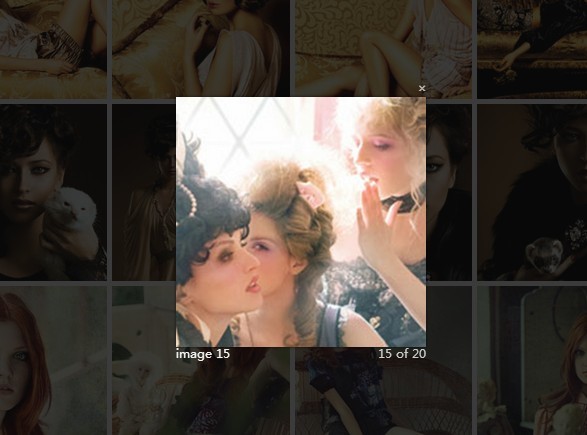
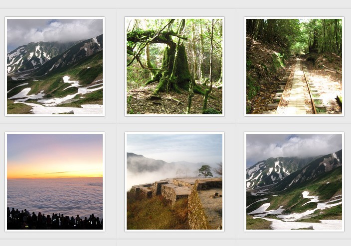
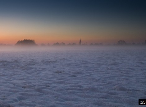
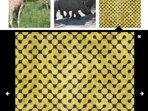
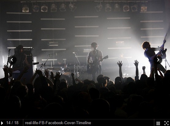
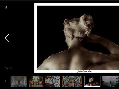
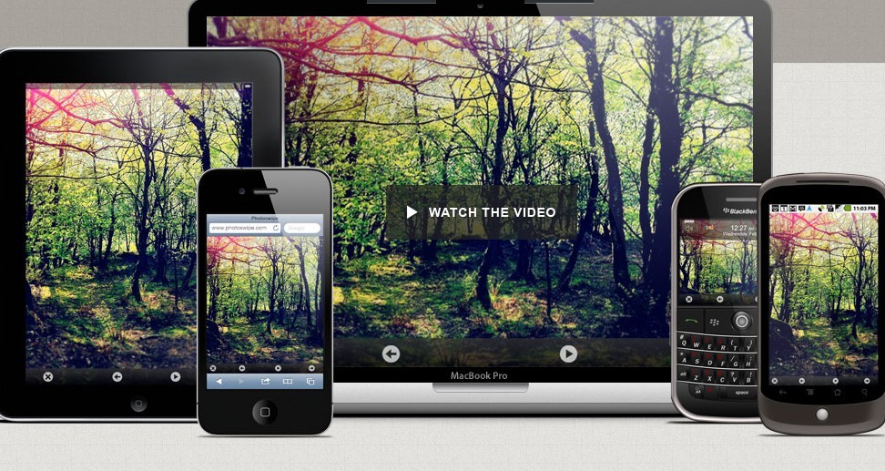
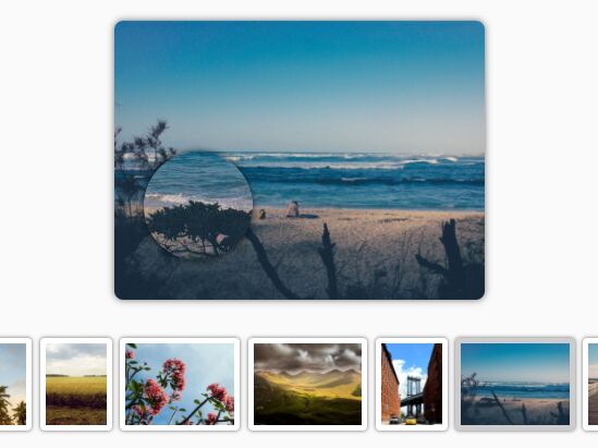
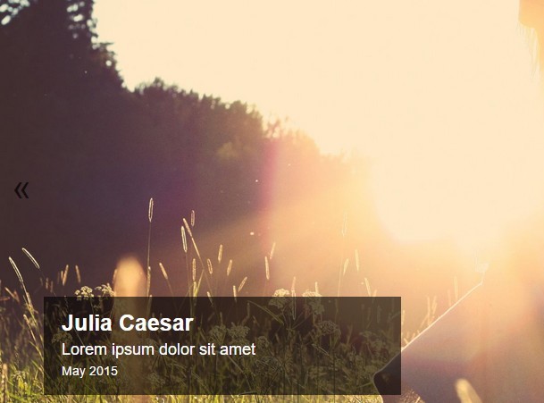
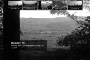
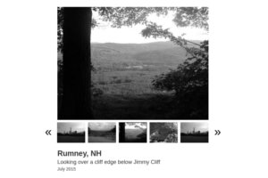
Demos
Click on the following demos to view them (you can view the source code in the demos directory):

You can also view these demos in a CodePen collection.
Usage
Download the latest release from the releases page and install it into the <head> tag of the page you want the gallery to show:
<script type="text/javascript" src="gallerize-<VERSION>.min.js"></script> Then initialize the gallery by creating a new Gallerize object and calling start(). The following should be placed before the </body> tag:
<script type="text/javascript"> var gallery = new Gallerize({ gallery: '#gallery', images: [ 'path/to/image/one.jpg', 'path/to/image/two.jpg', ], }); document.addEventListener('DOMContentLoaded', function() { gallery.start(); }); </script> The above shows the minimal configuration. See the configuration section below for more options.
Styling
gallerize.js is not designed to display a styled gallery by default. It requires you to style the elements used (gallery and thumbnails, indicators, counter, prev, next, text if they are used). At a bare minimum, you will need to add a height and width to the gallery element.
gallerize.js uses a z-index range of 90-100. Any z-index above 100 will show above the gallery and a z-index below 90 will show below it. If you want an element to appear as a part of the gallery (the text element for instance), use a z-index of 99 so it will appear below the loading animation.
Look at the examples in the demos directory for good starting points on styling the gallery.
Configuration
The following configuration options are available. The only required configuration options are gallery and images.
gallery
The element to display the gallery in. You can style this element how you want, but the contents should be empty.
images
An array of images to display. You can use absolute or relative paths.
links
Array of links to attach to images within the gallery. Can use null as an item if no link is desired for a certain image. This should have the same number of items as the images array.
bg_color
The color to fill blank areas when an image does not fully cover the gallery element. Default is #FFF.
auto
Boolean to automatically advance the gallery based on delay. Default is true.
pause
Boolean to pause rotation timer when mouse hovers over gallery. Has no effect if auto is false. Default is true.
delay
Time in milliseconds to wait before advancing the gallery. Default is 5000 (5 seconds).
fade
Time in milliseconds the fade animation will last. Default is 1000 (1 second).
contain
What images should use background-size:contain vs background-size:cover. There are five options:
none: All images will be cropped to fill the gallery element.
all: All images will be contained within the gallery element and no cropping will occur.
portrait: Only portrait images will be contained within the gallery. Landscape images will be cropped to fill the gallery element.
landscape: Only landscape images will be contained within the gallery. Portrait images will be cropped.
parent: gallerize.js will use the size of the gallery to determine the best way to display the image. If the gallery element is in a portrait orientation, portrait images will be cropped to fill the element and landscape images will be contained within the element (and vice versa).
The default is none.
thumbnails
Allows you to display a thumbnail navigation. It cannot co-exist with indicators.
It takes an object:
thumbnails: { element: null, images: null, captions: null, buttons: true, button_color: '#000', active_color: '#000', } thumbnails.element
The element to display the thumbnail navigation in. You can style this element to your liking, but it should be empty. Overrides indicators.
thumbnails.images
An array of thumbnails to use. This should match up with the images array and have the same number of items. If not specified, gallerize.js will use the images array for thumbnails instead.
thumbnails.captions
Array of captions to display below the thumbnail images. This should have the same number of items as the images array.
thumbnails.buttons
Boolean to show or hide the prev/next buttons in the thumbnail navigation element. Default is true.
thumbnails.button_color
The text color to use for the prev/next buttons in the thumbnail navigation. Default is #000.
thumbnails.active_color
The border color around the active thumbnail. Default is #000.
thumbnails.hpadding
The horizontal padding between thumbnails as a percent of the width of the thumbnails. Default is 0.125.
thumbnails.vpadding
The vertical padding of thumbnails as a percent of the height of the thumbnails. Default is 0.125.
indicators
Allows you to display an indicator navigation. It cannot co-exist with thumbnails.
It takes an object:
indicators: { element: null, color: '#999', acolor: '#FFF', round: false, opacity: 1, image: null, aimage: null, } indicators.element
The element to display an indicator navigation in. You can style this element to your liking, but it should be empty.
indicators.color
The color for inactive indicators. Default is #999.
indicators.acolor
The color for the active indicator. Default is #FFF.
indicators.round
Boolean to make indicators round. Default is false (indicators will be square).
indicators.opacity
Opacity of inactive indicators. Should be between 0 and 1. Default is 1.
indicators.image
Image to use for inactive indicators. Overrides indicator_color.
indicators.aimage
Image to use for the active indicator. Overrides indicator_acolor.
indicators.size
The size of the indicators as a percent of the height of the indicator element. A value of 1 will make the indicators the same height as indicators.element. Default is 0.5.
indicators.padding
The padding between indicators as a percent of the size of the indicators. Default is 0.25.
text
Allows you to display text that rotates along with the images in an element of your choosing. It takes an object:
text: { element: null, items: null, } text.element
Element to display rotating text within. You can style this element to your liking, but it should be empty.
text.items
Array of rotating text to display within the text_element. You can use HTML as well as plain text. This should have the same number of items as the images array.
prev
Allows you to display a previous button within an element of your choosing. It takes an object:
prev: { element: null, text: '❮', image: null, } prev.element
Element to display a previous button within.
prev.text
Text to use for previous button. Default is ❮.
prev.image
Path to image to use for previous button. Overrides prev.text.
next
Allows you to display a next button within an element of your choosing. It takes an object:
next: { element: null, text: '❯', image: null, } next.element
Element to display a next button within.
next.text
Text to use for next button. Default is ❯.
next.image
Path to image to use for next button. Overrides next.text.
counter
Allows you to display a counter showing where the user is within the image gallery. It takes an object:
counter: { element: null, separator: ' of ', } counter.element
Element to display a counter in.
counter.separator
The separator to use between the count and total. The counter will appear in format "(current)(separator)(total)". Default is of.
loading
Allows you to display a small loading image before gallery images load. It takes an object:
loading: { image: null, all: true, } loading.image
Image to display when gallery image is loading.
loading.all
Boolean to show loading image for all images or just the first. Default is true.
Full Example
An example configuration using all options:
<div id="gallery"></div> <div id="thumbnails"></div> <div id="indicators"></div> <div id="counter"></div> <div id="prev"></div> <div id="next"></div> <div id="text"></div> <script> var gallery = new Gallerize({ gallery: '#gallery', images: [ 'path/to/image/one.jpg', 'path/to/image/two.jpg' ], links: [ 'http://example.com', null ], bg_color: '#FFF', auto: true, pause: true, delay: 5000, fade: 1000, contain: 'portrait', thumbnails: { element: '#thumbnails', images: [ 'path/to/thumb/one.jpg', 'path/to/thumb/two.jpg' ], captions: [ 'Caption One', 'Caption Two' ], buttons: true, button_color: '#000', active_color: '#000', hpadding: 0.1, vpadding: 0.1, }, indicators: { element: '#indicators', color: '#999', acolor: '#FFF', round: false, opacity: 1, image: 'path/to/indicator/inactive.png', aimage: 'path/to/indicator/active.png', size: 0.75, padding: 0.375, }, text: { element: '#text', items: [ '<b>Text One</b>', 'Text Two' ], }, prev: { element: '#prev', text: '«', image: 'path/to/prev/image.jpg', }, next: { element: '#next', text: '»', image: 'path/to/next/image.jpg', }, counter: { element: '#counter', separator: ' of ', }, loading: { image: 'path/to/loading/image.gif', all: true, }, }); document.addEventListener('DOMContentLoaded', function() { gallery.start(); }); </script> Also see the demos directory for more examples.
Advanced Usage
You can also bind the changeImage method to events:
document.querySelector('#random_element').addEventListener('click', function() { gallery.changeImage(1); }); This will adjust the image rotation by an offset. In this example, it switches to the next image. Use negative numbers to go backwards.
If you want to go to a specific image, use changeToImage:
document.querySelector('#random_element').addEventListener('click', function() { gallery.changeToImage(3); }); This will switch the gallery to the third image in the images array.
Feedback
If you find yourself needing to hack the source code to get this to behave the way you want, please let me know by opening an issue or submitting a pull request to make what you need configurable. My hope for this is to make it as versatile and usable as possible.
Internet Explorer
It makes liberal use of background-size and Javascript methods such as addEventListener which are not supported in IE8 and below. If you are looking for an image gallery that displays in those browsers, this is not for you.
To get this working in IE9, you'll need to copy the polyfill here and load it into your page. Note that IE9 doesn't support CSS3 transitions, so there will be no transition between images in that browser.
IE10 and above are supported out of the box.