##Responsive Elements Responsive elements makes it possible for any element to adapt and respond to the area they occupy. It's a tiny javascript library that you can drop into your projects today.
Feedback, bugs, questions? email me, I'll respond quickly, promise!
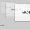
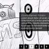
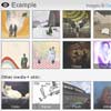
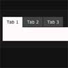
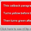
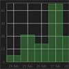
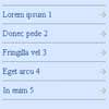
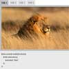
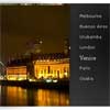
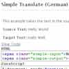
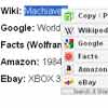
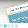
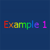
###Example
###Usage
####1. Load jQuery and responsive-elements.js right before your closing </head> tag
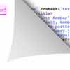
<script src="jquery.min.js"></script> <script src="responsive-elements.js"></script>####2. Explicitly declare which elements you want to be responsive using a data-respond attribute
<div class="quote" data-respond>####3. Use 'less than' and 'greater than' classes as breakpoints to write responsive CSS
.quote.lt500 {background: blue} .quote.gt150.lt300 {background: red}####4. Optionally declare start, end and interval values on your data-respond attribute to control breakpoint generation
<div class="quote" data-respond="start: 100px; end: 900px; interval: 50px;">- Start: What pixel value should breakpoint generation start at
- End: What pixel value should breakpoints end at
- Interval: How many pixels between breakpoints


