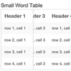
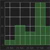
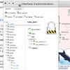
 A CSS/JS solution for tables that allows them to shrink on small devices without sacrificing the value of tables, comparison of columns.Our solution for responsive tables requires two included files (both linked on this page): responsive-tables.css and responsive-tables.js.
The JS will help us create some new elements on small devices, so we don’t have to modify our table markup on the page. The CSS applies the requisite positioning and overflow styles to make the new elements work.
A CSS/JS solution for tables that allows them to shrink on small devices without sacrificing the value of tables, comparison of columns.Our solution for responsive tables requires two included files (both linked on this page): responsive-tables.css and responsive-tables.js.
The JS will help us create some new elements on small devices, so we don’t have to modify our table markup on the page. The CSS applies the requisite positioning and overflow styles to make the new elements work.
You May Also Like


jQuery Plugins
- 3D Slider
- AutoComplete
- Barcode
- Blur Effect
- Calculator
- Captcha
- Checkbox
- Color Picker
- Confirm Dialog
- Context Menu
- Cookies
- Countdown Timer
- Coverflow
- Currency Format
- DateTime Picker
- Dialog
- Editable
- Event Calendar
- File Upload
- Filter
- Fixed Header
- Flipbook
- Form Submit
- Form Validation
- Form Wizard
- Fullscreen
- Geolocation
- Grid
- History
- Html5 Audio Player
- HTML5 canvas
- Html5 Local Storage
- Html5 Video Player
- Image Crop
- Image Hover Effect
- Lazy Load
- Login
- Mask
- Mega Menu
- MultiSelect
- News Ticker
- Notification
- Parallax
- Placeholder
- Portfolio
- Preloader
- Progress Bar
- Range Slider
- Rating
- Rotate Image
- Scrollbar
- Scrolling Effects
- SelectBox
- Shopping Cart
- Side Menu
- Social Share
- Sorting
- Timeline
- Tooltip
- Treeview
- Video Background
- Weather
- Website Tour
- Wysiwyg Editor
- YouTube
AngularJs Plugins
- Accordion
- Animation
- Application
- Autocomplete
- Bootstrap
- Calendar
- Carousel
- Chart_Graph
- Date_Time
- Drag_Drop
- Forms
- Gallery
- Maps
- Menu_Navigation
- Modal_Popup
- Plugins
- Premium
- Slider
- Table
- Tabs
- Text Effects
- Tutorials
- Video_Audio
- Zoom