Responsive Testimonals for jQuery
First steps
Add the following lines to the header:
<link href="responsive-testimonals/css/responsive-testimonals.css" rel="stylesheet"> <script src="responsive-testimonals/js/jquery.min.js"></script> <script src="responsive-testimonals/js/responsive-testimonals.js"></script> <script> $(document).ready(function () { $('.responsive-testimonals').responsiveTestimonals(); }); </script>HTML
The plugin provides two main layout modes:
- Horizontal
- Vertical
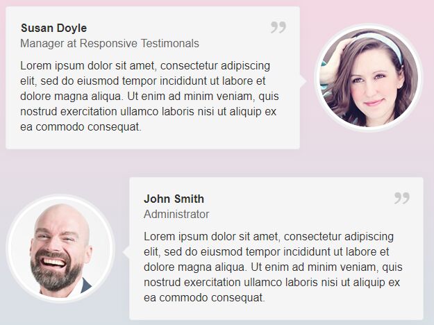
Horizontal
<div class="responsive-testimonals responsive-testimonals--layout-row"> <div class="responsive-testimonals__list"> <div class="responsive-testimonals__item responsive-testimonals__item--layout-order-2 responsive-testimonals__item--align-aside-center"> <div class="responsive-testimonals__aside"> <div class="responsive-testimonals__img-box responsive-testimonals__rounded-full"> <img class="responsive-testimonals__img responsive-testimonals__rounded-full" src="responsive-testimonals/img/1.jpg" width="142" height="142" alt=""> </div> </div> <div class="responsive-testimonals__content responsive-testimonals__rounded-4"> <div class="responsive-testimonals__content-body"> <div class="responsive-testimonals__title">Susan Doyle</div> <div class="responsive-testimonals__subtitle">Manager at Responsive Testimonals</div> <div class="responsive-testimonals__desc"> Lorem ipsum dolor sit amet, consectetur adipiscing elit, sed do eiusmod tempor incididunt ut labore et dolore magna aliqua. Ut enim ad minim veniam, quis nostrud exercitation ullamco laboris nisi ut aliquip ex ea commodo consequat. </div> </div> </div> </div> <div class="responsive-testimonals__item responsive-testimonals__item--layout-order-1 responsive-testimonals__item--align-aside-center"> <div class="responsive-testimonals__aside"> <div class="responsive-testimonals__img-box responsive-testimonals__rounded-full"> <img class="responsive-testimonals__img responsive-testimonals__rounded-full" src="responsive-testimonals/img/2.jpg" width="142" height="142" alt=""> </div> </div> <div class="responsive-testimonals__content responsive-testimonals__rounded-4"> <div class="responsive-testimonals__content-body"> <div class="responsive-testimonals__title">John Smith</div> <div class="responsive-testimonals__subtitle">Administrator</div> <div class="responsive-testimonals__desc"> Lorem ipsum dolor sit amet, consectetur adipiscing elit, sed do eiusmod tempor incididunt ut labore et dolore magna aliqua. Ut enim ad minim veniam, quis nostrud exercitation ullamco laboris nisi ut aliquip ex ea commodo consequat. </div> </div> </div> </div> </div> </div>Vertical
<div class="responsive-testimonals responsive-testimonals--layout-col"> <div class="responsive-testimonals__list"> <div class="responsive-testimonals__item responsive-testimonals__item--layout-order-1 responsive-testimonals__item--align-aside-center"> <div class="responsive-testimonals__aside"> <div class="responsive-testimonals__img-box responsive-testimonals__rounded-full"> <img class="responsive-testimonals__img responsive-testimonals__rounded-full" src="responsive-testimonals/img/3.jpg" width="142" height="142" alt=""> </div> </div> <div class="responsive-testimonals__content responsive-testimonals__rounded-4"> <div class="responsive-testimonals__content-body"> <div class="responsive-testimonals__title">Johnny Doe</div> <div class="responsive-testimonals__subtitle">Administrative Assistant</div> <div class="responsive-testimonals__desc"> Lorem ipsum dolor sit amet, consectetur adipiscing elit, sed do eiusmod tempor incididunt ut labore et dolore magna aliqua. Ut enim ad minim veniam, quis nostrud exercitation ullamco laboris nisi ut aliquip ex ea commodo consequat. </div> </div> </div> </div> <div class="responsive-testimonals__item responsive-testimonals__item--layout-order-1 responsive-testimonals__item--align-aside-center"> <div class="responsive-testimonals__aside"> <div class="responsive-testimonals__img-box responsive-testimonals__rounded-full"> <img class="responsive-testimonals__img responsive-testimonals__rounded-full" src="responsive-testimonals/img/4.jpg" width="142" height="142" alt=""> </div> </div> <div class="responsive-testimonals__content responsive-testimonals__rounded-4"> <div class="responsive-testimonals__content-body"> <div class="responsive-testimonals__title">Sarah Joyce</div> <div class="responsive-testimonals__subtitle">Operative Director</div> <div class="responsive-testimonals__desc"> Lorem ipsum dolor sit amet, consectetur adipiscing elit, sed do eiusmod tempor incididunt ut labore et dolore magna aliqua. Ut enim ad minim veniam, quis nostrud exercitation ullamco laboris nisi ut aliquip ex ea commodo consequat. </div> </div> </div> </div> </div> </div>CSS
Default classes
responsive-testimonals- This is the main container element of the plugin. It can be call the Responsive Testimonals with it.responsive-testimonals__list- This element contains the items (3). It must be inside the plugin main container (1). One container element (1) could contains one list (2).responsive-testimonals__item- This element contains the container element (4) of image and the container element (7) of the text box. Unlimited quantities can be added to the list (2).responsive-testimonals__aside- This element contains the image container (5) and the image itself (6).responsive-testimonals__img-box- This is the container element of the image.responsive-testimonals__img- This is the image.responsive-testimonals__content- This element contains the text sections (9, 10, 11) and the container (8) of these elements.responsive-testimonals__content-body- This is the container element of text sections (9, 10, 11).responsive-testimonals__title- This is the title (9) of description (11).responsive-testimonals__subtitle- This is the subtitle (10) of description (11).responsive-testimonals__desc- This is the description.
Layout and appearance classes
With the following classes you can easily set the layout to horizontal or vertical. It means the positition of the text box related to the photo. Horizontal layout will place the text box next to the photo container, while vertical layout will organize them below each other.
responsive-testimonals--layout-rowresponsive-testimonals--layout-col
Note! For aesthetic reasons, the horizontal layout (480px) automatically modified to vertical layout to keep the best user experience on mobiles and tablets.
These classes must be extended with them: responsive-testimonals (required)
With the following classes you can align the items horizontally: left (1), center (2) or right (3)
responsive-testimonals__list--align-h-leftresponsive-testimonals__list--align-h-centerresponsive-testimonals__list--align-h-right
These classes can be extended with them: responsive-testimonals__list (optional)
Default: 2.
Align the items vertically with the following classes: top (1), center (2), bottom (3), all elements of the same height in the current row (4).
responsive-testimonals__list--align-v-topresponsive-testimonals__list--align-v-centerresponsive-testimonals__list--align-v-bottomresponsive-testimonals__list--align-v-stretch
These classes can be extended with them: responsive-testimonals__list (optional)
Default: 4.
The following classes are set the order of the text box and the image container related to each other.
responsive-testimonals__item--layout-order-1responsive-testimonals__item--layout-order-2
In the first case (1):
- in horizontal layout, the image will be placed to the left and the text box will be placed to the right side
- in vertical layout, the image will be placed at the top and the text box will be placed below
In the second case (2):
- in horizontal layout, the image will be placed to the right and the text box will be placed to the left side
- in vertical layout, the image will be placed at the bottom and the text box will be placed top
These classes must be extended with them: responsive-testimonals__item (required)
The following classes set the position of the photo container element vertically or horizontally: at the begin, center, at the end
responsive-testimonals__item--align-aside-startresponsive-testimonals__item--align-aside-centerresponsive-testimonals__item--align-aside-end
These classes can be extended with them: responsive-testimonals__item (optional)
The following classes set the alignment of the content in the text box horizontally: left (1), center (2), right (3), justify (4).
responsive-testimonals__content--align-h-leftresponsive-testimonals__content--align-h-centerresponsive-testimonals__content--align-h-rightresponsive-testimonals__content--align-h-justify
These classes can be extended with them: responsive-testimonals__content (optional)
Default: 1.
The following classes set the alignment of the content in the text box vertically: top (1), center (2), bottom (3)
responsive-testimonals__content--align-v-topresponsive-testimonals__content--align-v-centerresponsive-testimonals__content--align-v-bottom
These classes can be extended with them: responsive-testimonals__content (optional)
Default: 2.
The following classes set the curves of the elements to be rounded. Scale is defined as 1 to 20. The number at the end of class names indicates the number of pixel rounds for that item. There is an exception at the end of which there is no number, but a "full" suffix, which makes a full round (forms of circles of equal width and length).
responsive-testimonals__rounded-1responsive-testimonals__rounded-2responsive-testimonals__rounded-3responsive-testimonals__rounded-4responsive-testimonals__rounded-5responsive-testimonals__rounded-6responsive-testimonals__rounded-7responsive-testimonals__rounded-8responsive-testimonals__rounded-9responsive-testimonals__rounded-10responsive-testimonals__rounded-11responsive-testimonals__rounded-12responsive-testimonals__rounded-13responsive-testimonals__rounded-14responsive-testimonals__rounded-15responsive-testimonals__rounded-16responsive-testimonals__rounded-17responsive-testimonals__rounded-18responsive-testimonals__rounded-19responsive-testimonals__rounded-20responsive-testimonals__rounded-full
These classes can be extended with them: responsive-testimonals__img-box, responsive-testimonals__img-box, responsive-testimonals__content (optional)
License – MIT
Copyright 2017 © jablonczay.com
Permission is hereby granted, free of charge, to any person obtaining a copy of this software and associated documentation files (the "Software"), to deal in the Software without restriction, including without limitation the rights to use, copy, modify, merge, publish, distribute, sublicense, and/or sell copies of the Software, and to permit persons to whom the Software is furnished to do so, subject to the following conditions:
The above copyright notice and this permission notice shall be included in all copies or substantial portions of the Software.
THE SOFTWARE IS PROVIDED "AS IS", WITHOUT WARRANTY OF ANY KIND, EXPRESS OR IMPLIED, INCLUDING BUT NOT LIMITED TO THE WARRANTIES OF MERCHANTABILITY, FITNESS FOR A PARTICULAR PURPOSE AND NONINFRINGEMENT. IN NO EVENT SHALL THE AUTHORS OR COPYRIGHT HOLDERS BE LIABLE FOR ANY CLAIM, DAMAGES OR OTHER LIABILITY, WHETHER IN AN ACTION OF CONTRACT, TORT OR OTHERWISE, ARISING FROM, OUT OF OR IN CONNECTION WITH THE SOFTWARE OR THE USE OR OTHER DEALINGS IN THE SOFTWARE.