
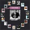
MasonJS
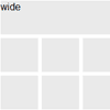
Mason.js is a jQuery plugin that allows you to create a perfect grid of elements.
This is not Masonry, or Isotope or Gridalicious. Mason fills in those ugly gaps, and creates a perfectly filled space.
Bower Version
2.0.2
USE
Basic CSS
#container { width: 100%; position: relative; } .box { float: left; background-color: #00ffff; position: relative; } Call Mason.js (BASIC)
$("#container").mason({ itemSelector: ".box", ratio: 1.5, sizes: [ [1,1], [1,2], [2,2] ] }); OPTIONS
Mason.js has a number of options:
$("#container").mason({ itemSelector: ".box", ratio: 1.5, sizes: [ [1,1], [1,2], [2,2] ], columns: [ [0,480,1], [480,780,2], [780,1080,3], [1080,1320,4], [1320,1680,5] ], promoted: [ ['class_name', 2, 1], ['class_name', 2, 3], ['class_name', 3, 3], ], filler: { itemSelector: '.fillerBox', filler_class: 'custom_filler', keepDataAndEvents: false }, layout: 'fluid', gutter: 10 },function(){ console.log("COMPLETE!") }); - itemSelector
- the element that makes up your grid
- ratio
- The ratio is a number that is used to create the blocks based on column count and width. This is based on the number of columns requested and the browser width.
- sizes
- Sizes are an array of sizes you wish to use in your grid. These are composed of block numbers. (ex: [1,1] means 1 block high, 1 block wide)
- columns
- columns are an array of break points for your columns. Think of this like media queries. start small and grow. They should be formatted as [min,max,cols]
- filler
- itemSelector: This describes the elements to be used to fill in blank spaces. This will default to the original itemSelector if there is nothing
- filler_class: This is a class given to filler elements within the grid, used for cleaning up if a grid set to fluid
- keepDataAndEvents: Mason creates a clone of the filler elements before adding them to the grid, this boolean (true/false) property tells Mason to retain the events and data that have already been bound to the filler elements
- promoted
- Accepts an array of ['CLASS_NAME', WIDTH, HEIGHT] these items will be forced to those dimensions.
- Layout
- There are two layouts, fluid and fixed. Mason will default to fixed. Fluid means it will be responsive.
- Callback
- You can add a callback function to Mason to notify you when the grid has completed building.
- Gutter
- Allows you to add spacing between the elements, think of this as a margin.
DESTROY
At times you may want to destroy the mason object and no longer track window changes, to do this assign the mason grid to a variable such as var mason and when you're ready to destroy just call mason.destroy() this will remove all listeners on the mason object and you can remove the grid or elements without any ill effects.
Install
npm installbower install
Running
cd into project and run gulp
Building
cd into project
- run
gulp dist - run
gulp finish_dist
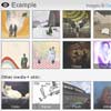
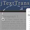
Examples
Look at the public folder for examples.


