Development of this plugin has ended. Please upgrade to the new Formstone.

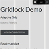
Gridlock
A responsive CSS grid system. Part of the Formstone Library.
Bower Support
bower install Gridlock
Usage
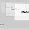
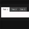
Gridlock works by nesting 'cells' within 'rows'. Cells are defined by classes that set widths at specific breakpoints. The breakpoints correspond to general screen sizes. By default, Gridlock renders 3 columns on mobile, 6 columns on tablet and 12 columns on desktop.
Markup
A basic example may look something like:
<body class="gridlock"> <div class="row"> <div class="mobile-3 tablet-2 desktop-4">...</div> <div class="mobile-3 tablet-2 desktop-4">...</div> <div class="mobile-3 tablet-2 desktop-4">...</div> </div> </body> This will create 3 cells that each span 3 columns on mobile, 2 columns on tablet and 4 columns on desktop screen sizes. You can think of the nested structure like a directory tree:
gridlock ├─ row | ├─ cell | |─ cell | | └─ row | | ├─ cell | | └─ cell | └─ cell └─ row ├─ cell └─ cell Box-Sizing
Gridlock relies on border-box and includes a global box-sizing reset:
*, *:before, *:after { -webkit-box-sizing: border-box; -moz-box-sizing: border-box; box-sizing: border-box; } This will effect every element on the page and can have unexpected results. In the long run it will help speed development by modifying how padding and borders effect the box model calculations. Learn more about border-box.
Row Widths and Columns Counts
| Name | Screen Size | Row Width | Column Count |
|---|---|---|---|
| min | smaller than 500px | 300px | 3 |
| mobile | smaller than 740px | 480px | 3 |
| tablet | 740px to 960px | 720px | 6 |
| desktop | 960px to 1220px | 960px | 12 |
| max | larger than 1220px | 1200px | 12 |
Defining Cells
| Class | Description |
|---|---|
min-X | only min size |
mobile-X | both mobile and min sizes |
tablet-X | tablet size |
desktop-X | both desktop and max sizes |
max-X | only max size |
all-X | all sizes |
Cells are defined by the target screen size and column count, relative to it's screen size. For example mobile-2 will produce a cell spanning 2 of the 3 available columns in the mobile screen size range. Cell classes should be stacked to specify column spans across all screen sizes:
<div class="mobile-3 tablet-6 desktop-12">...</div> The max-X and min-X classes give you an added level of control when targeting the desktop and mobile sizes. For example, you may need a cell to span 2 columns at the larger mobile size, but span the full width at the smallest mobile size:
<div class="min-3 mobile-2 ...">...</div> The all-X classes give you the ability to create a cell that spans the specified width on all screen sizes (only works with fraction cells):
<div class="all-full ...">...</div> Fraction Cells
You can also use the fraction classes in place of specific column counts:
| Class | Description |
|---|---|
X-full | entire row width |
X-half | 1/2 row width |
X-third | 1/3 row width |
X-fourth | 1/4 row width |
Hidden Cells
You can hide cells at specific screen sizes:
| Class | Description |
|---|---|
min-hide | Hide on min |
mobile-hide | Hide on mobile |
tablet-hide | Hide on tablet |
desktop-hide | Hide on desktop |
max-hide | Hide on max |
Helper Classes
Helper classes can be added to cells to modify their default behavior in predictable ways.
| Class | Description |
|---|---|
padded | Swaps cell margin for padding. Allows backgrounds to touch while maintaining gutters. |
contained | Removes cell margin. Allows backgrounds to touch by removing gutters. |
centered | Centers cell. Useful for centering odd column count cells. |
LESS Configuration
Gridlock can also be configured and rebuilt using Grunt. Simply edit the variables found in /src/fs.gridlock-config.less before running the default grunt process.
| Variable | Default | Description |
|---|---|---|
| Structure | ||
@class-container | gridlock | Container class |
@class-row | row | Row class |
@class-contained | contained | Contained helper class |
@class-padded | padded | Padded helper class |
@class-centered | centered | Centered helper class |
| Cells | ||
@class-all | all | All cell class |
@class-min | min | Min cell class |
@class-mobile | mobile | Mobile cell class |
@class-tablet | tablet | Tablet cell class |
@class-desktop | desktop | Desktop cell class |
@class-max | max | Max cell class |
| Columns | ||
@columns-mobile | 3 | Mobile column count |
@columns-tablet | 6 | Tablet column count |
@columns-desktop | 12 | Desktop column count |
| Widths | ||
@width-min | 300px | Min row width |
@width-mobile | 480px | Mobile row width |
@width-tablet | 720px | Tablet row width |
@width-desktop | 960px | Desktop row width |
@width-max | 1200px | Max row width |
| Breakpoints | ||
@width-break-min | 320px | Min break width |
@width-break-mobile | 500px | Mobile break width |
@width-break-tablet | 740px | Tablet break width |
@width-break-desktop | 980px | Desktop break width |
@width-break-max | 1220px | Max break width |
| Gutters | ||
@gutter | 1.0416666666666667%; | Gutter width |


