About
Focus is a minimal popup, modal, overlay, notification, drawer, accordion and dialogue window plugin built by Elkfox.
Features
- Under 4 KB
- Easy to use data API
- No dependencies
Getting Started
Grab focus.js or focus.min.js from the repository.
Include the script in your html file.
<script src="<path_to_javascript_files>/focus.min.js"></script>Or if you’re using Shopify include the following in your theme.liquid
{{ 'focus.min.js' | asset_url | script_tag }}Optionally include the styles located in the css directory of the repository.
Include add a Focus element with this basic structure.
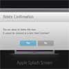
<button data-trigger="popup" data-target="#examplePopup">Click Me</button> <div class="popup overlay" id="examplePopup"> <div class="popup-inner"> <div class="popup-content left"> <h2>Hello world!</h2> <a class="popup-close" data-close aria-label="Close popup">Close popup</a> </div> </div> </div>Now whenever someone clicks the “Click Me” button it will open the #examplePopup Focus element which contains a button to close the modal. Pretty easy!
Note that the data-close doesn’t have a data-target attribute. When this is the case data close will close the Focus element that it is contained within.
Here we also use .popup-inner to close the Focus element when a user clicks outside of the popup.
The user can also use the escape key to close Focus elements.
Here we are using the simple data api to get started which consists of the following:
data-trigger="popup"data-target="#examplePopup"data-close
JavaScript
In some cases you may wish to fire your Focus element from within your JavaScript.
Say for example when a user scrolled a specific part of the page.
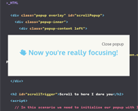
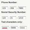
<div class="popup overlay" id="scrollPopup"> <div class="popup-inner"> <div class="popup-content left"> <h2>👏 Now you're really getting focused!</h2> <a class="popup-close" data-close>Close popup</a> </div> </div> </div> <h2 id="scrollTrigger">Scroll to here I dare you</h2> <script> // In this scenario we need to initialise our Focus element with JS var scrollPopup = new Focus('#scrollPopup'); // Now scrollPopup has access to .hide .show and .toggle methods // The following js is use to detect how far we have scrolled. $(document).on('scroll load resize', function(){ var docTop = ($(document).scrollTop() + $(window).height()); var scrollTrigger = $('#scrollTrigger').offset().top; if( docTop > scrollTrigger && docTop < (scrollTrigger+100) ) { // Now we have scrolled far enough lets open the popup 🎉 scrollPopup.show(); } }) </script>Scroll to here I dare you 👻
Examples
Accordion open by default
<div data-trigger="accordion" data-target="#accordionExample" class="open"> <span> Focus accordion example <span class="more">+</span> <span class="less">-</span> </span> </div> <div id="accordionExample" class="visible accordion-content"> <div class="accordion-inner"> Here is an example for focus being used as an accordion </div> </div> <script> var accordionExample = new Focus('#accordionExample', { triggerClass: 'open', slide: true, visible: true }); </script>Accordion closed by default
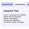
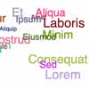
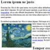
<div data-trigger="accordion" data-target="#accordionExampleClosed"> <span> Focus accordion example <span class="more">+</span> <span class="less">-</span> </span> </div> <div id="accordionExampleClosed" class="accordion-content" style="display:none;"> <div class="accordion-inner"> <p> This accordion is close to start with </p> <p> Lorem ipsum dolor sit amet, consectetur adipiscing elit, sed do eiusmod tempor incididunt ut labore et dolore magna aliqua. Ut enim ad minim veniam, quis nostrud exercitation ullamco laboris nisi ut aliquip ex ea commodo consequat. Duis aute irure dolor in reprehenderit in voluptate velit esse cillum dolore eu fugiat nulla pariatur. Excepteur sint occaecat cupidatat non proident, sunt in culpa qui officia deserunt mollit anim id est laborum. </p> </div> </div> <script> var accordionExampleClosed = new Focus('#accordionExampleClosed', { triggerClass: 'open', slide: true }); </script>Options
You may wish to configure your Focus element with some settings that are different to the defaults used above. You can control these on a per Focus element basis using the Focus constructor.
var scrollPopup = new Focus('#scrollPopup', { visibleClass: 'active', innerSelector: '.outer-popup', autoFocusSelector: '[name="search"]' });| Option | Default | Type | Description |
|---|---|---|---|
| bodyClass | active-popup | string | Class name applied to the body when the Focus element is opened. |
| targetClass | null | string | Set the target class that gets added to the Focus element trigger. |
| visibleClass | visible | string | Set the visible class that gets added to show the Focus element. |
| innerSelector | .popup-inner | string | Set the selector for the area outside of the Focus element, when clicked the Focus element will close. |
| autoFocusSelector | [data-auto-focus] | string | Set the selector of an input field that you would like to be focused when the Focus element opens. |
| slide | null | boolean | Uses jQuery slideDown and slideUp functions for hiding and showing the focus element, useful for creating accordions. |
| slideDuration | fast | number/string | Set the speed of the jQuery slideDown and slideUp functions. |
| detach | null | boolean | Move the element to the end of the body on initialisation. |
| visible | false | boolean | Set to true if the focus element is visible by default. |
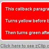
| showCallback | null | function | Callback function for when a popup is successfully shown. |
| hideCallback | null | function | Callback function for when a popup is successfully hidden. |
| error | null | function | Callback function for when a popup could not be hidden or shown. |
Styles
CSS
We provide some basic popup styling CSS and SCSS files located in the css/ folder that have been pulled from our in-house framework Concrete. Variables located at the top of the file are the easiest ways to modify the configuration of the popup.
Table Of Classes
| Class | Description |
|---|---|
| .popup | The parent class of the popup. Should be added to the starting element of every popup to apply styling. |
| .overlay | When added to the starting element, this will open the popup with a semi-transparent background overlay. |
| .popup-outside | The outside area of the popup, used for closing the Focus element when clicked. |
| .popup-inner | The vertically and horizontally centered popup element. |
| .popup-content | The contents of the popup, this will scroll vertically if the content height exceeds the window height. |


