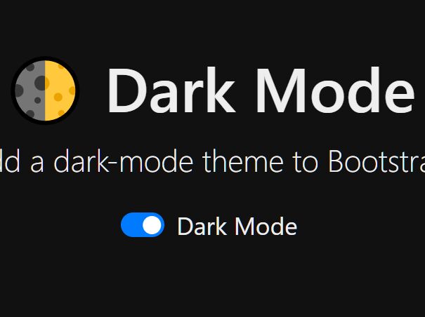
🌓 Dark Mode Switch
Add a dark-mode theme toggle with a Bootstrap Custom Switch.
- Uses local storage to save preference
- Only 230 Bytes minified and gzipped!
Quick start
Several quick start options are available:
- Download the latest release
- Clone the repo
git clone https://github.com/coliff/dark-mode-switch.git - Install with npm
npm install dark-mode-switch - Install with yarn
yarn add dark-mode-switch
Usage
- Add your custom switch for the Dark Mode toggle followed by the
dark-mode-switch.min.jsscript:
<div class="custom-control custom-switch"> <input type="checkbox" class="custom-control-input" id="darkSwitch" /> <label class="custom-control-label" for="darkSwitch">Dark Mode</label> </div> <script src="dark-mode-switch.min.js"></script>Note: the JS must be loaded after the switch, but should be as early as possible to prevent CSS repainting.
- Edit the
dark-mode.cssto suit your site - the one included here is a very basic example.
How it works
Turning dark mode on will add data-theme="dark" to the body tag. You can use CSS to target the elements on the page like so:
[data-theme="dark"] { background-color: #111 !important; color: #eee; }Demo
Browser Support
Works well with all the browsers supported by Bootstrap
Credits
Created thanks to the excellent dark-theme and local storage tutorials over at codyhouse.co.


