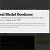
Circle Bars
Circle Bars is a Jquery plugin which is used to add circular countdown timers or progress bars in your project easily.


- implemented with css; no canvas, png or jpg sprites messing around.
- highly customisable with various designed skins.
- less than 2KB when minified.
- optimised and production ready code in dist/ folder.
- SASS support also.
- CDN provided at unpkg
- Cross browser functionality
What to include
Include jQuery first and then follow up.
- By CDN
<link rel="stylesheet" type="text/css" href="https://unpkg.com/[email protected]/dist/circle.css"> <script src="https://unpkg.com/[email protected]/dist/circle.js"></script> <!-- Optionally add this to use a skin : --> <link rel="stylesheet" type="text/css" href="https://unpkg.com/[email protected]/dist/skins/whitecircle.css">- By downloading the package
- first install with
npm install circlebars - then include these files in your html.
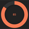
<link rel="stylesheet" type="text/css" href="node-modules/circlebars/dist/circle.css"> <script src="node-modules/circlebars/dist/circle.js"></script> <!-- Optionally add this to use a skin : --> <link rel="stylesheet" type="text/css" href="node-modules/circlebars/dist/skins/whitecircle.css">Example
<div id="circle-1"> <div class="loader-bg"> <div class="text">00:00:00</div> </div> </div> <script> new Circlebar({ element : "#circle-1" }); </script>or
<div class="circle-2"> <div class="loader-bg"> <div class="text">00:00:00</div> </div> </div> <script> $(".circle-2").Circlebar({ </script>or
<div class="circlebar"> <div class="loader-bg"> <div class="text">00:00:00</div> </div> </div>Options
Options are provided as attributes 'data-circle-option':
<div id="circle-1" data-circle-dialWidth=10 data-circle-skin="white"></div>or in the "Circlebar()" call :
$("#circle-1").Circlebar({ maxValue : 20, fontSize : "14px", triggerPercentage : true });- Note : The inline data attributes will overwrite the properties specified in the Circlebar() call .
The following options are supported :
- Note : value and maxValue options are common for both (timer and progressbar) but vary slightly in essence to both.
Behaviors :
- startValue : starting time for timer or initial value of progressbar | default = 0 | integer
- maxValue : the max time for timer to display or the value till which circlebar progresses | default = 60 | integer
- counter : the time in which timer increase by 1s | default = 1000 | integer (1000 == 1sec)
- triggerPercentage : should the circles styling alters according to progress level | default = false | boolean
- type : type of circlebar can be timer, progress or manual | default = "timer"
UI :
- dialWidth : the thickness of the circular ring | default = 5 | integer
- fontSize : the font size of the text in center of circle | default = "20px" | string with unit also ( units can be px, em, rm, % etc.)
- fontColor : the font color of the text in center of circle | default = "rgb(135, 206, 235)" | string (unit can be HEX, rgb, rgba, hsla, hsv, etc.)
- skin : the name of the custom skin to include | default = " " | string
- size : the size of the whole circle bar | default = "150px" | string with unit also ( units can be px, % etc.)
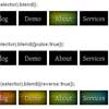
Avaliable skins
All Skins are located in the dist/skins folder. Here are the ones currently avaliable:
To use a skin, first include it as a css file.
<link rel="stylesheet" type="text/css" href="path/to/skins/bluecircle.css">Then, you can set the custom skin name with the skin option when creating your circebar instance.
$("#circle-1").Circlebar({ skin: "blue" });Or, as a data attribute when using a DOM element.
<div id="circle-1" data-circle-skin="blue"></div>To make your own skin, use one of the included ones and edit the css to your specification.
Example
<div id="circle-1" data-circle-dialWidth=10 data-circle-skin="white"> <div class="loader-bg"> <div class="text">00:00:00</div> </div> </div> $("#circle-1").Circlebar({ maxValue : 20, fontSize : "14px", triggerPercentage : true, type: "progress" });and
<div class="circlebar" data-circle-startValue=0 data-circle-dialWidth=20 data-circle-size="250px"> <div class="loader-bg"> <div class="text">00:00:00</div> </div> </div>Note that you can put any content inside
<div class="text"></div>like text, icons, images, etc.
Demo also available at Codepen
Supported browser
Tested on Chrome, Safari, Firefox.


