ng2-slider-component
Status:

Angular 2 slider component
Demo: http://bogdan1975.github.io/slider/
Dependencies
- Angular 2
- SlideAble Directive Module
npm install ng2-slideable-directive - Styled Directive Module
npm install ng2-styled-directive
Install
You can get it on npm.
npm install ng2-slider-component###IMPORTANT!
*.js files compiled for WebPack
If you use SystemJS, you have to use *.system.js files, they are compiled for SystemJS.
Fragment of SystemJS config:
packages: { .... 'node_modules/ng2-slider-component': { main: 'ng2-slider.component.system.js', defaultExtension: 'system.js' }, .... }Usage
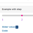
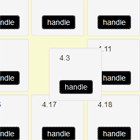
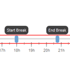
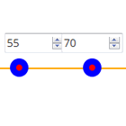
<ng2-slider min="6" max="23" startValue="9" endValue="21" stepValue="2" [normalHandlerStyle]="{ 'background-color': 'green'}" [slidingHandlerStyle]="{ 'border-radius': '9px', 'background-color': 'red' }"> </ng2-slider>Component
min, max
This attributes set range of possible values
value
This attribute set initial value and set simple mode. startValue and endValue will be ignored.
startValue
This attribute set initial floor value. Ignored in value was set case.
endValue
This attribute set initial ceil value and set range mode. Ignored in value was set case. In case of this attribute is not set, mode will be set to simple
stepValue
Attribute set step value
Default value: "1"
normalHandlerStyle, slidingHandlerStyle
This attributes set styles of slider handles in normal and sliding modes
Example:
<ng2-slider min="3" max="33" value="7" stepValue="1" [normalHandlerStyle]="{ 'background-color': 'blue'}" [slidingHandlerStyle]="{ 'border-radius': '9px', 'background-color': 'orange' }" > </ng2-slider>Events
onRangeChanged
Event onRangeChanged fired when range was changed