🙌 adapttext.js v1.0.1
adapttext.js is a dependency free and simple javascript solution capable to fit your text inside the parent element.
It calculates the maximum font-size possibile in order to keep the text's width and height inside the parent.
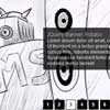
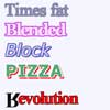
It's very useful in responsive situation and where we don't know in advance the text's length (text pulled from a CMS?). It is also very handy when we need to display text along an image and we want to avoid overlaps.

Installation
adapttext.js supports AMD, CommonJS and Browser global (it uses UMD)
You can install it using bower: bower install adapttext.js --save-dev
You can install it using npm: npm install adapttext.js --save-dev
or just including the script in your page:
<script src="adapttext.js" type="text/javascript"></script> Usage
new AdaptText(element, options);
Example:
<div id="mybox"> <span>This is an example test...</span> </div> <style> #mybox { width: 50%; height: 30%; } </style> <script> var el = document.getElementById('mybox'); var adapt = new AdaptText(el); </script> Using jQuery
If you're using jQuery in your project you can use
$('.mybox').adaptText(options); If you need the adapttext.js instance later:
var instance = $('.mybox').data('adaptText'); instance.destroy(); Options
adapttext.js also accept some optional options:
new AdaptText(el, { minFontSize: 10, //define in px the minimum font size possible maxFontSize: 200, //define in px the maximum font size possible tollerance: 10, //define a number of px of allowed exceed callback: function(newpx) { //this callback is called everytime a new font size is set //the first argument is the new font-size px value } }); CSS stuff to consider
- Your parent element need to have both width and height.
- The child will be automatically set as
display: inline-blockandmargin: 0
Methods
.destroy()
Removes the event listener attached to the window resize.
.elaborate()
Force the recalculation of the correct font-size.
Why?
Most solutions (flowtype.js, fitText.js...) uses jquery as dependency and just fit the text based on parent's width, without the height constraint.
TODO
- Debounce on resize event
- Meke tests on various browsers
Other
adapttext.js is released under the MIT License and it's made by Luigi De Rosa.
The photo used in the demo is courtesy of https://unsplash.com/danielacuevas
Issue & Pull Requests are more than welcome!!


