react-native-modal-dropdown
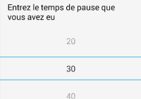
A react-native dropdown/picker/selector component for both Android & iOS.
Features
- Pure JS.
- Compatible with both iOS and Android.
- Auto position. (Won't be covered or clipped by the edge of screen.)
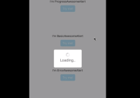
- Zero configuration. (Options are needed of course or a loading indicator will show.)
- Highly customizable.
- Controllable with API by code. (Show/Hide/Select)
- Change everything into a dropdown list trigger.
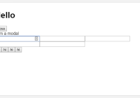
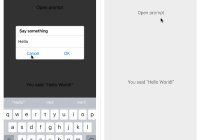
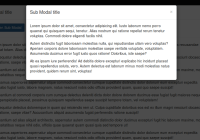
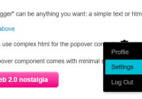
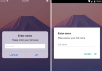
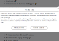
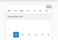
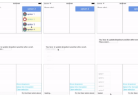
Demo
You can find them in the example.
Update History
v0.6.2
- Fix #139
renderButtonTextrenders [object Object] if there is a call tosetStateinonSelectorrenderButtonTextfunctions
v0.6.1
v0.6.0
- Introduce
renderButtonTextproperty to extract button text from object array data.
Installation
npm i react-native-modal-dropdown -saveUsage
Basic
Import this module:
import ModalDropdown from 'react-native-modal-dropdown';Use as a component:
<ModalDropdown options={['option 1', 'option 2']}/>Use as a wrapper / container:
<ModalDropdown options={['option 1', 'option 2']}> ... </ModalDropdown>Customization
Give the style props as your choice:
style: Change the style of the button (basic mode) / container (wrapper mode).textStyle: Change the style of text of the button. Invalid in wrapper mode.dropdownStyle: Change the style of dropdown container.
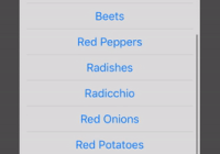
You can also render your option row and row separator by implement renderRow and renderSeparator function.
API
Props
| Prop | Type | Optional | Default | Description |
|---|---|---|---|---|
disabled | bool | Yes | false | disable / enable the component. |
defaultIndex | number | Yes | -1 | Init selected index. -1: None is selected. This only change the highlight of the dropdown row, you have to give a defaultValue to change the init text. |
defaultValue | string | Yes | Please select... | Init text of the button. Invalid in wrapper mode. |
options | array | Yes | Options. The dropdown will show a loading indicator if options is null/undefined. | |
animated | bool | Yes | true | Disable / enable fade animation. |
showsVerticalScrollIndicator | bool | Yes | true | Show / hide vertical scroll indicator. |
style | object | Yes | Style of the button. | |
textStyle | object | Yes | Style of the button text. Invalid in wrapper mode. | |
dropdownStyle | object | Yes | Style of the dropdown list. | |
dropdownTextStyle | object | Yes | Style of the dropdown option text. | |
dropdownTextHighlightStyle | object | Yes | Style of the dropdown selected option text. | |
adjustFrame | func | Yes | This is a callback after the frame of the dropdown have been calculated and before showing. You will receive a style object as argument with some of the props like width height top left and right. Change them to appropriate values that accord with your requirement and make the new style as the return value of this function. | |
renderRow | func | Yes | Customize render option rows: function(option,index,isSelected) Will render a default row if null/undefined. | |
renderSeparator | func | Yes | Customize render dropdown list separators. Will render a default thin gray line if null/undefined. | |
renderButtonText | func | Yes | Use this to extract and return text from option object. This text will show on button after option selected. Invalid in wrapper mode. | |
onDropdownWillShow | func | Yes | Trigger when dropdown will show by touching the button. Return false can cancel the event. | |
onDropdownWillHide | func | Yes | Trigger when dropdown will hide by touching the button. Return false can cancel the event. | |
onSelect | func | Yes | Trigger when option row touched with selected index and value. Return false can cancel the event. | |
accessible | bool | Yes | true | Set accessibility of dropdown modal and dropdown rows |
keyboardShouldPersistTaps | enum('always', 'never', 'handled') | Yes | 'never' | See react-native ScrollView props |
Methods
| Method | Description |
|---|---|
show() | Show the dropdown. Won't trigger onDropdownWillShow. |
hide() | Hide the dropdown. Won't trigger onDropdownWillHide. |
select(idx) | Select the specified option of the idx. Select -1 will reset it to display defaultValue. Won't trigger onSelect. |
Next version
Any suggestion is welcome.