React Native Simple Dialogs


Cross-platform simple dialogs for React Native based on the Modal component. ⚛
Features
Expo Snack
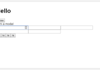
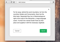
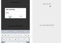
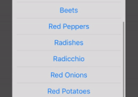
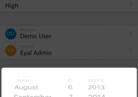
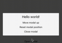
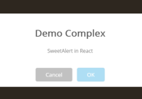
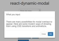
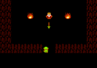
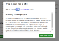
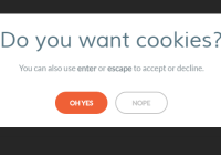
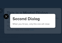
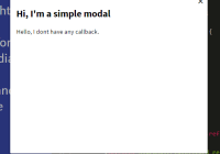
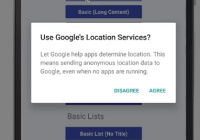
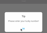
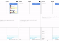
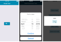
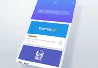
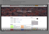
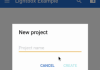
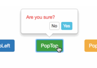
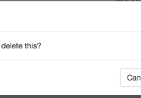
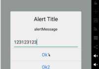
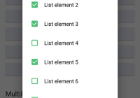
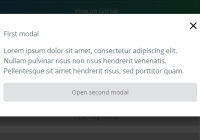
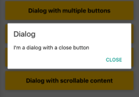
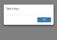
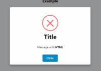
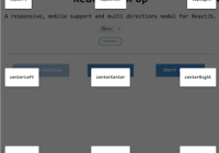
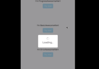
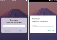
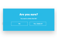
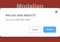
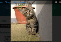
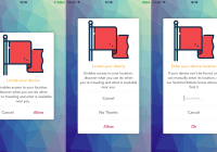
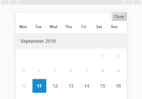
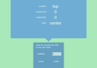
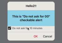
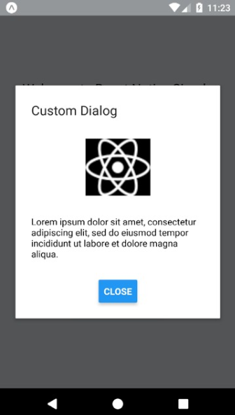
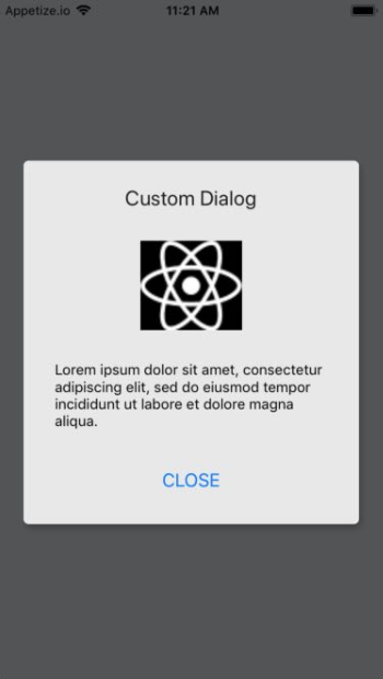
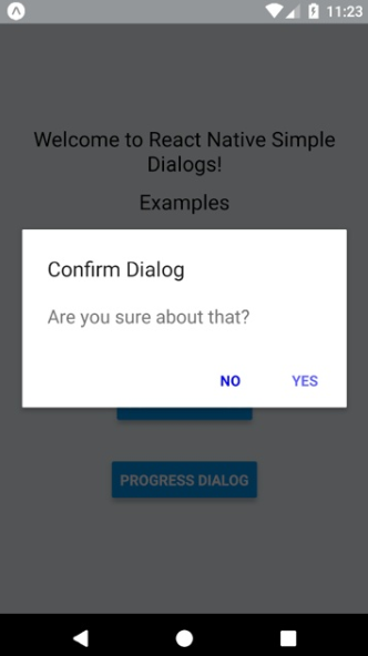
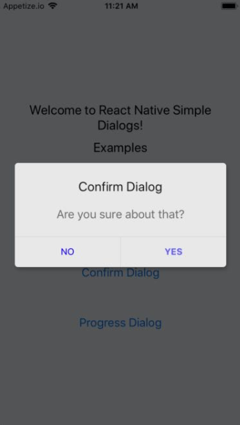
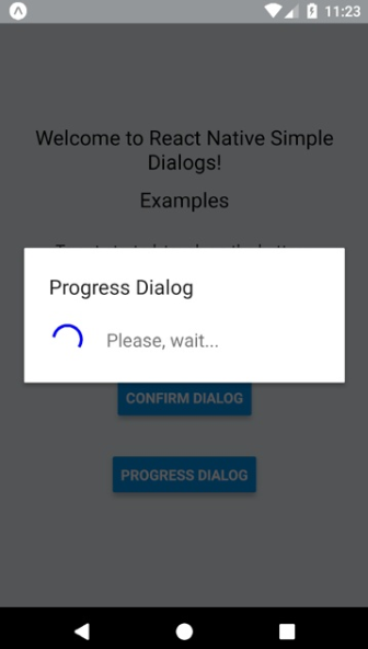
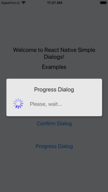
Screenshots
| Android | iOS |
|---|---|
 |  |
 |  |
 |  |
Requirements
- React Native >= 0.44.0
NOTES
- for RN 0.58.0 or later use react-native-simple-dialogs@latest
- for RN 0.56.0 ... 0.57.8 use [email protected]
- for RN 0.44.0 ... 0.55.4, use [email protected]
Install
yarn add react-native-simple-dialogsOr
npm i -S react-native-simple-dialogsUse
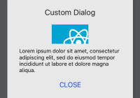
Custom Dialog
import { Dialog } from 'react-native-simple-dialogs'; <Dialog visible={this.state.dialogVisible} title="Custom Dialog" onTouchOutside={() => this.setState({dialogVisible: false})} > <View> // your content here </View> </Dialog>Available props
| Name | Type | Default | Description |
|---|---|---|---|
| visible | Boolean | false | Show the modal? |
| onRequestClose | Function | null | Callback that's called when users taps the hardware back button on Android |
| animationType | Enum('none', 'slide', 'fade') | 'none' | Controls how the modal animates |
| onShow | Function | null | Callback that's called once the modal has been shown |
| onOrientationChange | Function | null | Callback that's called when the orientation change while the modal is being displayed on iOS |
| supportedOrientations | Array of Enum('portrait', 'portrait-upside-down', 'landscape', 'landscape-left', 'landscape-right') | 'portrait' | Allowed orientation while modals is being shown. More info at react-native docs |
| onTouchOutside | Function | null | Callback that's called when users tap outside the shown modal |
| title | String | null | Modal's title |
| titleStyle | React StyleSheet | null | Custom text style object for modal's title |
| dialogStyle | React StyleSheet | null | Custom view style for dialog box |
| contentStyle | React StyleSheet | null | Custom view style for dialog content wrapper |
| buttonsStyle | React StyleSheet | null | Custom view style for dialog button wrapper |
| overlayStyle | React StyleSheet | null | Custom view style for dialog overlay |
| buttons | React Component | null | Modal button component |
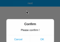
Confirm Dialog
import { ConfirmDialog } from 'react-native-simple-dialogs'; // with message <ConfirmDialog title="Confirm Dialog" message="Are you sure about that?" visible={this.state.dialogVisible} onTouchOutside={() => this.setState({dialogVisible: false})} positiveButton={{ title: "YES", onPress: () => alert("Yes touched!") }} negativeButton={{ title: "NO", onPress: () => alert("No touched!") }} /> // with custom content <ConfirmDialog title="Confirm Dialog" visible={this.state.dialogVisible} onTouchOutside={() => this.setState({dialogVisible: false})} positiveButton={{ title: "OK", onPress: () => alert("Ok touched!") }} > <View> // your content here </View> </ConfirmDialog>Available props
| Name | Type | Default | Description |
|---|---|---|---|
| ...{Dialog.props} | Dialog Props | null | Same props as Dialog Component |
| message | String | null | Message shown in the confirm dialog |
| messageStyle | React StyleSheet | null | Custom text style for message |
| negativeButton | Button Props | null | Button element object to describe the negative button. See below for detailed shape of button |
| positiveButton | Button Props | REQUIRED | Button element object to describe the positive button. See below for detailed shape of button |
Button props
| Name | Type | Default |
|---|---|---|
| title | String | REQUIRED |
| onPress | Function | REQUIRED |
| disabled | Boolean | null |
| titleStyle | React StyleSheet | null |
| style | React StyleSheet | null |
Progress Dialog
import { ProgressDialog } from 'react-native-simple-dialogs'; <ProgressDialog visible={this.state.progressVisible} title="Progress Dialog" message="Please, wait..." />Available props
| Name | Type | Default | Description |
|---|---|---|---|
| ...{Dialog.props} | Dialog Props | null | Same props as Dialog Component |
| message | String | REQUIRED | Message shown in the progress dialog |
| messageStyle | React StyleSheet | null | Custom text style for message |
| activityIndicatorColor | color | 'gray' | The foreground color of the spinner |
| activityIndicatorSize | enum('small', 'large'), number | 'small' | Size of the indicator. Number only supported on Android |
| activityIndicatorStyle | React StyleSheet | null | Custom style for the activity indicator |
More info on the sample project.
Contribute
New features, bug fixes and improvements are welcome! For questions and suggestions use the issues.


Licence
The MIT License (MIT) Copyright (c) 2017 Douglas Nassif Roma Junior See the full licence file.