bootstrap-fullscreen-select
A custom fullscreen select / multiselect for Bootstrap using BUTTONS or User defined elements, designed for mobile devices.
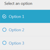
Often UI developers may need to trigger the select via a custom element, That is fullfilled using the data-triggerOn attribute. and access the custom element from the mobileSelect's callback functions. mobileSelect makes it easy for mobile users to get the most of their screen.
inspired by, phonegap, cordova & bootstrap-select
Installation
Download the latest release here
A full documentation page is included within the release.
copy the css and js files from /dist/ to your project, and link them to your HTML page.
and finally via Javascript run $('select').mobileSelect().
Demo and Documentation
See a Bootstrap 3 example here.
Authors
Basic Usage
Create your <select> with the .mobileSelect class.
<select class="mobileSelect"> <option value="pizza">Pizza</option> <option value="burger">Burger</option> <option value="tacos">Tacos</option> <option value="garlic-bread">Garlic Bread</option> </select>Then you need to initialize the plugin within the $(document).ready() block.
$('.mobileSelect').mobileSelect();Or
// To style all <select>s $('select').mobileSelect();Checkout the documentation for further information.
Copyright and license
Copyright (C) 2013-2014 bootstrap-fullscreen-select
Licensed under the MIT license.


