Vue ZyDialog


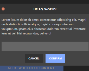
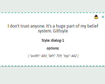
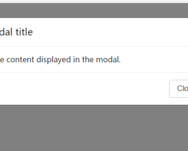
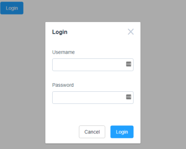
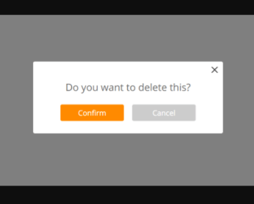
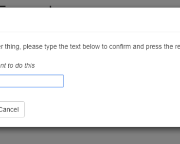
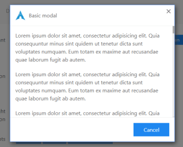
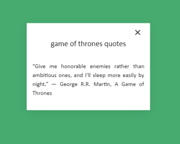
A dialog component that provides customizable alert, confirm and prompt for your Vue.js apps.
Features
- Promise based, friendly programming interface
- Global and per call config
- Sequential calls are queued automatically, while it's possible to override the priority manually
- Zero styling dependency, theming (WIP) based on CSS
- Mobile & desktop ready
Requirement
- Vue.js 2.x
Browser Compatibility
- Evergreen browsers
- IE >= 10
Installation
With Yarn
yarn add vue-zydialog Or with NPM
npm install vue-zydialog --save Basic Example
Import ZyDialog in your main.js file
import ZyDialog from 'vue-zydialog' Vue.use(ZyDialog)Use it in your vue component
... methods: { sayHello () { this.$alert('Hello world') .then(() => { this.$alert('World confirmed') }) } } ...If you prefer the async/await flavour, you can do this
... methods: { async sayHello () { await this.$alert('Hello world') this.$alert('World confirmed') } } ... ... methods: { async toConfirm () { if (await this.$confirm('Are you sure?')){ // continue to process } else { // abort processing } } } ...Documentation
Options
You can pass an object of options when initializing ZyDialog or when calling alert, confirm and prompt. For example:
// Global options import ZyDialog from 'vue-zydialog' Vue.use(ZyDialog, { duration: 3000 // This will make all dialogs auto close after 3 seconds }) // Per call options // When calling with a string as the parameter, the string automatically goes to "title" field, or you can explicitly set the "title" and other options like this ... methods: { async sayHello () { await this.$alert({ title: 'Hello world', duration: 3000 }) } } ...Available options are as follows:
| Field | Type | Default | Notes |
|---|---|---|---|
| id | String | 'vue-zydialog-default' | DOM id |
| className | String | '' | additional DOM class name |
| maskColor | String | 'rgba(40, 40, 40, 0.6)' | color of the mask area |
| override | Boolean | false | current dialog overrides the queue and will be shown instantly, this will also clear the queue |
| parent | String | 'body' | parent DOM node, needs a querySelector compatible string |
| transition | String | 'zy-dialog-transition' | transition class name, refer to Vue.js Transitions Docs for defining your own transition |
| duration | Number | 0 | milliseconds before auto close, set to 0 or any falsy value to disable auto close |
| wide | Boolean | false | shows as a wide dialog |
| title | String | '' | dialog title |
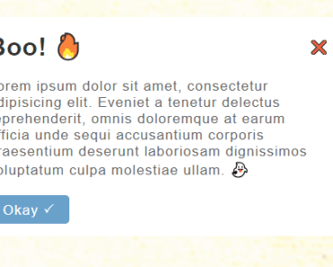
| message | String | '' | dialog message |
| forceStay | Boolean | true | set to true to prevent closing / canceling the dialog when mask area is clicked |
| lbHide | Bolean | false | hide left button |
| rbHide | Boolean | false | hide right button |
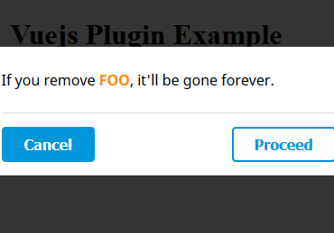
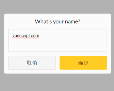
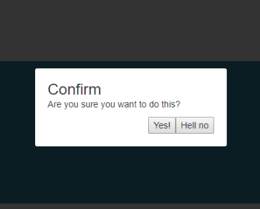
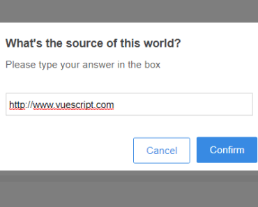
| lbLabel | String | '取消' | left button label text |
| rbLabel | String | '确认' | right button label text |
| actionAlt | Function/null | null | callback function when left button and mask area is clicked |
| action | Function/null | null | callback function when right button is clicked |
Theme
Docs WIP for theming the visual part
License
MIT © mogita