

vue-dialog-drag
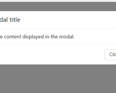
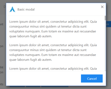
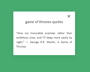
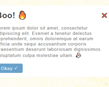
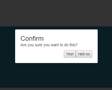
Simple draggable dialog
Features:
- Drag & Drop
- Touch support (only for drag, not for drop)
- Drop area component
- 'Pin mode', to lock drag.
Installation
npm install vue-dialog-drag --save Usage
Import and register component
import DialogDrag from 'vue-dialog-drag' export default{ ... components:{ DialogDrag } }include css
<style src='vue-dialog-drag/dist/vue-dialog-drag.css'></style> Or import source component from: 'vue-dialog-drag/src/vue-dialog-drag.vue' And install devDependencies. (stylus and pug) see package.json)
Examples
Single file component
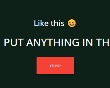
<template> <div id="app"> <dialog-drag id="dialog-1"> <p> Test dialog</p> </dialog-drag> <drop-area @drop='drop'> <p>Drop Here</p> </drop-area> </div> </template> <script> import DialogDrag from 'vue-dialog-drag' import DropArea from 'vue-dialog-drag/dist/drop-area' export default { name: 'app', components: { DialogDrag, DropArea }, methods: { drop (id) { console.log('drop id:', id) } } } </script> <style src="vue-dialog-drag/dist/vue-dialog-drag.css"></style> <style src="vue-dialog-drag/dist/drop-area.css"></style> <!-- optional dialog styles, see example --> <style src="vue-dialog-drag/dist/dialog-styles.css"></style> html
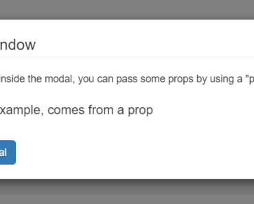
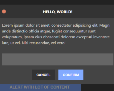
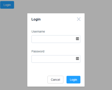
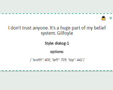
Dialog Component
Slots
- title: dialog title. If you don't need formatted title, use 'title' prop.
- button-pin: content for pin button
- button-pinned: content for pin button when dialog is pinned
- button-close: content for close button
Props
- id: Unique id for dialog
- title: Dialog title
- eventCb: Function(props Object)
- options: Object
- left: Number
- top: Number
- zIndex: Number
- x: alias of left
- y: alias of top
- z: alias of zIndex
- width: Number (0 or null to auto)
- height: Number (0 or null to auto)
- buttonPin: Boolean
- buttonClose:Boolean
- dragCursor: css cursor to show when drag is enabled
- centered: "viewport" | "parent" , center dialog to viewport or parent element
- pinned: Boolean, disable/enable drag
- dropEnabled: Boolean, handle drag with mouse events, instead of drag events
Events
All event emits an object: { id, left, top, x, y, z, width, height, pinned } You can format it, whith 'eventCb' prop.
- load: fired on mounted
- focus: fired on click and touch
- pin: fired on pin / unpin dialog
- drag-start: fired on dragstart
- move: fired when move dialog
- drag-end: fired on dragend
- close: fired when close dialogs
Css
The main container has class .dialog-drag, and .dialog-drag .fixed when dialog is pinned
You can import extra dialog styles from dist/dialog-styles.css.
view: example styles
Drop area component
Slots
Over: content rendered when the dialog is dragged over drop area.
Events
drop: fired when drop the dialog, emits dialog id.