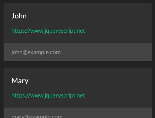
Bootstrap Table To Cards
Transforms Bootstrap 4 tables to cards if screen width is under a threshold to improve mobile readability.
Setup
Simply download tableToCards.js and reference it in your HTML file(s): <script src="tableToCards.js"></script>.
Requirements
Requires jQuery. If you haven't already, reference jQuery in your HTML file(s): <script src="https://cdnjs.cloudflare.com/ajax/libs/jquery/3.3.1/jquery.min.js"></script>.
Usage
The effect will automatically be applied to all HTML <table>s that have the Bootstrap 4 .table class. If you do not want a specific table to be transformed, add the attribute data-card-ignore. Your tables will now transform in cards if you lower the browser width.
Card (sub-)titles
If you want the cards to have a title, simplay add the attribute data-card-title to a <th> in your table. The same applies for subtitles (multiple subtitles are supported) with the attribute data-card-subtitle.
Action links
In case a column consists of action links, add the attribute data-card-action-links to the corresponding <th>.
Card footer
To add a footer to your cards, you may add the attribute data-card-footer to your <th>. You can also specify a data-card-footer-pattern, where {0} will be replaced with the current cell value, and {1} will display the field name.
Merge columns
If you want multiple table columns to be displayed as one field in the cards, you can do so by adding a name with the data-card-merge-name attribute. All columns with the same name will be merged into one card field. You also need to provide a data-card-merge-index specifying the order in which the fields are merged. The optional data-card-merge-pattern attribute allows you to format your data: {0} will be replaced with the cell value itself. Don't forget to add spaces!
Transform width
By default, a table will be transformed if the screen width is below 566 pixels. You can change this to any size by using data-card-width on the <table> tag itself. Note that only pixel size are supported.
