vue-checkbox-radio
A Vue component to easily styling checkbox and radio inputs.
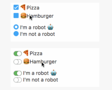


Example
Check out demo and styling examples.
Usage
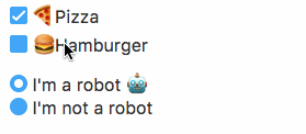
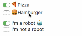
Checkbox
<checkbox name="terms" value="1"> I agree to the <a href="#">terms of service</a> </checkbox>Radio
<radio name="robot" value="1"> I'm a robot </radio> <radio name="robot" value="0"> I'm not a robot </radio>Install
yarn
yarn add vue-checkbox-radionpm
npm install vue-checkbox-radio --saveSetup
Register the plugin.
import CheckboxRadio from 'vue-checkbox-radio'; Vue.use(CheckboxRadio);Or register components manually.
import {Checkbox, Radio} from 'vue-checkbox-radio'; Vue.component('checkbox', Checkbox); Vue.component('radio', Radio);Params
Checkbox
| Parameter | Type | Default |
|---|---|---|
| id | string | checkbox-id-(element uid) |
| class-name | string | null |
| name | string | null |
| v-model | string, boolean or array | undefined |
| value | string or boolean | null |
| checked | boolean | false |
| required | boolean | false |
| disabled | boolean | false |
Radio
| Parameter | Type | Default |
|---|---|---|
| id | string | radio-id-(element uid) |
| class-name | string | null |
| name | string | null |
| v-model | string or boolean | undefined |
| value | string or boolean | null |
| checked | boolean | false |
| required | boolean | false |
| disabled | boolean | false |
Events
Both components emit the input event to work with v-model.
Full example
<checkbox id="input-terms" class-name="terms" name="terms" value="1" v-model="model" checked required> I agree to the <a href="#">terms of service</a> </checkbox>Slots
Slot input-box allow overwriting input-box for specific customizations.
<checkbox> <span class="input-box" slot="input-box"> [...] </span> Test </checkbox>License
MIT © Mario Juárez