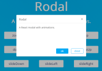
Rodal 


A React modal with animations.
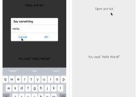
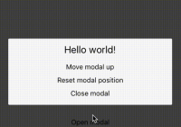
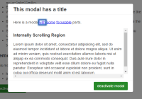
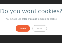
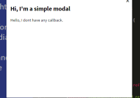
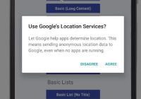
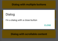
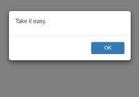
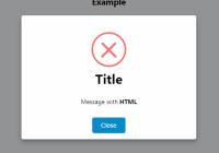
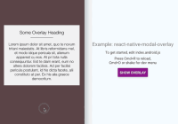
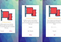
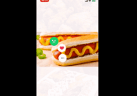
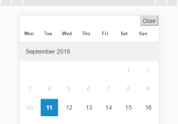
Example
Installation
React 15/16
npm i rodal --save React 0.14
npm i [email protected] --save Usage
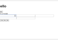
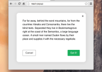
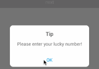
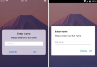
import React from 'react'; import Rodal from 'rodal'; // include styles import 'rodal/lib/rodal.css'; class App extends React.Component { constructor(props) { super(props); this.state = { visible: false }; } show() { this.setState({ visible: true }); } hide() { this.setState({ visible: false }); } render() { return ( <div> <button onClick={this.show.bind(this)}>show</button> <Rodal visible={this.state.visible} onClose={this.hide.bind(this)}> <div>Content</div> </Rodal> </div> ) } }Props
| Property | Type | Default | Description |
|---|---|---|---|
| width | number | 400 | width of dialog |
| height | number | 240 | height of dialog |
| measure | string | px | measure of width and height |
| onClose | func | / | handler called onClose of modal |
| onAnimationEnd | func | / | handler called onEnd of animation |
| visible | bool | false | whether to show dialog |
| showMask | bool | true | whether to show mask |
| closeOnEsc | bool | false | whether close dialog when esc pressed |
| closeMaskOnClick | bool | true | whether close dialog when mask clicked |
| showCloseButton | bool | true | whether to show close button |
| animation | string | zoom | animation type |
| enterAnimation | string | / | enter animation type (higher order than 'animation') |
| leaveAnimation | string | leave animation type (higher order than 'animation') | |
| duration | number | 300 | animation duration |
| className | string | / | className for the container |
| customStyles | object | / | custom styles |
| customMaskStyles | object | / | custom mask styles |
Animation Types
- zoom
- fade
- flip
- door
- rotate
- slideUp
- slideDown
- slideLeft
- slideRight