jQuery Tabs
A simple jQuery plugin for responsive tabs.
Description
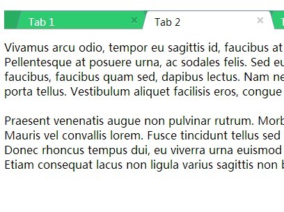
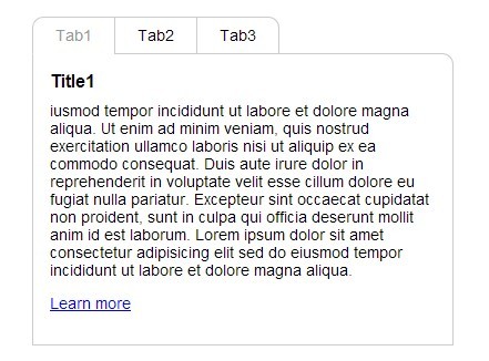
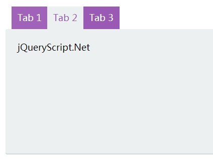
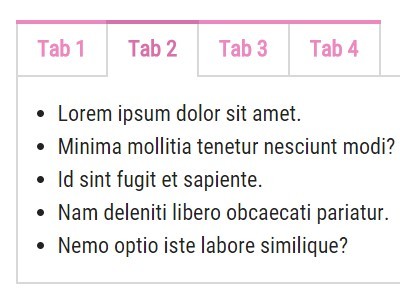
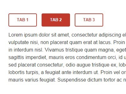
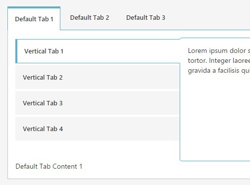
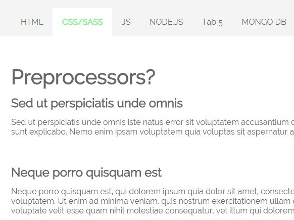
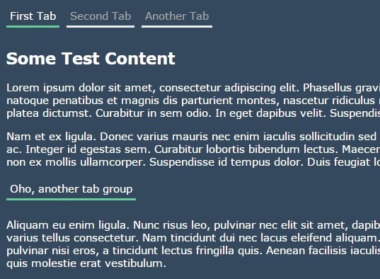
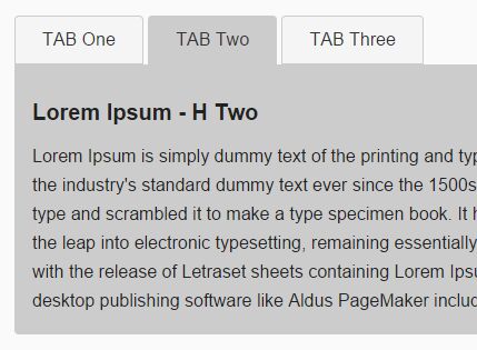
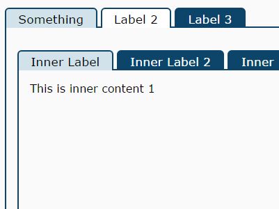
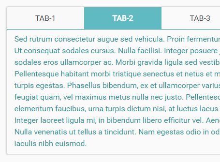
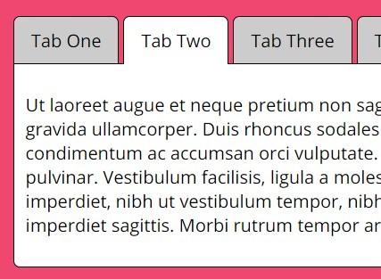
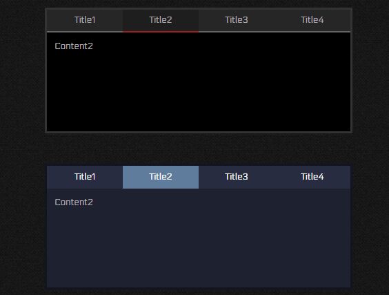
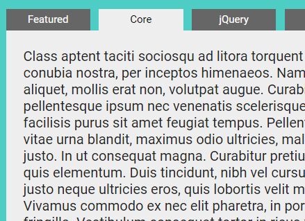
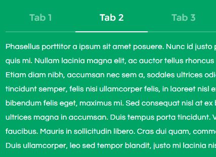
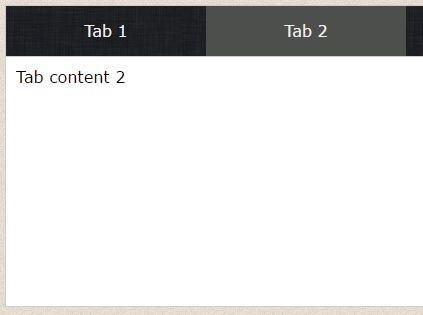
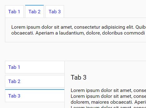
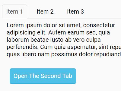
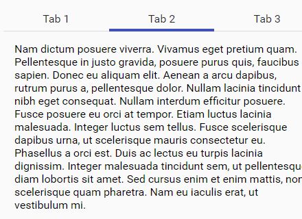
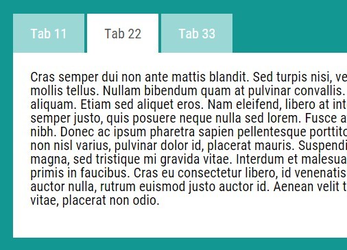
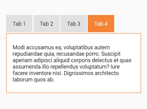
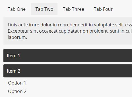
- Tabs separate mutually exclusive content. Only one tab is active at a time and therefore only the content related to the active tab is visible at any given time.
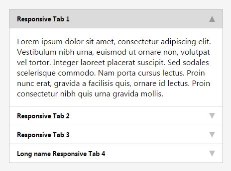
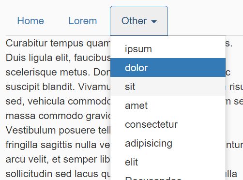
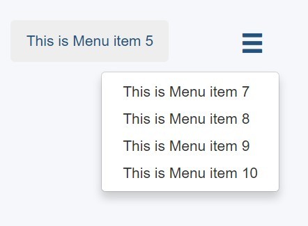
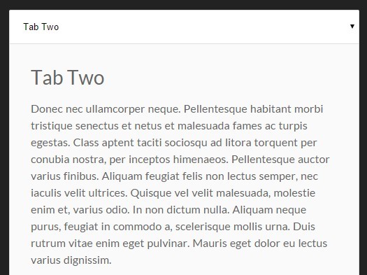
- On mobile, the tabs becomes
<select>drop down. - The drop-down carry all the states from the tabs and vice versa.
- You can cofigure the enter and exit animations for tab content.
Usage
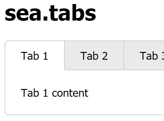
The plugin converts the following markup into tabs -
<div class="tabs-wrapper"> <ul class="tab-nav"> <li class="active"> <a href="#" data-target="tab-1">Tab 1</a> </li> <li> <a href="#" data-target="tab-2">Tab 2</a> </li> <li> <a href="#" data-target="tab-3">Tab 3</a> </li> </ul> <div class="target-tabs"> <div id="tab-1" class="tab-content"> Tab 1 Content </div> <div id="tab-2" class="tab-content"> Tab 2 Content </div> <div id="tab-3" class="tab-content"> Tab 3 Content </div> </div> </div>Initialization
You can initialize the plugin by adding the following line to your script
$('.tabs-wrapper').tabs();Configuration
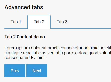
- The plugin allows configuring enter and exit animations for tabs.
- You can provide animate.css classes or your own CSS classes for showing and hiding tabs with cool effects.
- Example code for configuring the plugin
$('.tabs-wrapper').tabs({ enterAnimation: 'slideInDown', exitAnimation: 'slideOutDown' });