react-google-button


Codepen Demo
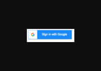
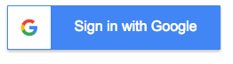
Rendered Preview
Getting Started
react-google-button is universal, so it can be used client-side or server-side.
-
Install through:
npm install --save react-google-button -
Import
GoogleButtonfromreact-google-button:import GoogleButton from 'react-google-button'
-
Use
GoogleButtoncomponent:<GoogleButton onClick={() => { console.log('Google button clicked') }} />
Props
type
PropType
oneOf([ 'light', 'dark' ])Default
'dark'Example
<GoogleButton type="light" // can also be written as disabled={true} for clarity onClick={() => { console.log('Google button clicked') }} />Description
'light' or 'dark' for the different google styles (defaults to dark)
disabled
disabled - whether or not button is disabled
PropType
BooleanDefault
falseExample
<GoogleButton disabled // can also be written as disabled={true} for clarity onClick={() => { console.log('this will not run on click since it is disabled') }} />label
PropType
StringDefault
'Sign in with Google'Example
<GoogleButton label='Be Cool' onClick={() => { console.log('Google button clicked') }} />Description
Override the 'Sign in with Google' words with another string.
Note: Google's branding guidelines states you should not to do this


