Simple Mobile Menu
Get started with the simple responsive menu with the "Simple Mobile Menu" jQuery plugin. This is very easy to use and easily customizable code base. You have to maintain the very easy HTML structure for this plugin.
How to use
Include the CSS( customize or rewrite the style as per your web or application UI ) & JS accordingly on your site. Please use the "simpleMobileMenu.js" after your jquery (use the latest one).
One more thing I have used the iconic css for the icons. If you want to use font awesome or anything else feel free to customize.
<link rel="stylesheet" type="text/css" href="http://code.ionicframework.com/ionicons/2.0.1/css/ionicons.min.css"> <link rel="stylesheet" type="text/css" href="css/simpleMobileMenu.css" /> <script src="js/simpleMobileMenu.js"></script>Menu structure
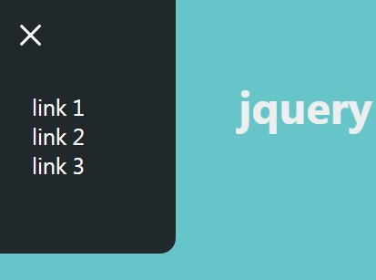
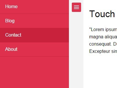
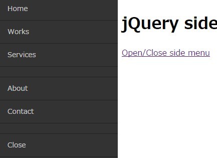
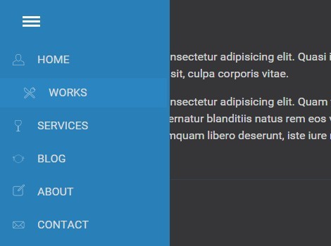
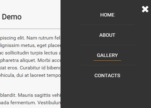
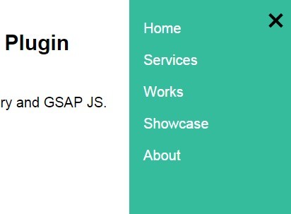
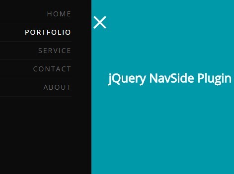
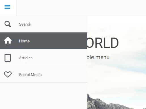
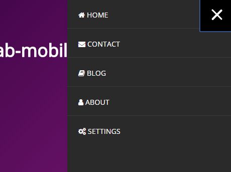
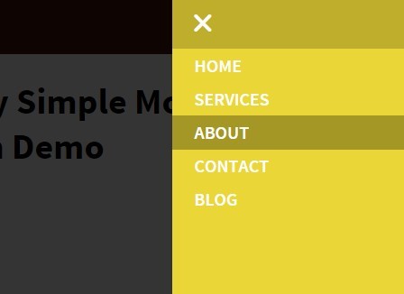
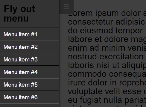
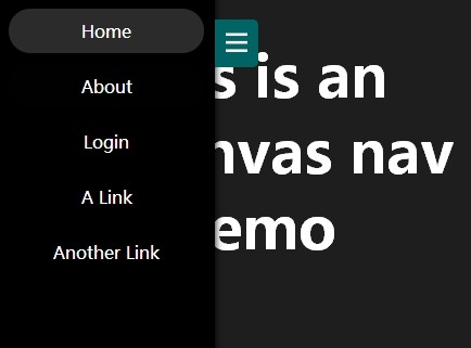
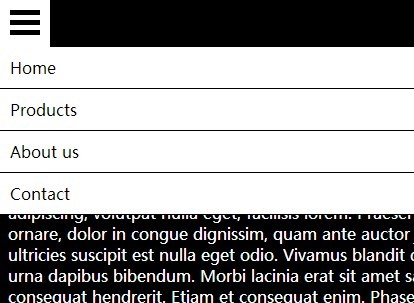
<nav> <a href="javascript:void(0)" class="smobitrigger ion-navicon-round"><span>Menu</span></a> <ul class="mobimenu"> <li><a href="">Home</a></li> <li><a href="">About Me</a></li> <li><a href="">Portfolio</a></li> <li><a href="">Contact Me</a></li> </ul> </nav>Initialize
$('.smobitrigger').smplmnu();If you want advance features. here is the little code to use and change the value accordingly.
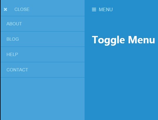
$('.smobitrigger').smplmnu({ background: "#EAD636", speed: "0.5s", textColor: "#fff" });Requirements
Requires jQuery 1.8+
####Tested Browsers:
- Chrome
- Firefox
- Safari
- Opera
- IE7+
- Android Browser
- iOS Safari
Version
- v 0.01 ( born phase ;) )

