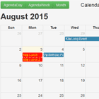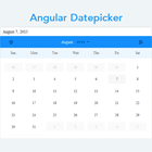
Animating Angular Datepicker
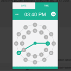
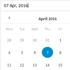
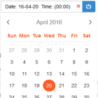
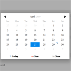
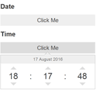
An Animating Datepicker for Angular 2+. For some smooth date picking :). Including range functionality, multiple calendars next to each other and loads of other functionality. Checkout the Demo page for a preview.
Want an improvement or found bug? please use the pull request functionality or create an issue.
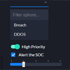
Some existing- and upcoming features
- Directive
- Reactive Forms Support
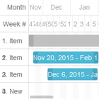
- Multiple Calendars next to each other
- Composable footer
- Themable
- Multi Languages support using Intl.DateTimeFormat
- Animations
- i18n
- Keyboard control
- ...
Installation
To install go through the following steps
npm install ngx-animating-datepicker --save-- or --yarn add ngx-animating-datepicker- Add
AaDatepickerModuleto your module imports:
import {AaDatepickerModule} from 'ngx-animating-datepicker'; @NgModule({ ... imports: [ ... AaDatepickerModule ] }Basic Usage
Implement the datepicker component in one of the following ways
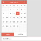
1. Inline Animatepicker
Implement aa-animatepicker component inline
<aa-animatepicker [options]="datepickerOptions" [(selectedDates)]="dates"></aa-animatepicker>2. As Directive
Implement datepicker as a directive
<input type="text" value="dates | date" [options]="datepickerOptions" [(selectedDates)]="dates" aaDatepicker="directiveOptions" />Options
The options can be used for the inline- as well as the directive implementation.
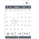
In the following example you'll see the default options:
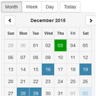
datepickerOptions: Options = { selectMultiple: false, // Select multiple dates closeOnSelect: false, // Close datepicker when date(s) selected animationSpeed: 400, // Animation speed in ms easing: 'ease-in', // Easing type string hideRestDays: false, // Hide the rest days disableRestDays: true, // Disable the click on rest days hideNavigation: false, // Hide the navigation range: false, // Use range functionality currentDate: new Date(), // Tne current displayed date (month, year) timeoutBeforeClosing: 5000, // The timeout / delay before closing weekdayFormat: 'short', // "narrow", "short", "long" weekStart: 'monday' // Set the week start day };Directive options
These options can be used only on the directive like so
<input aaDatepicker="directiveOptions" />In the following example you'll see the default options
directiveOptions: DirectiveOptions = { appendToBody: true, // Append Datepicker to body openDirection: 'bottom', // The direction it should open to closeOnBlur: true // Close the datepicker onBlur useAnimatePicker: true // Use the regular datepicker or the animating one };@Input's()
The following inputs are available for the Animatepicker
@Input() minDate: Date; // Disables dates until this date @Input() maxDate: Date; // Disables dates from this date @Input() language: string; // Set the locale string. Example: nl-NL @Input() numberOfMonths: number; // Number of months shown next to eachother @Input() selectedDates: Date | Date\[\]; // Also a @Output (two-way data bindend) @Input() theme: string; // Theme string is added to the host @Input() isOpen: boolean; // The open stateDirective @input's()
All the above @Input's() can be used with the directive implementation as well. Additionally, you can use these @Input's() for the directive. The assigned values are the default ones:
@Input() appendToBody = true; // Append Datepicker to the body else append to directive @Input() openDirection = 'bottom' // 'top', 'left', 'right', 'bottom' @Input() closeOnBlur = true; // Close datepicker on blurComposing
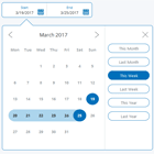
You can add a footer or header to the datepicker by adding a <footer> or <header> element between the tags.
<aa-animatepicker [options]="datepickerOptions" [(selectedDates)]="dates"> <header (click)="someLogic()">put your logic here</header> <footer (click)="someLogic()">put your logic here</footer> </aa-animatepicker>Regular Datepicker Component
The Animatepicker is an extension of the regular datepicker component. Don't want all that fancy animations? Then this is exactly what you need. Use aa-datepicker to implement in your component
"Advanced" Usage
Control the datepicker programmatically
You can also control the datepicker programmatically from within your component by using ViewChild(). Like so:
@ViewChild('demoDatepicker') demoDatepicker: AnimatepickerComponent; close(){ this.demoDatepicker.close(); } open(){ this.demoDatepicker.open(); } next(){ this.demoDatepicker.goToNextMonth(); } previous(){ this.demoDatepicker.goToPreviousMonth(); }And in your template:
<aa-animatepicker #demoDatepicker></aa-animatepicker>Include your component in the datepicker
Implement your custom component into the datepicker by using the ng-content located on the bottom of the datepicker
<aa-animatepicker #demoDatepicker> <app-custom-component></app-custom-component> </aa-animatepicker>