Anguar Material Design Progress Buttons


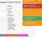
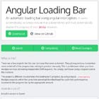
Demo
View all the directives in action at https://mat-progress-buttons.firebaseapp.com
StackBlitz demo https://stackblitz.com/edit/mat-progress-buttons-demo
Dependencies
- Angular (requires Angular 2 or higher, tested with 2.0.0)
- Angular Material
Installation
Install above dependencies via npm.
Now install mat-progress-buttons via:
npm install --save mat-progress-buttonsSystemJS
Note:If you are using
SystemJS, you should adjust your configuration to point to the UMD bundle. In your systemjs config file,mapneeds to tell the System loader where to look format-progress-buttons:
map: { 'mat-progress-buttons': 'node_modules/mat-progress-buttons/bundles/mat-progress-buttons.umd.js', }Once installed you need to import the main module:
import { MatProgressButtonsModule } from 'mat-progress-buttons';The only remaining part is to list the imported module in your application module. The exact method will be slightly different for the root (top-level) module for which you should end up with the code similar to (notice MatProgressButtonsModule .forRoot()):
import { MatProgressButtonsModule } from 'mat-progress-buttons'; @NgModule({ declarations: [AppComponent, ...], imports: [MatProgressButtonsModule.forRoot(), ...], bootstrap: [AppComponent] }) export class AppModule { }Other modules in your application can simply import MatProgressButtonsModule:
import { MatProgressButtonsModule } from 'mat-progress-buttons'; @NgModule({ declarations: [OtherComponent, ...], imports: [MatProgressButtonsModule, ...], }) export class OtherModule { }Usage
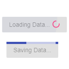
Spinner Button
import { Component } from '@angular/core'; import { MatProgressButtonOptions } from 'mat-progress-buttons'; @Component({ selector: 'app-home', template: '<mat-spinner-button (btnClick)="btnClick()" [options]="btnOpts"></mat-spinner-button>' }) export class SomeComponent { // Button Options btnOpts: MatProgressButtonOptions = { active: false, text: 'Stroked Button', spinnerSize: 19, raised: false, stroked: true, flat: false, fab: false, buttonColor: 'accent', spinnerColor: 'accent', fullWidth: false, disabled: false, mode: 'indeterminate', }; // Click handler btnClick(): void { this.btnOpts.active = true; setTimeout(() => { this.btnOpts.active = false; }, 3350); } };Bar Button
import { Component } from '@angular/core'; import { MatProgressButtonOptions } from 'mat-progress-buttons'; @Component({ selector: 'app-home', template: '<mat-bar-button (btnClick)="btnClick()" [options]="btnOpts"></mat-bar-button>' }) export class SomeComponent { // Button Options btnOpts: MatProgressButtonOptions = { active: false, text: 'Stroked Button', buttonColor: 'accent', barColor: 'accent', raised: false, stroked: true, flat: false, mode: 'indeterminate', value: 0, disabled: false }; // Click handler btnClick(): void { this.btnOpts.active = true; setTimeout(() => { this.btnOpts.active = false; }, 3350); } };Note: Bar Button does not suppor the fab style, currently. Hope to have something like this soon.
Run Demo App Locally
- clone this repo by running
$ git clone https://github.com/michaeldoye/mat-progress-buttons.git- link the mat-progress-buttons package
$ gulp link- navigate to the demo app directory
$ cd demo- install the dependencies
$ npm i- run/start/serve the app
$ npm run startor
$ ng serve --open- the app is now hosted by
http://localhost:4200/
Development
- clone this repo
- Install the dependencies by running
npm i - build the library
npm run buildorgulp build - Link the library
gulp link - Navigate to the demo app's directory
cd demo_npm i_npm start
License
Copyright (c) 2018 Michael Doye. Licensed under the MIT License (MIT)