NgxImageViewer
A configurable Angular image viewer component, compatible with Angular 2.x, 4.x and 5.x
Features:
- Compatible with Angular 2.x, 4.x and 5.x
- Configurable
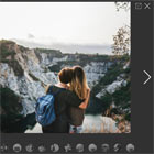
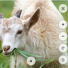
- Rotate image
- Zoom image
- Drag to move image
- Toggle fullscreen mode
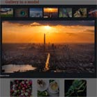
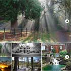
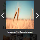
DEMO
https://angular-2wrbwp.stackblitz.io/
Set up
To use default configuration, simply import the ImageViewerModule into your module, like so:
import { ImageViewerModule } from "ngx-image-viewer"; @NgModule({ //... imports: [ //... ImageViewerModule.forRoot() ], //... })Then, add the component to your template, providing an array of image URLs. You can also optionally add an index, to indicate which image should be shown first. The default will be the first item in the array.
<ngx-image-viewer [src]="images" [(index)]="imageIndex"></ngx-image-viewer>By default, the image viewer will fill its container. If you wish to restrict the size, simply place it within a div, and set the size constraints on the div.
If you want to use the standard icons, you will also need to install font-awesome
npm install --save font-awesome Otherwise, you will need to use the configuration to set different icon classes.
Configuration
Configuration can be provided at the module level (by passing the object as an argument to forRoot(), or at the component level, by passing it as the config input. Any configuration provided at the component level will override that which is set at the module level.
The configuration object is structured as below. All values are optional, and if ommitted, the default value shown below will be used.
{ btnClass: 'default', // The CSS class(es) that will apply to the buttons zoomFactor: 0.1, // The amount that the scale will be increased by containerBackgroundColor: '#ccc', // The color to use for the background. This can provided in hex, or rgb(a). wheelZoom: true, // If true, the mouse wheel can be used to zoom in allowFullscreen: true, // If true, the fullscreen button will be shown, allowing the user to entr fullscreen mode allowKeyboardNavigation: true, // If true, the left / right arrow keys can be used for navigation btnIcons: { // The icon classes that will apply to the buttons. By default, font-awesome is used. zoomIn: 'fa fa-plus', zoomOut: 'fa fa-minus', rotateClockwise: 'fa fa-repeat', rotateCounterClockwise: 'fa fa-undo', next: 'fa fa-arrow-right', prev: 'fa fa-arrow-left', fullscreen: 'fa fa-arrows-alt', }, btnShow: { zoomIn: true, zoomOut: true, rotateClockwise: true, rotateCounterClockwise: true, next: true, prev: true } };To add additional buttons use the following
<ngx-image-viewer [src]="images" [config]="{customBtns:[{name: 'link', icon: 'fa fa-paperclip'}]}" (customEvent)="handleEvent($event)"> </ngx-image-viewer>handleEvent(event: CustomEvent) { console.log(`${event.name} has been click on img ${event.imageIndex + 1}`); switch (event.name) { case 'print': console.log('run print logic'); break; } }Note: currently only 3 additional buttons is supported due to css